Imagine that you are a general manager, and you want to monitor how all the stores in the region are performing, in terms of sales and goods sold. You could have around ten stores in a particular state. Monitoring this on a line chart could get messy and confusing. To get valuable insights, the best option would be to compare each of the stores in a separate chart, but with a common axis arranged in the form of a grid. Using the small multiples in Power BI, these stores can also be grouped by cities or districts to drive further discussions.
The visual provided by xViz is popular across audiences. You can have panels showing trends across categories and sub-categories over a set of values. The trellis visualization helps when you want to analyze data in more granular categories to get a more detailed picture.
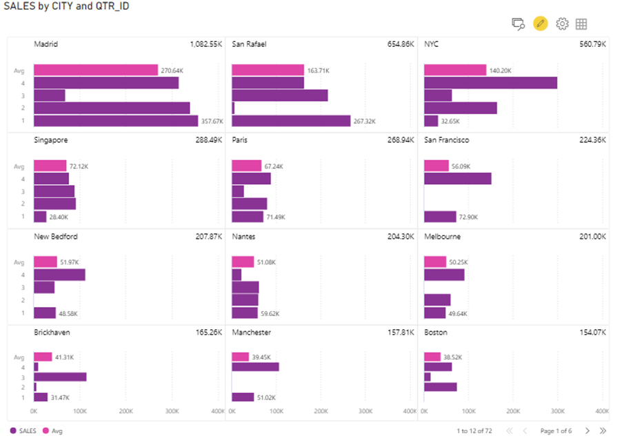
As shown below, the visual supports pagination. The ‘Average’ datapoint has been highlighted in each panel.
One instance shown in this article is using this visual to compare sales across different cities on a quarterly basis for the entire year. The xViz Advanced Trellis visual also supports time series analysis. Another use case we have shown in this article is comparing sales across different product categories over cities using the visual.
Some interesting features are illustrated here:
Choose from different charts to display:
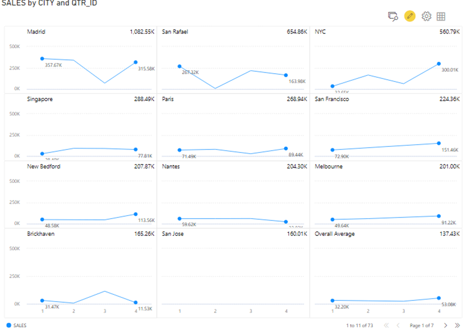
You can display the trends using various chart types such as line, lollipop, column, area, donut, and waterfall chart. You can analyze the trends of the different categories in panels, allowing for easier comparison. Since the X-axis is common across charts, it is easier to spot trends and identify the pain points or contributing factors.
Each chart type can further be customized to incorporate your reporting requirements. You can show data markers, data labels, and tooltips according to your preference with different styling options available.
Compare averages across categories:
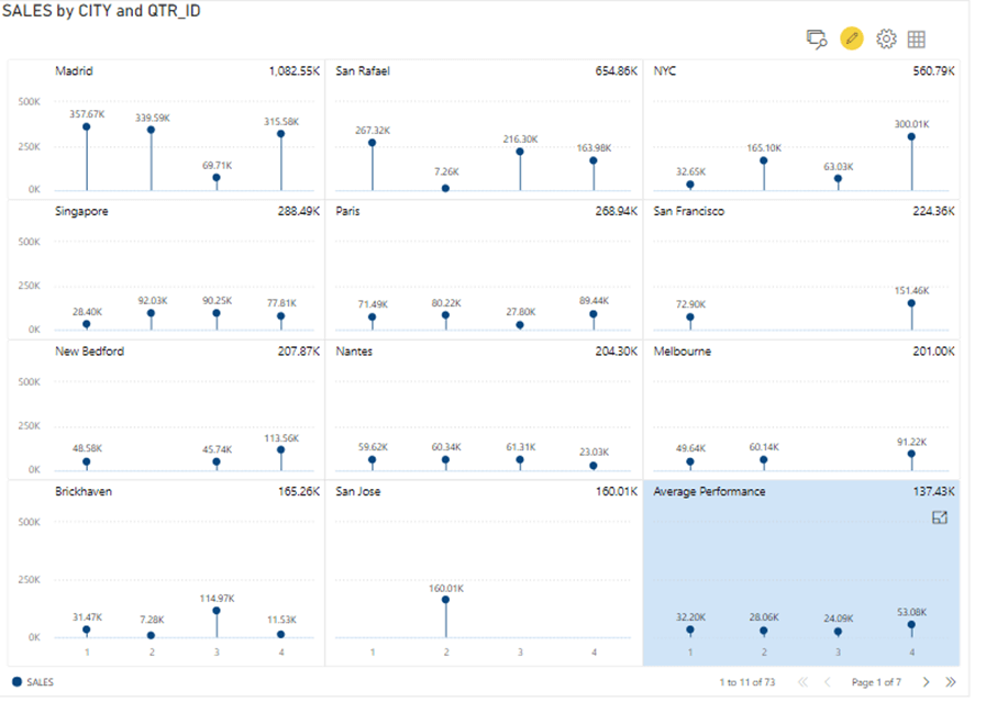
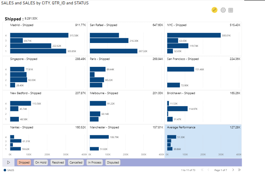
The xViz advanced small multiples in Power BI makes it very easy to compare averages. You can either have an average data point for each panel, or a panel showing the average over a period across categories, or even have both. If you’re displaying the average in the panel, you can choose the bar or lollipop chart option as shown below for a clear and concise representation.
The panel depicting the averages can be highlighted drawing further attention for a quick glance while presenting to executives.
Search for and pin a panel:
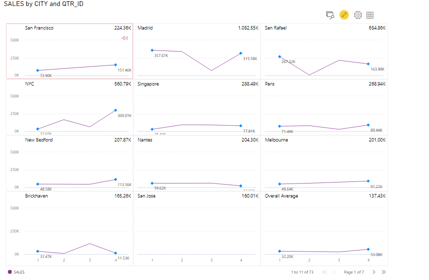
You can search for and pin a particular panel. Pinning a panel fixes its location on the grid. For instance, this helps when you have a baseline or a benchmark. You can pin a particular panel to drive discussions/analyses around it. This is especially useful when there are multiple pages to scroll through. This feature enables easy and quick navigation through the panels.
In the below example, the panel ‘San Francisco’ has been pinned.
Apply Conditional Formatting:
You can apply conditional formatting to the panel title and chart background. This will draw attention to any anomalies that require further study. You can have icons that show a favorable/negative trend depicting highs and lows. All of this can be done easily with just a few clicks.
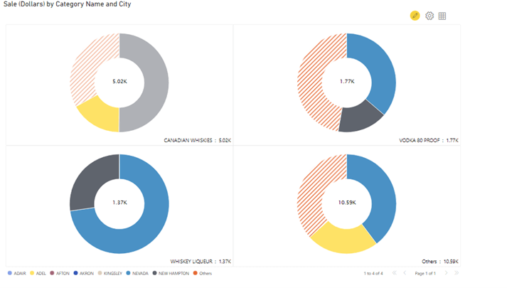
In the below chart, The panels represent the type of liquor, and the cities are represented on the x-axis. The ‘Others’ segment has been highlighted.
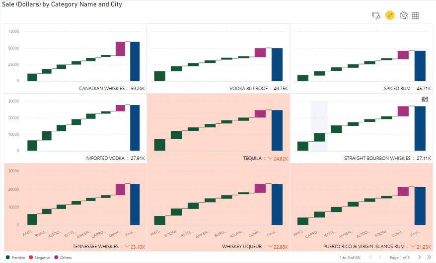
Compare Top and Bottom N:
In this visual, you can sort the categories using Top N/Bottom N functionality and classify everything else as ‘Others’. This helps to quickly identify the top/poor performing regions, product categories, etc. You also have the option to select the ‘Both’ options, so you can the Top N and Bottom N with everything else grouped under ‘Others’.
In the illustration below, we have used the Top N filter at both the panel and chart levels. The segment representing ‘Others’ can be shown with a gradient effect for quick identification.
Tell a story using Animated Charts:
The ‘Animated Charts’ feature can be leveraged to tell a story. It can be easily customized to seamlessly drive through the pages in the chart, where you can set the speed and make use of the looping. You can have an animation title and show the navigation through buttons or sliders. All you need to do is, go to the Format pane and select trellis type to be Animated Charts. To enable ‘Animated Charts’, there needs to be a field in the ‘Group By’ section.
You can also customize the animation panel, and each of the buttons as shown below.
*****
