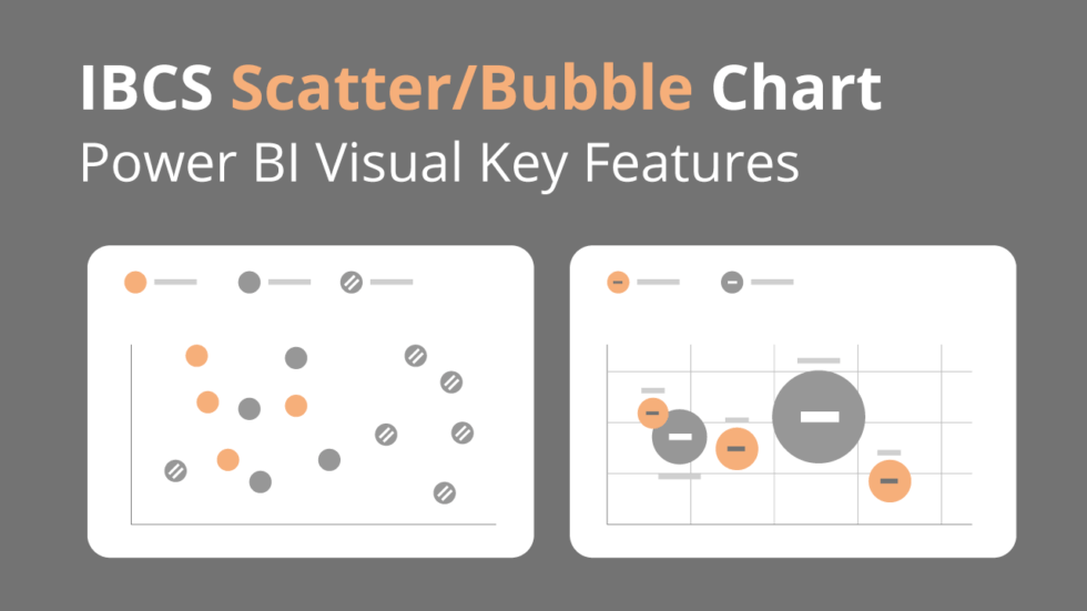
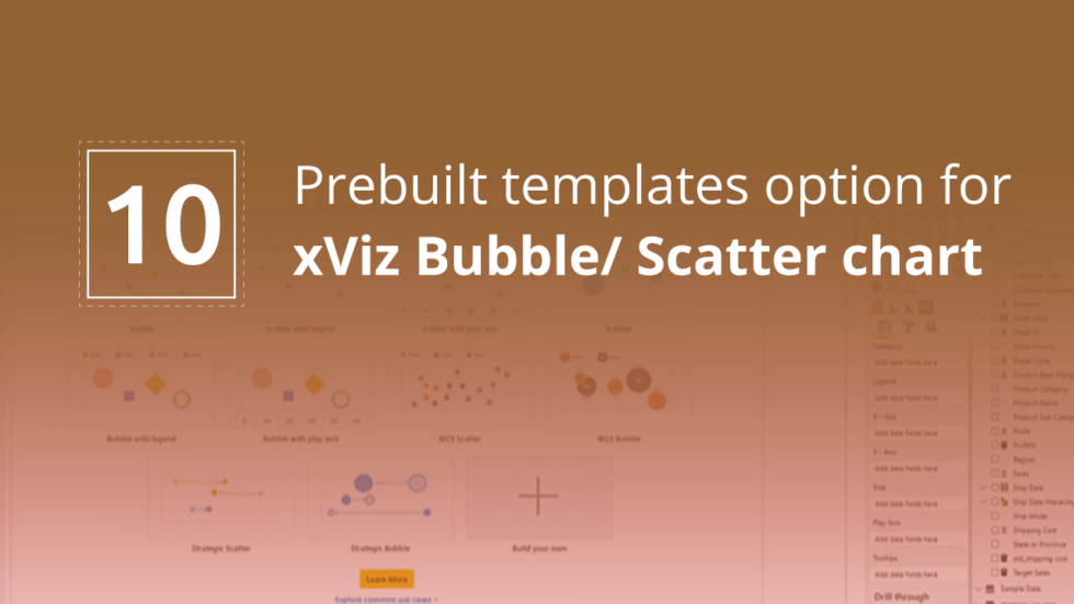
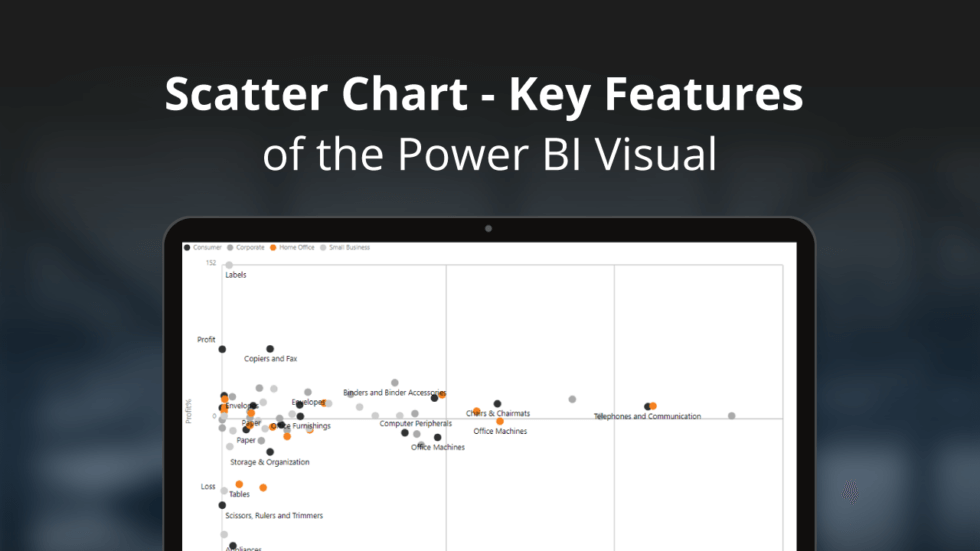
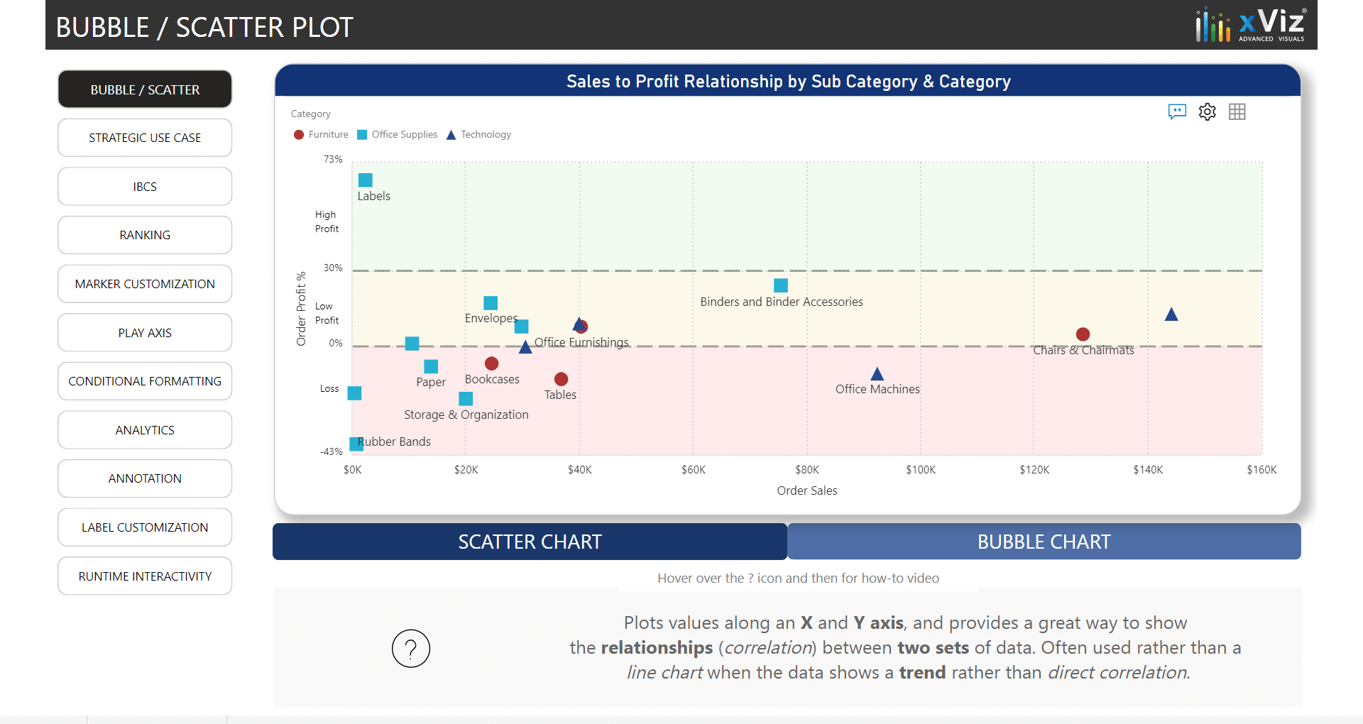
Scatter/Bubble Chart

Power BI Certified xViz Visual
The xViz Visual provides 9 quick-start templates, including Scatter, Bubble, and an IBCS variation for both. A Scatterplot chart displays the relationship between two numerical values (X and Y coordinate) and ideal for correlation analysis and outlier detection. The bubble chart further enhances the Scatterplot’s information density by adding a size variable as a third dimension. You can also pack more information by using color as the fourth variable, either value or category with the help of conditional formatting.
View interactive content

Get FREE version

For individual license desktop use*

Get PRO version

For Power BI desktop, service and report server; supports publishing and collaboration

Buy It

based on no. of creators and viewers

Looking to buy 100+ licenses?
Avail our 30-day Enterprise Trial

*Our xViz FREE Desktop Edition has been recently prompting users to upgrade to a paid subscription. This error is due to a Power BI update. We regret the inconvenience caused.

While we are working on fixing the issue as a priority,

  • Kindly check out our 30-day one-time Enterprise Trial to experience xViz without any restrictions
  • You can download the BETA version of the visual from our website with the popup issue fixed

Key Features

Pre-Defined Templates

9 Pre-Defined Templates enabling you to quickly Build your Own Visualizations

IBCS Scatter and Bubble

The custom visual provides supports IBCS Scatter and Bubble Chart Variation

Bubble Customization

Customize the appearance of the bubble in the form of shape, pattern and custom images

Top N

Ranking and Displaying the Top ‘N’ and group the remaining as Others.

Analytics

Enable different analytical options inside the custom visual such as Reference Lines. Custom Lines, Trends and much more

Annotations

Enahance your storytelling options by adding comments/annotations inside the custom visual

Watch it in action

Learn more

Read more about Bubble/Scatter Chart
For any feature requests or questions about this advanced custom visual, please write to us at community.xviz.com
Leveraging-Scatterplot-for-interactive-data-analysis-in-Power-BI-webinar

Leveraging Scatterplot for interactive data analysis in Power BI

In this webinar, deep dive into how the scatterplot visual can be utilized in your Power BI reports deriving business insights. The speaker will walk you through the advanced analytical features of the xViz Bubble/ Scatter Visual and how it enables Power BI users to achieve their goals.
watch now

Want to explore other visuals?

linkedin facebook pinterest youtube rss twitter instagram facebook-blank rss-blank linkedin-blank pinterest youtube twitter instagram