The KPI values on a report become more meaningful when those are associated with comparative factors like a target, benchmark, past performance, etc. The Bullet chart is one such visual that provides the aid of visualizing KPIs with such benchmarks.
Additionally, the KPIs of any business are often interdependent. This creates a need to visualize multiple KPIs at once. Creating multiple instances of a Bullet chart drives us against the rule of thumb in report performance of keeping minimal visuals on a report and adds to the maintenance of the visuals on the report canvas. Trellis chart, popularly known as Small Multiples, is a kind of chart that allows to dynamically duplicate the chart multiple times using different values, within one instance. Thereby, eliminating the need to create and maintain multiple instances of the chart.
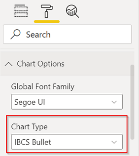
The xViz Bullet Chart supports showing multiple KPIs in different bullet charts but only in one visual instance. Let us understand how to configure the Trellis style xViz Bullet Chart, as shown below.
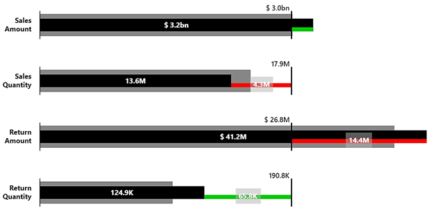
Let us consider a scenario and plot a trellis-style Bullet Chart for it: We want to analyze the Actual value, Target value and, Previous Year Actual value (PY Value) for 4 different KPIs of a manufacturing company. The KPIs that we want to visualize are Sales Amount, Sales Quantity, Return Amount, and Return Quantity.
IBCS Chart Type for multiple KPIs
To use the Trellis style in the xViz Bullet Chart, select the Chart Type as ‘IBCS Bullet’, from the Format pane, as shown below:
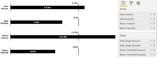
Actual and Target values
Now, let us insert the Actual values in the ‘Actual’ data field and the corresponding Target values in the ‘Target’ data field. Use the wide range of formatting options to tweak the look and feel of the visual as per your requirements.
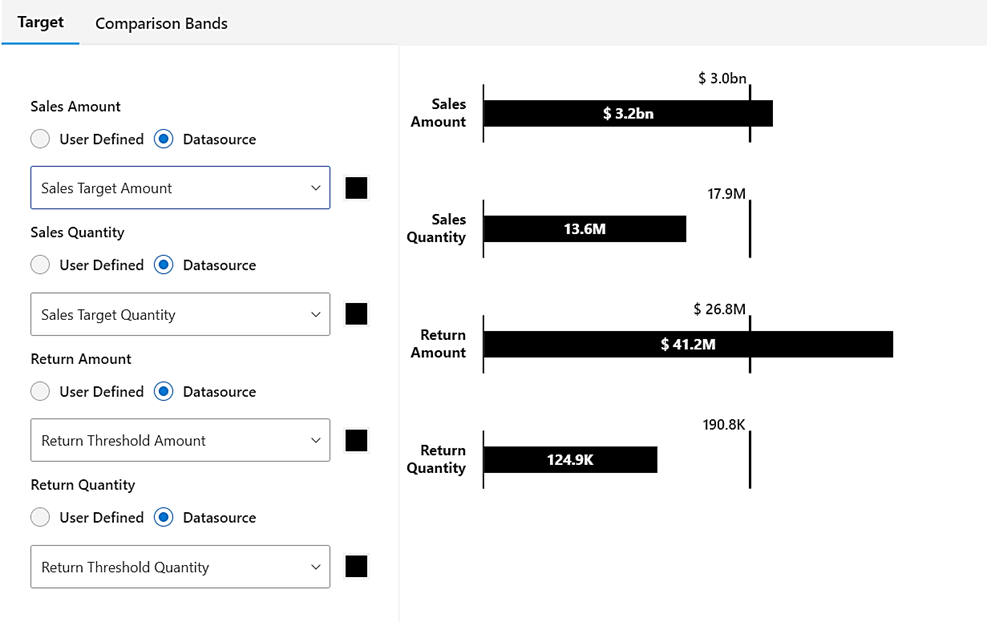
We can configure the Target values using the Advanced editor (edit icon) on the visual canvas. For every Actual value, either define the specific Target value or pick from one of the values inserted in the ‘Target’ data field. For our scenario, we will use the latter option.
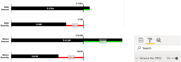
Variance
To visualize the variance of the Actual value from the Target value, enable the ‘Variance Bar’ option from the Format pane.
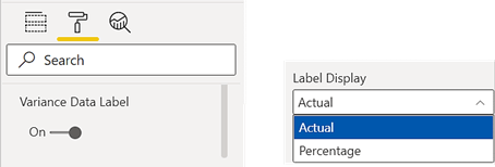
Variance – Absolute Value or Percentage
Variance data labels can either be absolute values or percentage values. To configure this, in the format pane options, we can navigate to the Data Labels section. Enable ‘Variance Data Label’ and choose the appropriate option in ‘Label Display’.
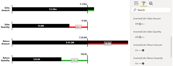
Invert Variance
In the case of Sales Amount and Sales Quantity, the Actual value exceeding the Target value is a positive indication. However, for Return Amount and Return Quantity, the Actual value exceeding the Target value is a negative indication.
The Target value in the second case is like the Threshold value. To configure invert indication, we can enable the Inverted option available for every Actual value, in the Variance Bar section from the Format pane.
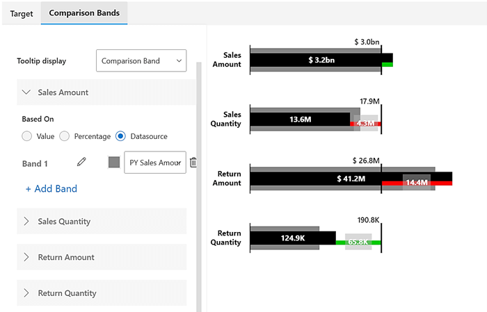
Comparison Bands
Finally, let us add more references to every metric using Comparison Bands. For our scenario, we will add the PY values in the Bands data field.
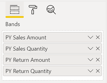
Like the Target configuration, we will go to the Advanced Editor (Edit icon) on the visual canvas and configure the settings for the Comparison band of every metric.
This is how we have shown the Actual, Target and, PY values for 4 different metrics in Trellis style using the xViz Bullet Chart.
**********
The xViz Bullet Chart is a part of the xViz Pro Suite, check out all the resources for Bullet Chart including other blogs, and FREE Power BI Desktop Version!
Check out all the Power BI Visuals in the xViz Pro Suite here
