This blog is part of the Bullet Chart Blog Series
In this blog, we will be looking at some of the common use cases of the Bullet Chart using xViz Custom Visuals for Power BI.
Use Cases – Summary
- Highlighting performance against benchmark using Conditional Formatting
- Comparing performance against 2 values (Comparative band + Benchmark)
- Comparing performance against 3 values (Comparative band + 2 Benchmark values)
- Qualitative analysis (Good, Average and Bad)
- Deviation/ Variance Analysis
- Tracking Process
- Detailed Single KPI
- Vertically oriented Bullet Chart for Trend Analysis
Use Cases – Description
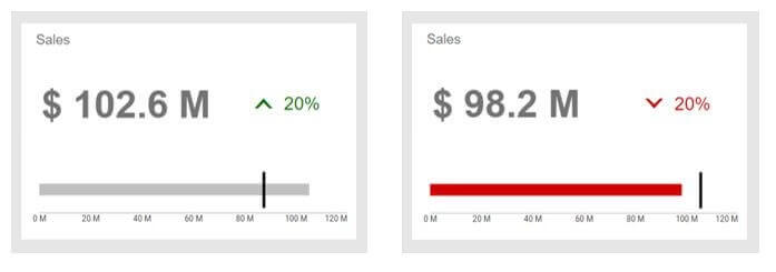
- Highlighting performance against benchmark using Conditional Formatting
Example: A Retail Company, trying to view their Sales for this quarter. With the help of a Bullet Chart, one can easily visualize sales progress by comparing the Actual Sales vs Target. Note that the red color quickly highlights the fact that the Target for this quarter has been missed.
2. Comparing performance against 2 values (Comparative band + Benchmark)
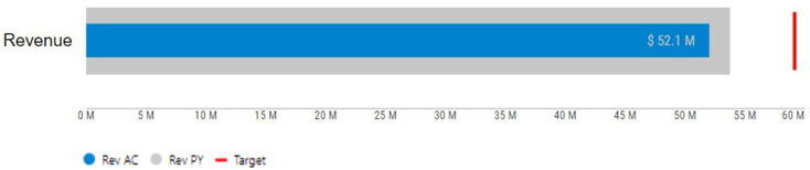
Example: A Bullet Chart could be used for Revenue Analysis where the Actual revenue could be compared with the Target and previous period Revenue. This also helps in looking at the target value relative to last year which makes it more powerful.
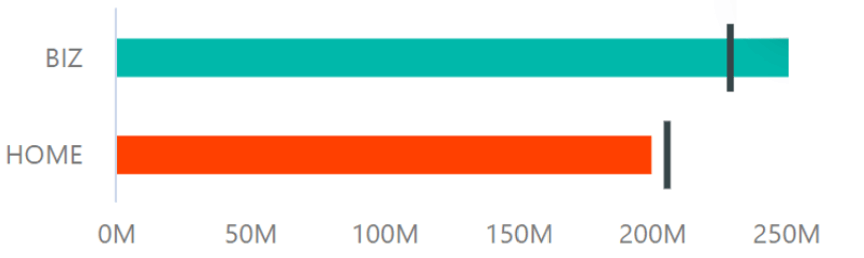
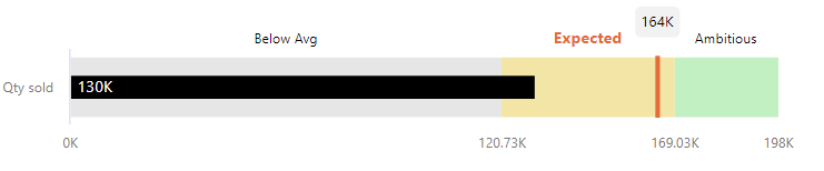
3. Comparing performance against 3 values (Comparative band + 2 Benchmark values)
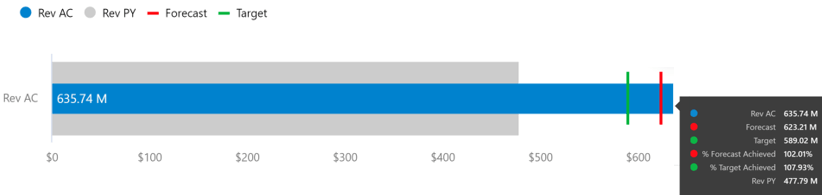
Example: A Manufacturing Company trying to analyze the order quantity of the product by comparing Actual quantity to the same period last year, Target and Forecasted value. This would help in Demand Planning forecast numbers leading to better Sales Planning.
4. Qualitative analysis (Good, Average and Bad)
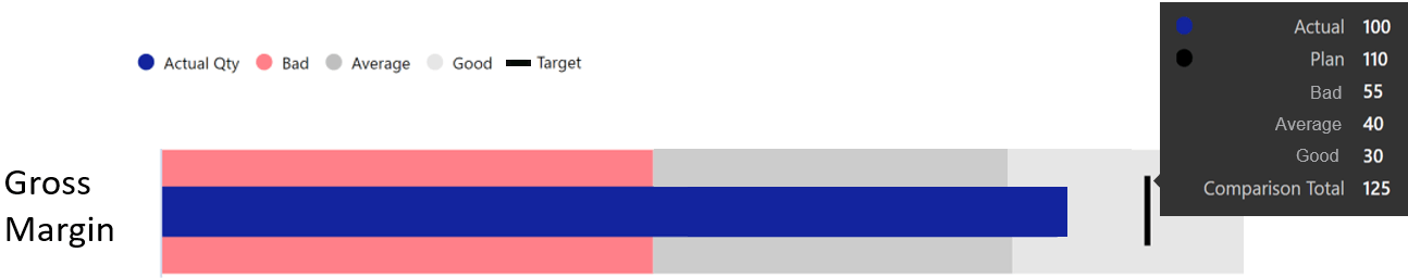
The qualitative scale not only helps to visualize the target achievement: poor, satisfactory, and good but also the degree to which it resides within that state. You could learn about the different ways to configure the Comparison Bands here.
Example: Using the qualitative range one could easily spot the gross margin lying in the good range. Another example could be when percentages are involved with the target being 100%.
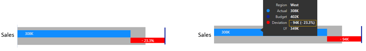
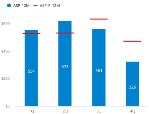
5. Deviation or Variance Analysis
As suggested by IBCS, the deviation bar helps you quickly spot the positive or negative variance from the benchmark or target value. It gives a visual indication to the user whether they have met or missed the target and by what value, both absolute and percentage variance
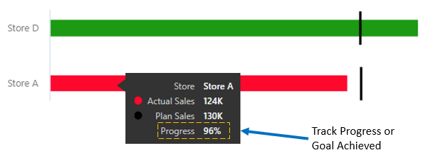
6. Tracking Progress
Along with Actual and Plan value, the next important KPI that business focuses on is the percentage of Target achieved or progress made towards Target. This KPI helps users understand the overall progress they have made and can benchmark desired progress values with the help of conditional formatting
7. Detailed Single KPI
One of the best use cases for Bullet chart is to present a KPI in a detailed manner, which is more suitable for printing without the need to hover over for extra information. In the below example, you could easily understand the KPI measured along with the Target value and threshold for each qualitative range.
8. Vertically oriented Bullet Chart for Trend Analysis
In certain cases, the vertical orientation of the Bullet Chart seems more beneficial than horizontal based on the real estate available. For example, you could visualize the trend information much easier in vertical orientation than horizontal
***
To get the latest version of the custom visual, reach out to us here.
You can take a look at the other advanced custom visuals by xViz here.