Note: This blog addresses some features of the custom visual that will be available in the App Source in Nov 2019. To get this latest build, reach out to us here.
This blog is part of the Gantt Chart Blog Series
Gantt charts are a set of bars representing a task across a certain timeline. Where the length of the bar represents the time taken by each task and the order of the task represents the order in which the tasks are supposed to be executed as part of the overall project. They are an important part of the project managers toolkit as they help visualize the project performance, project planning, resource allocations, and scheduling
In the previous blog, we looked at some of the key features of xViz Gantt chart. Now let’s look at some of the different use cases one can address using different customization options provided by xViz Gantt chart for Power BI
Use Cases – Summary
- Project Planning and scheduling – Actual and plan timeline values
- Resource planning and allocation – Gantt Resource
- Alerting – Conditional Formatting and Status Flag
- Task dependency – Connector lines
- Milestone achievement
Use Cases – Description
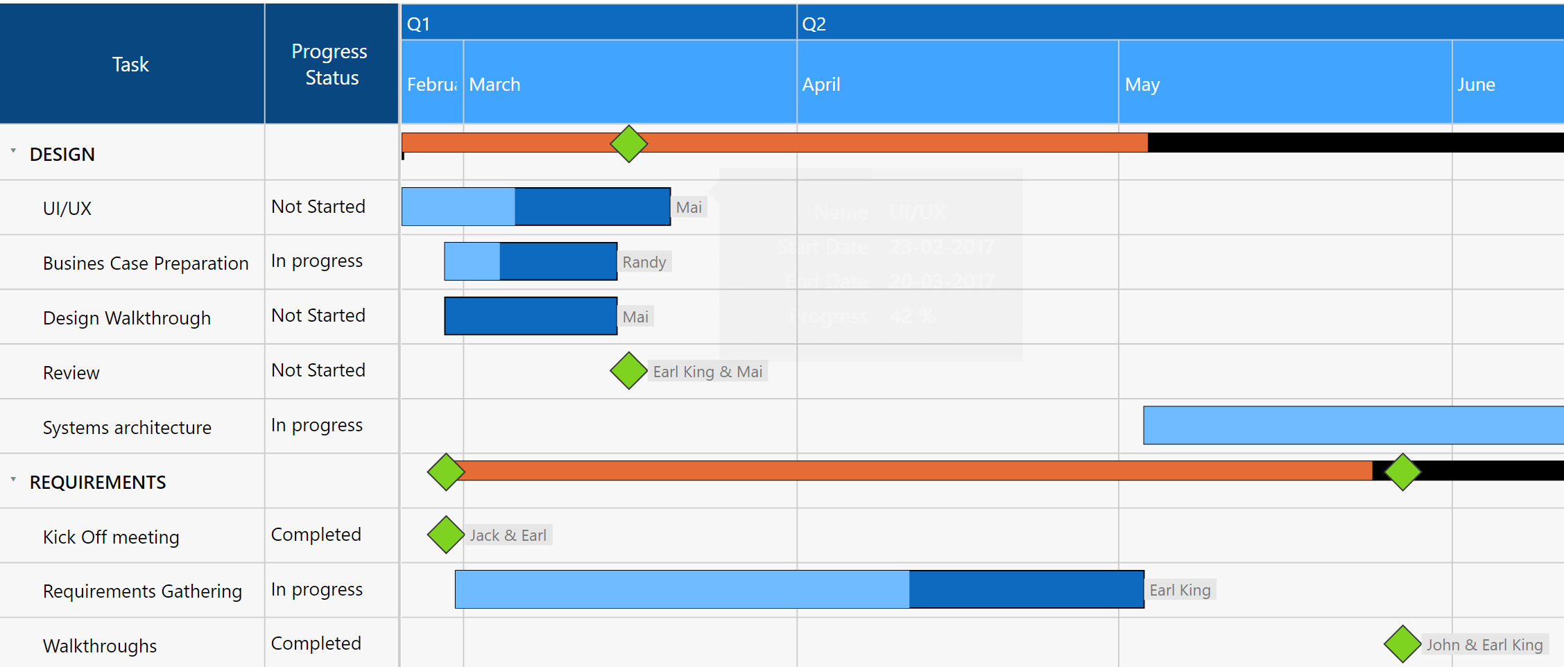
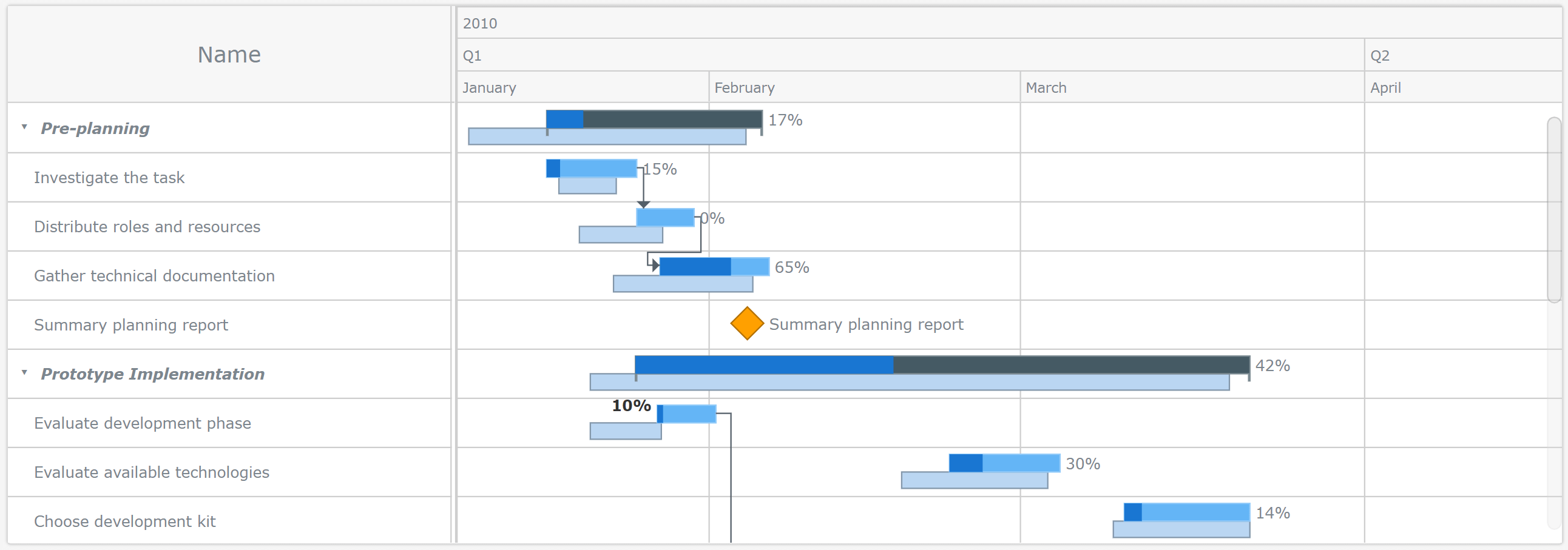
- Project Planning and scheduling – Actual and plan value
Gantt charts are used for planning projects and they are a useful way of showing what work is scheduled to be done on a specific day. They also help you view the start and end dates of a project in one simple view along with the progress made. The xViz Gantt chart provides the option to view the task progress both by comparing actual and planned timeliness or with just an Actual timeline. Apart from the individual task progress, you can also look at the total progress for the parent task.
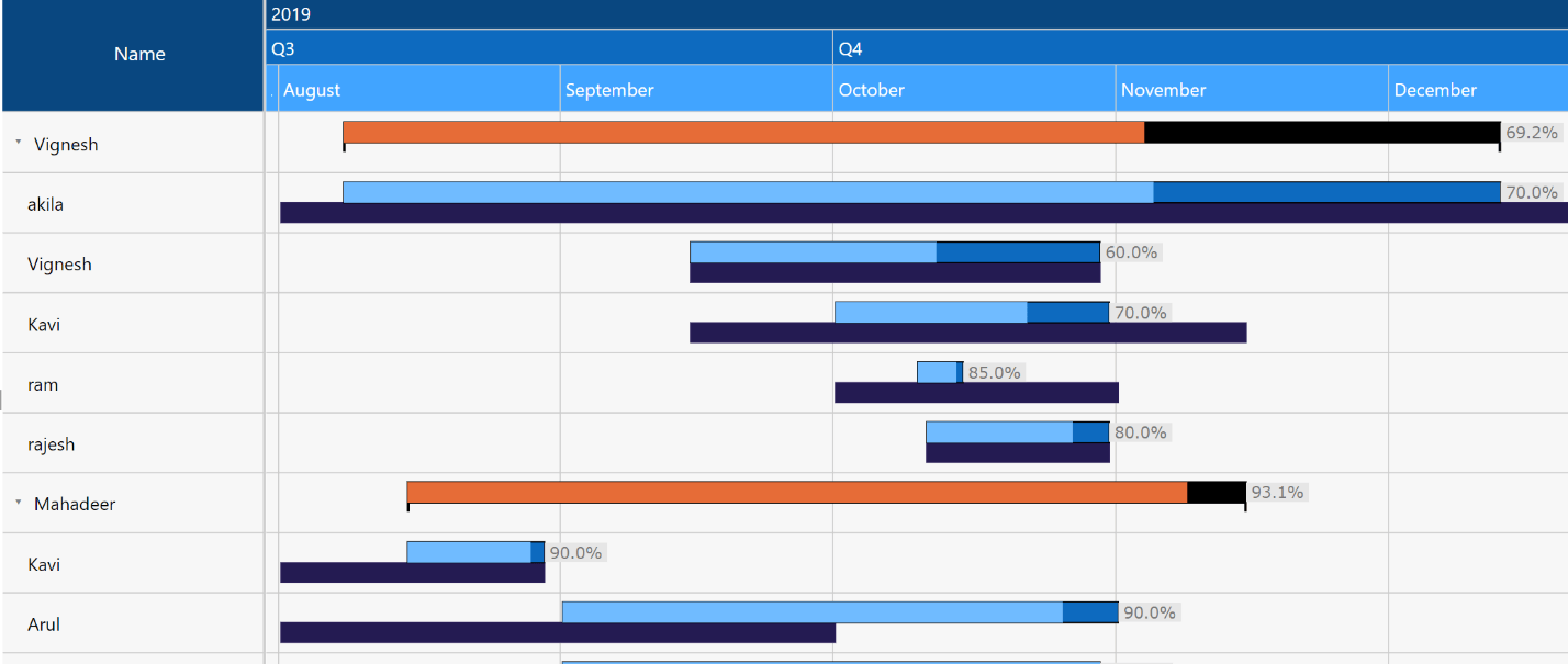
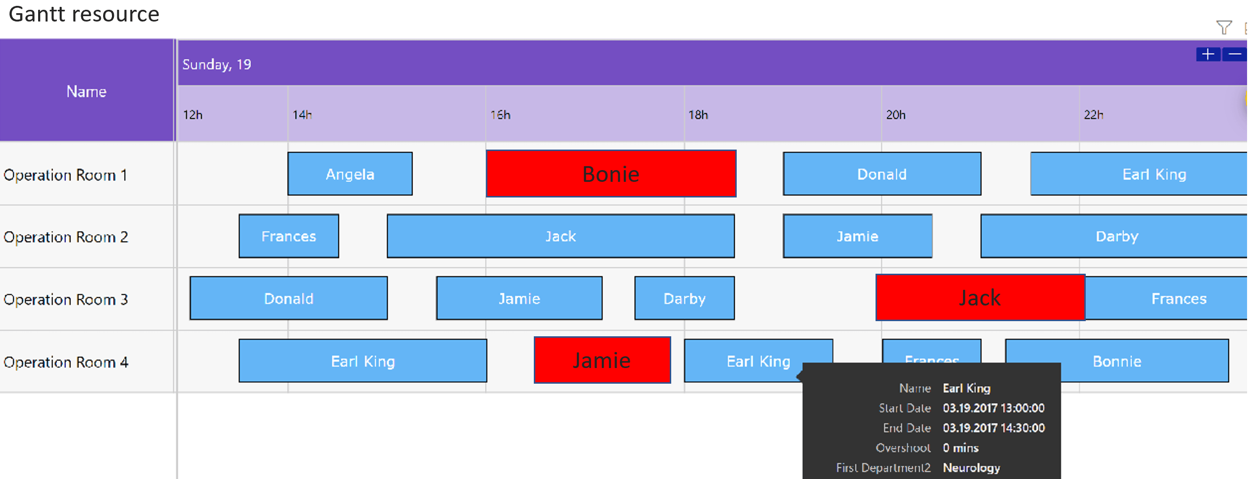
2. Resource Planning and Allocation – Gantt Resource
The xViz Gantt Chart provides another chart type know as the Gantt Resource (Pro Property) which is tailored specifically for use cases like resource planning, allocation, and performance review. The Gantt Resource Chart shows the timeline of the individual resource, where the resource could be an actual person with an assigned task or a resource could be an actual resource like a machine allocated for the required task. Below is an example of the Gantt resource displaying the Operation room availability along with the doctor’s information. The surgeries which have exceeded their scheduled time are displayed in red along with their exceeded time, thereby alerting the team to take necessary action.
3. Task dependency – Connector lines
Dependencies specify the relationships between tasks. They are used to indicate when a task should begin or end in relation to other tasks. On the Gantt Chart, dependencies appear as lines linking two of the tasks or linking a task to a milestone.
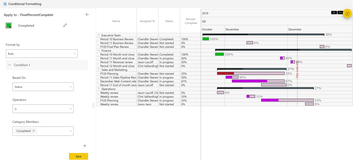
4. Project Monitoring – Conditional formatting and Status Flag
Just like any other chart, the xViz Gantt chart provides alerting options to highlight tasks based on set rules. For example, you would like to highlight certain tasks which are lagging as compared to the scheduled plan. There are 2 ways for achieving this in xViz Gantt chart –
Conditional Formatting – Highlights the progress bar in the timeline view based on set rule
Status Flag – Sets a small flag icon which is displayed in the data view to highlight the task based on the set rule
The xViz Gantt chart provides an option to set either one of these or both the conditional formatting and status flag together as desired.

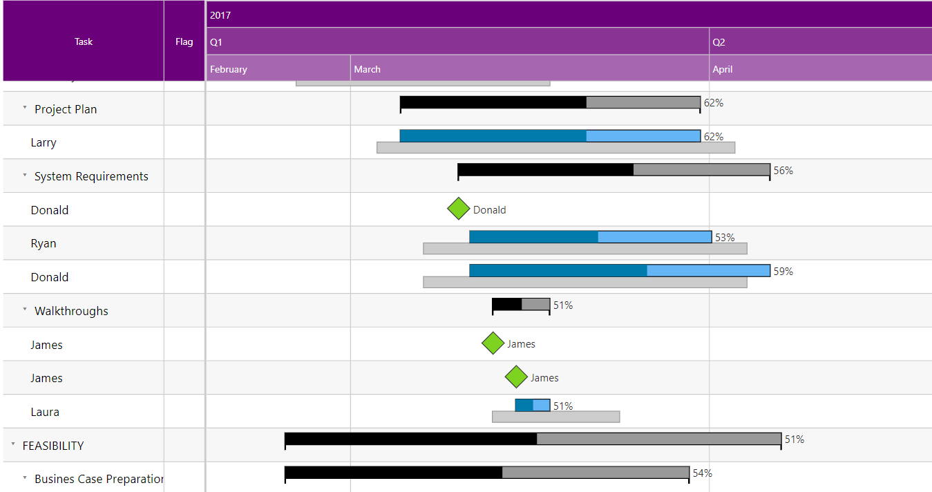
5. Milestone
As the name suggests, Milestones help track major events in a project timeline. For example, review or testing phase, project kick-off or completion of a parent task, etc. They are usually represented by a diamond symbol on the Gantt and have no duration. A milestone marks the end of a piece of work or phase of the project. They are often fixed dates with or important dates that you need to be aware of.
The xViz Gantt chart provides various customization options around Milestone not limited to just changing the color or shape of the milestone. The xViz Gantt chart based on the data can either display the Milestone automatically or can display based on the data column assigned to the Milestone field.
To get the latest version of the custom visual, reach out to us today here.
You can take a look at the other advanced custom visuals by xViz here.