Have a look at a valuable endorsement to our new product xViz for Power BI, by getting featured at length by Microsoft in their August 2019 Power BI Desktop Summary Blog.
Enterprises are trying to create comprehensive reports and visuals to engage and empower the internal and external audience using data visualization. The power of visualization of data and the clarity of decision making which comes along with better visualizations is a game changer for any organization. Read more about how xViz Visuals can help executives and decision makers to visualize and analyse business data in a whole different way.
The custom visuals discussed in the blog are:
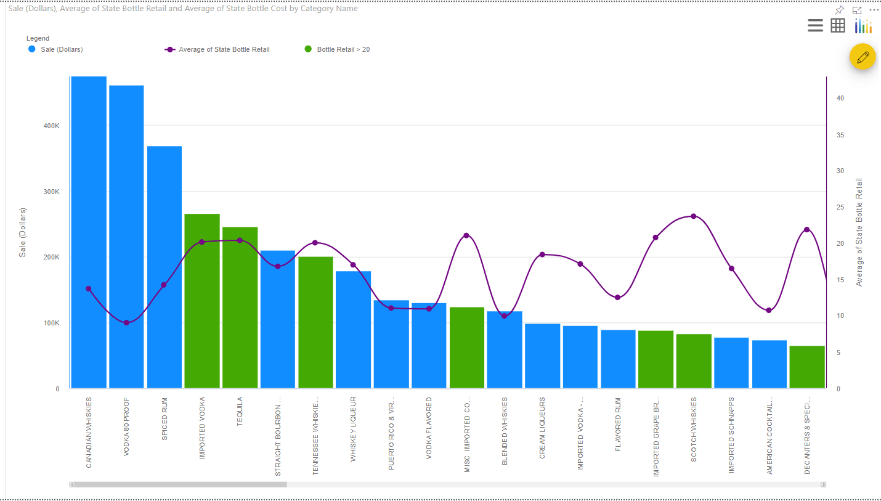
1. Multi Axes Chart – allows you to display up to five separate axis values, each with a unique visual type: column, column stacked, line, spline, area, area stacked or area spline.

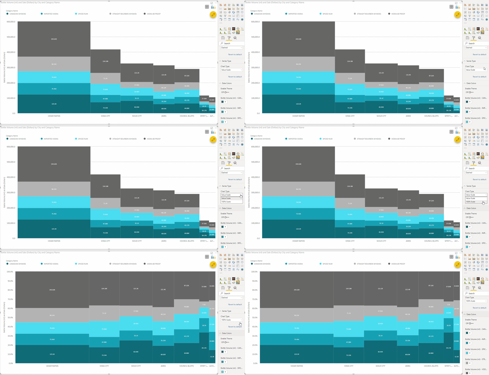
2. Marimekko Chart – lets you visualize categorical data over two scales, using both width and height, to show the relationship between them.

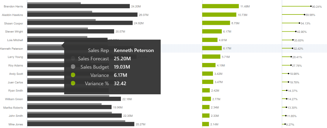
3. Variance Chart – allows you to easily compare multiple metrics, such as forecast versus budget, and see the variance between them.

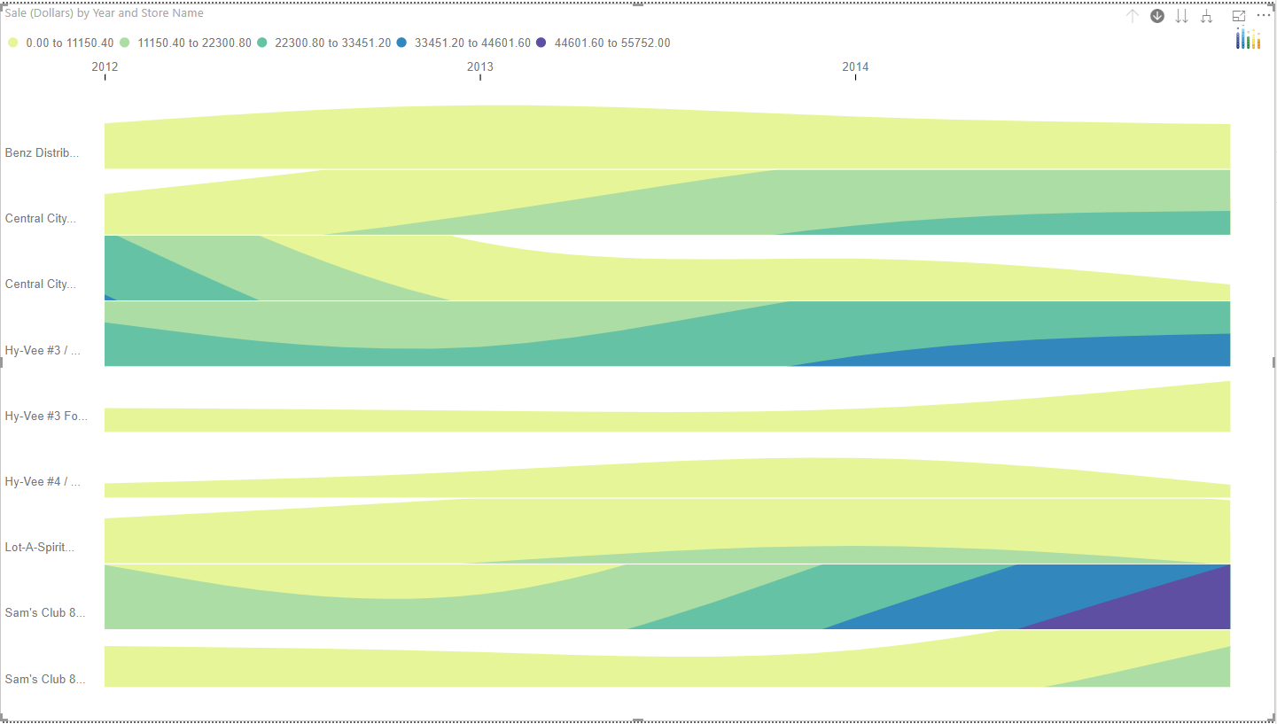
4. Horizon Chart – allows you to visualize partially overlapping line charts to show changes in distribution over time.


