Note: This blog addresses some features of the custom visual that will be available in the App Source in Nov 2019. To get this latest build, reach out to us here.
This blog is part of the Bullet Chart Blog Series.
In the previous blog, we looked at some of the key features of the bullet chart and the importance of comparison bands. Now let’s, have a closer look at the comparison bands and different ways to configure the comparison bands with the xViz bullet chart to solve various business use cases.
The Comparison Bands in the xViz Bullet Chart could be used for 2 important purposes
- Comparative Series
In cases where you would like to have an additional series to compare with the actual and benchmark value.
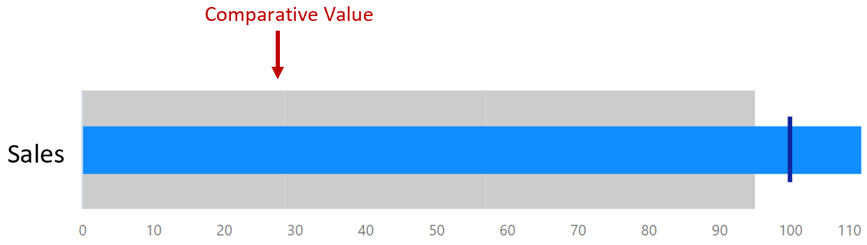
2. Qualitative Range
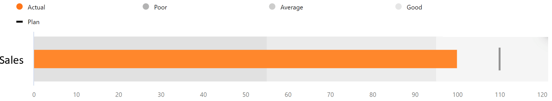
The qualitative range indicates the state of the measure depending on which band it resides in. They provide a performance rating to the value being measured where each color represents a different state for e.g. good, average and poor as seen below.
3 ways to configure the Comparison Bands
- When no value is assigned to the band field
Even if no value assigned to the band filed, you can still set up the qualitative ranges. Here, the qualitative ranges would be based on the Target value where the user has the ability to define both in the percentage of Target or absolute value.

2. Comparative series/ Qualitative Bands based on Single Value
When you assign a single value to the band field, you can configure it both as a comparison band or as a qualitative range. By default, it acts as a comparison band. However, you can convert this to a qualitative range by enabling the qualitative range option in the property sheet. The qualitative ranges here are based on the percentage of the band value assigned.
3. Qualitative bands based on individual values
The xViz Bullet Chart also provides the option to have values directly assigned to each of the qualitative bands. Each value assigned acts as a band (good, bad..) which stacks up to represent the entire qualitative range.
In the next blog we will be looking at the common use cases of the Bullet Chart.
***
To get the latest version of the custom visual, reach out to us today here.
You can take a look at the other advanced custom visuals by xViz here.