The most important indicators of the financial health and position of a company are the metrics that are tracked in financial statements such as Profit and Loss Statement, Balance Sheet, and Cash Flow Statement, among others. Often, these statements are lengthy and are represented in tabular format. To make things easier for executives, we can represent the key parameters of these statements in dashboards or reports in Power BI, with the help of interactive visualizations. The performance of these parameters must be quickly identified for key stakeholders to make effective decisions and chart out roadmaps. The right visualizations must be used to provide quick and actionable insights, with versatile slice and dice options.
The xViz range of visualizations offers a host of features that can be particularly useful in financial dashboards. We aim to identify the aptest visualizations (and slicers) that can play a vital role in creating efficient dashboards.
Hierarchy Filter/ Advanced Slicer
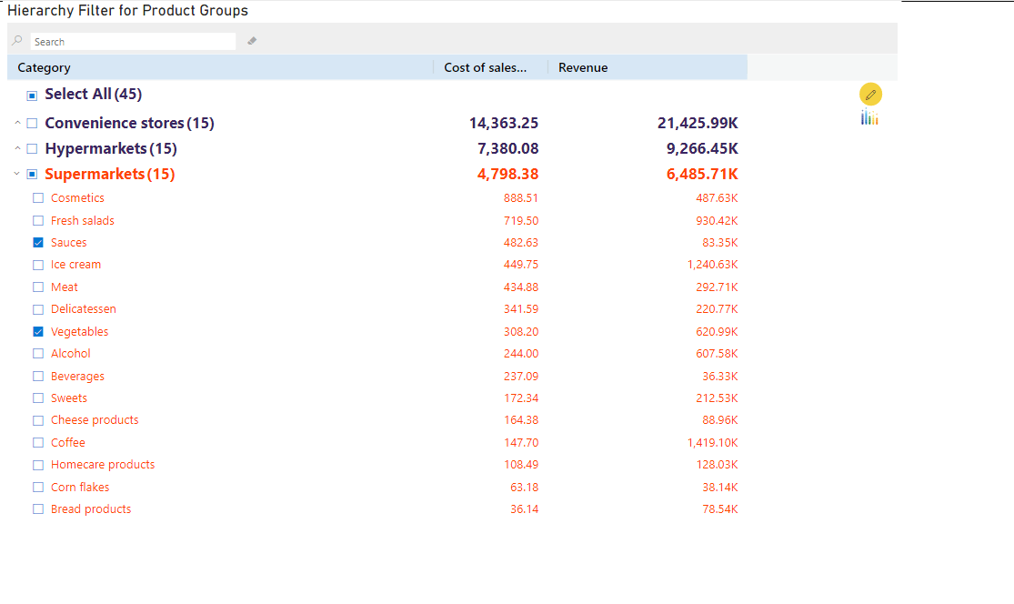
The xViz Hierarchy Filter is a slicer that has enterprise capabilities that make it a good fit for any enterprise dashboard. It has the capability to display value alongside each member within multi-level hierarchies, so displaying benchmarking metrics such as Gross Profit or Spend alongside corresponding categories (say, Cost Centers, for example) becomes easier. In addition, designers can even enable conditional formatting rules on the filter to alert low-performing values and guide users to making alert-induced selections. Additional features such as search capabilities and a variety of customization options make the xViz Hierarchy Filter a very useful slicer to represent enterprise hierarchies.
Variance Chart
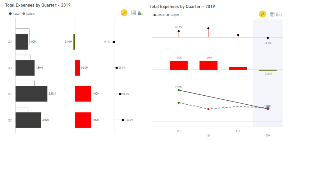
“Actual vs. Budget” and “Actual vs. Forecast” are 2 comparisons that are very synonymous with “Financial Budgeting” and “Financial Planning” within organizations. Showing an overview of this comparison can be extremely useful on a financial dashboard geared towards this type of planning, and the xViz Variance Chart is one of the best visualizations to display this comparison. The chart conforms to common IBCS recommendations, and the chart can auto-calculate and display variances across a series either as a percentage or actual values. With different orientation options, this simple chart can be a very powerful addition to your financial dashboards. In combination with the xViz Hierarchy Filter, it can be used to quickly identify deviations and perform root-cause analyses.
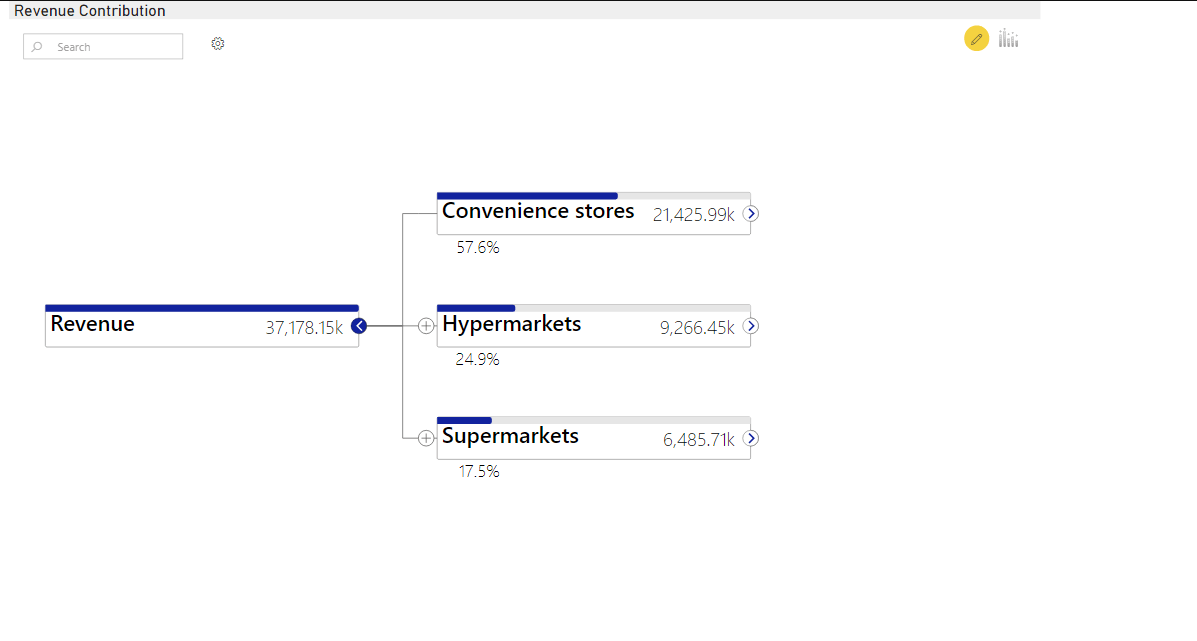
Hierarchy Tree/ Advanced Decomposition Tree
The xViz Hierarchy Tree is built keeping in mind the features of the standard decomposition tree provided by Power BI. It has many advanced features that were sought after by customers. This visualization is a minified version of the popular planning tool – ValQ. The xViz Hierarchy Tree can display hierarchies and multiple metrics in the form of a visually pleasing, interactive tree. It allows users to drill down into these hierarchies and check the contribution of each of the child nodes to the parent. A compact display of variances in terms of percentages or actual numbers can help perform variance analyses. It also carries a search functionality in cases where a larger hierarchy is displayed and conditional formatting to format each node. This visualization is particularly useful to display finance information, particularly when analyzing an overall metric containing individual components contributing to it.
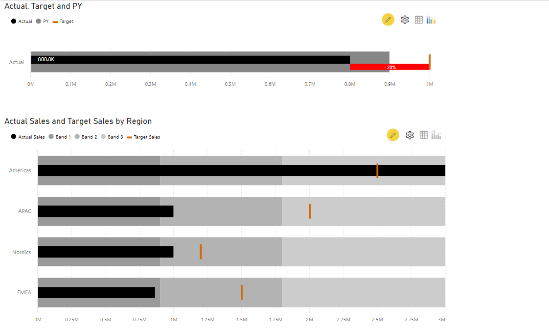
Bullet Chart
The xViz Bullet Chart is a very powerful tool for comparing the state of a financial metric against a benchmark and a comparative value. It gives immediate insight into the performance of the metric by displaying the variance and showing the progress of the metric towards the target. It provides very quick insight into whether a particular KPI has achieved its target value. Conditional formatting is useful to highlight the areas where the target has been missed. You have the option to use up to 2 benchmark values which could be ‘Target’ and ‘Forecast’. To add to the detail provided by this visualization, you can add a comparative band to show the current progress against that of the previous year. This visual conforms with IBCS recommendations as well which will add value to your financial dashboards.
Multi Axes Chart
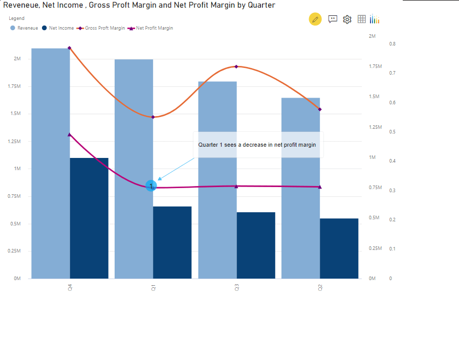
The xViz Multi Axes Chart gives you the ability to have as many as 5 axes for displaying KPIs across different ranges of values or scales on the same visualizations. You can choose from ten different chart options to display series, such as line chart, spline, stacked column chart, etc.
This chart can be used to analyze correlations between different key metrics. For example, you can compare how the increase in expenses, has resulted in a decrease in net income although the revenue was high. It is essential for executives who want to understand the factors that affect the result that is being monitored. We can compare metrics such as revenue vs net income and gross profit margin versus net profit margin, all in the same visual. The ability to conditionally format this visual and add annotations makes it a very useful tool in financial dashboards.
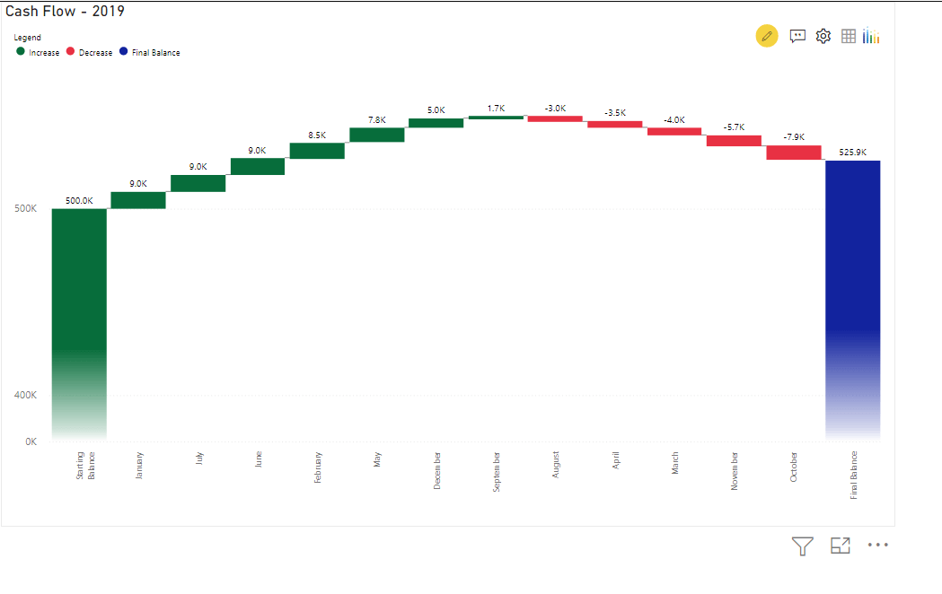
Waterfall Chart
The xViz Waterfall chart is often used to show the cumulative effect of sequential positive and negative values on the final value. One can analyze the contribution of each category towards the variance between starting and final values. This chart has many interesting features to offer such as breakdown analysis and deviation bar. We can use it to visualize Profit and Loss statements, cash flow statements, etc. For example, this chart can be used to visualize the contribution to the final balance in a cash flow statement. You can make it more interactive by making use of features such as sorting, runtime deviation bar, and annotations.
**********