Often, the story that you aim to tell your users with your Power BI dashboards comes down to the type of visualizations that you use (among a number of other things). While an ideal dashboard needs to convey information at a glance, the use of modern-day dashboarding tools has introduced more robust slice-and-dice options to allow a user to get their own perspective on these stories by interacting with them.
In this article, we aim to show you a few of our best xViz visualizations that our customers have been successfully using, and the myriad options that they are equipped with to add more impact to the data you are visualizing in your Power BI Dashboards.
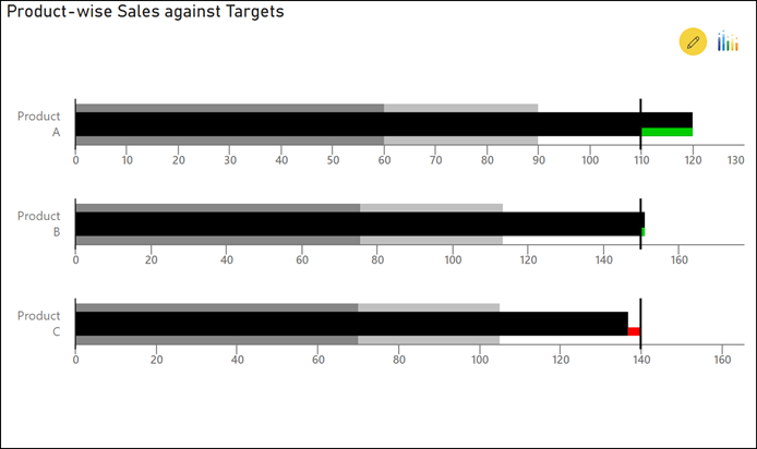
Bullet Chart
Undoubtedly, the Bullet Chart is one of the most useful visuals to convey information about performance with respect to targets at a quick glance. The xViz Bullet Chart, apart from being able to show simple Actual vs. Target data on a report or a dashboard, can also accommodate the use of performance “bands” to provide more context to your existing comparisons. Additionally, to draw attention, the xViz Bullet Chart also supports the use of alerts or conditional formatting. Report authors can set up conditional formatting rules based on measures on the chart.
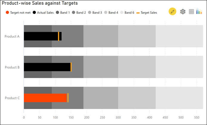
The xViz Bullet Chart visual also comes with in-built IBCS representation capabilities. On Power BI dashboards particular following these visualization standards, the visualization can be switched over to this kind of representation merely by toggling a single property.
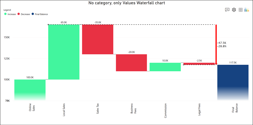
Waterfall Chart
The most common use for the Waterfall Chart is financial – it enables easy visualization of net values and how they were arrived at through a series of gains and/or losses. However, the waterfall chart can also be very effectively used in non-financial use cases – inventory, for example. Regardless of the type of usage, the xViz Waterfall Chart has a host of features that allow it to be used in either context.
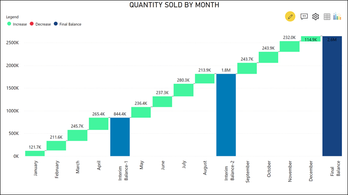
Some of the features that are most popular with our customers are the ability to introduce intermediate sums and running sums within the visualization, the ability to perform a breakdown analysis on the fly, deviation bars that can show the difference in values by simply hovering over different bars on the chart, drill-down capability with breadcrumbs and annotation & ranking capability.
Multi Axes Chart
Easily the most versatile xViz visualization, the xViz Multi Axes chart builds on the simplicity of basic chart types by introducing the ability to visualize multiple series of data within a single chart on varying scales. The chart allows you to easily configure up to 5 different series of data in 20+ different configurations.
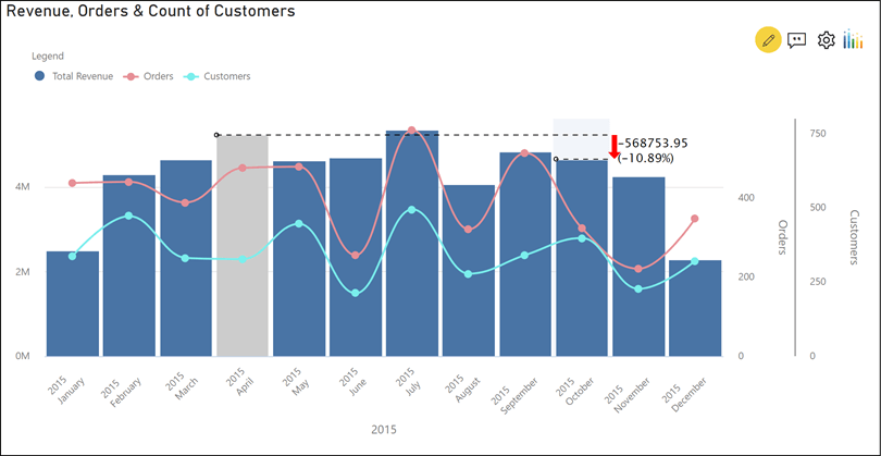
The xViz Multi Axes chart includes the ability to set up Conditional Formatting rules to set up visual alerts on your charts, customizable tooltips depending on the chart type and the ability to set up navigation to external URLs by passing dynamic context and parameters when clicking on the chart.
Advanced Trellis
Very few visualizations can pack a whole host of information across a single screen – the xViz Advanced Trellis Chart, or Small Multiples Chart, can do so. This visualization can group value fields split across a category and display it across multiple panels so as to allow end-users to analyze trends juxtaposed against each other.
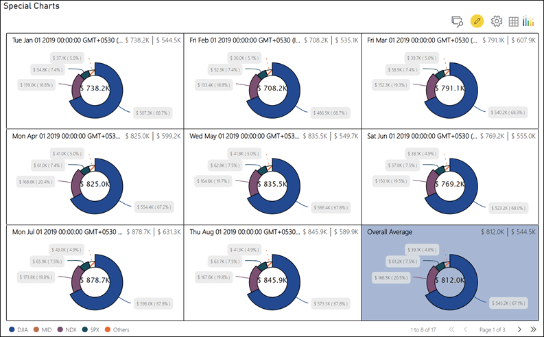
As with most xViz visualizations, the small multiples visual also comes with a set of features that not only make it a mere display element but also give it the ability to slice and dice to a certain extent. For instance, runtime interactivity is enhanced with features such as the ability to enlarge or pin panels, perform a ‘Top N’ ranking on the fly, change axis scaling and even change the layout. In addition, enhanced conditional formatting capabilities, pagination, and the ability to set up “average” panels can make this a very useful visualization despite its real-estate hungry nature.
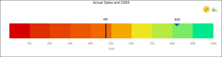
Advanced Gauge or Linear Gauge
“Gauges” are a term that’s almost synonymous with the term “dashboard”. This is probably one of the best ways to display a single point of data on a dashboard, while also indicating whether the value falls within an ideal range. The xViz Advanced Gauge brings a bit more to the traditional, radial gauge by offering different types of display options – arc type gauges, semi-circular and circular. It also adds the ability to display more than a single metric to provide the context where required.

For report authors looking for a slightly different way to present quantitative values, the xViz Linear Gauge is another option. This visual is best used to represent Actual vs Target values as a horizontal or a vertical bar, and can also double up as a progress bar where required. The xViz Linear Gauge also comes with Conditional Formatting options, where even the track background can be conditionally formatted to create heat-scale or colored intervals.
***************
All of the visuals that we’ve mentioned above are just our recommendations based on the most common metrics that most dashboards display. While there are certain visuals that are versatile enough to be used across a variety of use cases, depending upon the type of data being displayed and the nature of the KPI, there may be a different visualization that may be more suited for the purpose. However, we are quite certain that at least one of the xViz visualisations will be just about perfect for your purpose - just as it has been for our numerous customers. So, feel free to experiment and do watch out on this space for more!