Pie charts don’t get a lot of love among the experts these days although they continue to remain popular among users. They are held in such low regard that all of the luminaries outlined in a previous blog (“The Luminaries of Data Visualization: Who will stand the Test of Time?”) have spoken out against them. Still, a lot of people remain unconvinced. Who would have thought that such a simple device could gain so much press?
Why are pie charts a bad idea?
Pie charts turn up frequently and are staples of annual reports and executive presentations. There are a few key areas in which they are useful, but expert distaste is demonstrated by the fact that many visualization software vendors no longer include them in their catalogs. Pie charts are prone to misinterpretation, can portray an inaccurate picture of data, can be difficult to read, and can easily be turned into disinformation.
Following are some of the main reasons that pie charts are not preferred:
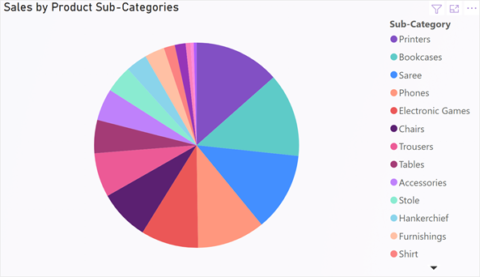
- Limited display of Diversity: Pie charts are not very effective at displaying categorical data where the number of categories exceeds 3 or 5. The more slices in the pie, the harder it is to read at a glance.
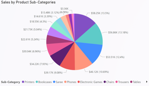
- Limited Precision: Since Pie Charts are area-based representations of data and do not have an axis, conveying information with higher precision is difficult without the use of data labels. The inclusion of these data labels would conversely limit real estate on a dashboard and detract from the ability to consume information at a glance.
- Ambiguity in Size & Orientation: Pie charts lack specific ordering with respect to their slices and are open to differences in interpretation. Moreover, additional accents such as 3D or tilting can cause misrepresentation in the size of slices.

Perhaps the most famous diatribe against pie charts is by commentator Stephen Few, author of the well-known paper “Save the Pies for Dessert.” He writes “of all the graphs that play major roles in the lexicon of quantitative communication… the pie chart is by far the least effective. Its colorful voice is often heard but rarely understood. It mumbles when it talks.” Another luminary, Edward Tufte wrote in his book, The Visual Display of Quantitative Information (1983), “the only worse design than a pie chart is several of them.”
Another visionary, Rolf Hichert (along with Holger Gerths) wrote in Designing Business Charts with Excel based on the standards of Hichert SUCCESS: Pies “are still quite popular, but seldom convey informative insights as they only permit one-dimensional analysis.”
The statistician who is often credited with starting modern data visualization, John Tukey, said “There is no data that can be displayed in a pie chart that cannot be displayed better in some other type of chart.”
Where do pie charts make sense?
Although scorned by the experts, pie charts continue to be used and continue to be popular. The problem is the overwhelming tendency to misuse them. Even luminaries concede there are some places where pie charts might still be useful. But these are fairly limited circumstances. For example, Stephen Few wrote in “Save the Pies for Dessert “: “Pie charts are not without their strengths. The primary strength of a pie chart is the fact that the message “part-to-whole relationship” is built right into it in an obvious way. ” The natural ability for any user to read a clock allows them to easily interpret part-to-whole relationships depicted within a pie chart.
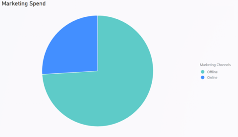
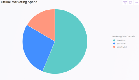
Another application for pie charts is to indicate a considerable difference between 2 or 3 different segments of the total – as long as the difference is big enough, it is sufficient to make broad conclusions and comes especially handy in dashboards displaying metrics at a very high level.
What are the best alternatives to pie charts?
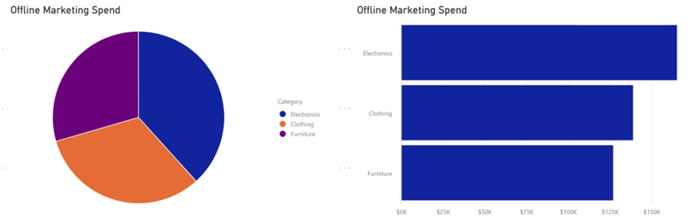
So, what can replace the pie? The donut chart is essentially a pie chart with the center cut out. This appears to make the pie slices somewhat easier to view, but it decreases readability even further by eliminating the slice angles that aid judging volume. The most common alternatives to the pie chart are the column chart and the bar chart. Both of these can provide a good visual comparison between volumes that is at once easily understandable and accurate. Bar and column charts exist in a wide variety of formats. They do not immediately have the facility of pie charts in representing a part-to-whole relationship, but it is possible to build this in through stacking and other means.
Don’t be lazy!
One objection to the use of pie charts is that they are a lazy way to display data. There are innumerable visualization possibilities available, suited to different purposes. Selection is important because displays need to make an obvious point. Immediately selecting the simplest option keeps users from investigating more useful approaches and creating better and more useful data displays.