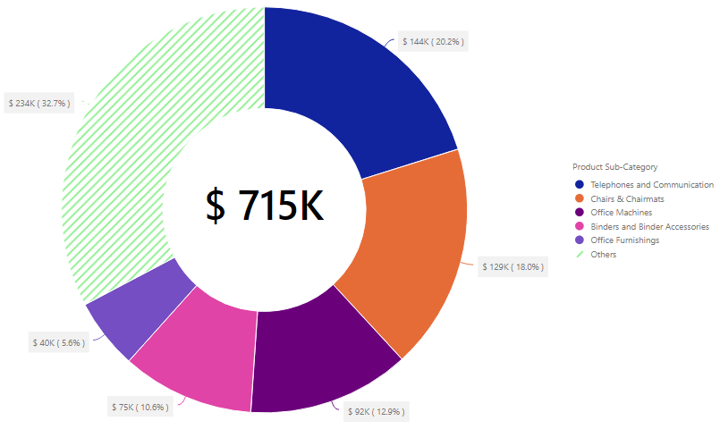
Pie and Donut charts are used to show the proportions of categorical data, with the size of each piece representing the proportion of each category. The xViz Advanced Pie and Donut provides several Pie and Donut chart varieties and use cases into a single visual. To better visualize the part to whole relationship and for comfortable viewing, the xViz Advanced Pie and Donut by defaults ranks the Top 5(n) slices and groups the rest into others while visualizing seven or more slices.
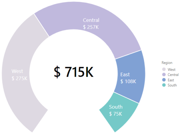
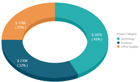
Donut charts, as compared to pie charts, have a better data intensity ratio and visuals appeal. The hollow center is often used to display the Total values. Thus, improving the information density of the visuals.
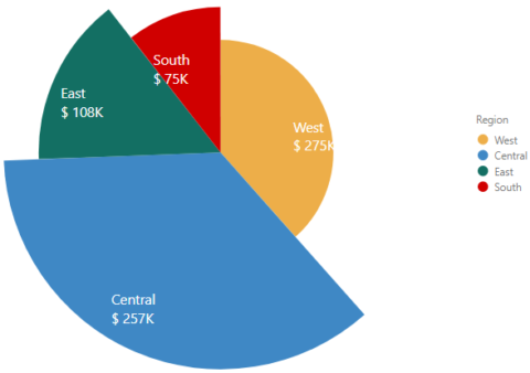
Apart from visualizing single category and value use cases, you can also visualize 2 values together with the help of variable radius pie chart option.
Key Features – Summary
- 7 Chart Options – Pie, Donut, Variable width pie, 3D options
- Ranking with ‘Others’
- Totals section for Donut chart
- Styling options – Set patterns for individual slices to make them stand out
- Gradient coloring
- Data Label Formatting
- Conditional Formatting
Key Features – Description
- Chart Types
The xViz Advanced Pie and Donut charts provide 7+ charts options which are as follows:
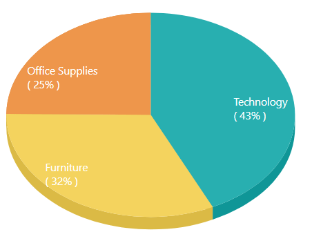
a. Pie (1 Category, 1 value)
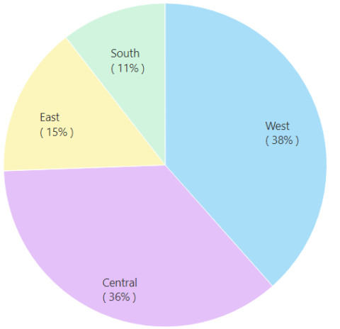
b. Semi Circle Pie(1 Category, 1 value)
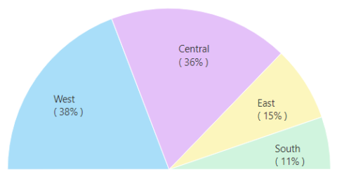
c. Donut(1 Category, 1 value)
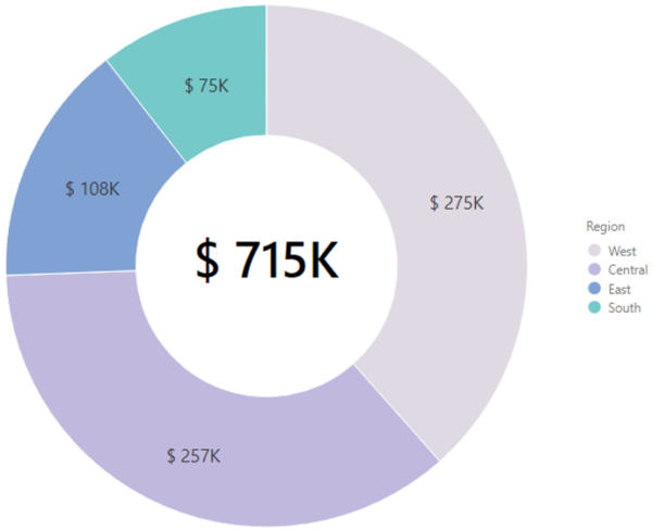
d. Arc Donut(1 Category, 1 value)
e. Variable Pie (1 Category, 2 Value)
f. 3D Pie Chart(1 Category, 1 Value)
g. 3D Donut Chart(1 Category, 1 Value)
2. Ranking with ‘Others’
The pie and donut charts are ideal for viewing 6 or fewer slices. The xViz Advanced Pie and Donut will auto-apply Top 5 ranking with ‘Others’ slice in case you have 7 or more slices. However, this behavior can be changed or disabled as desired by the user. The ranking feature is part of the Utility Menu option and is available both at design and runtime for the end audience to make changes.
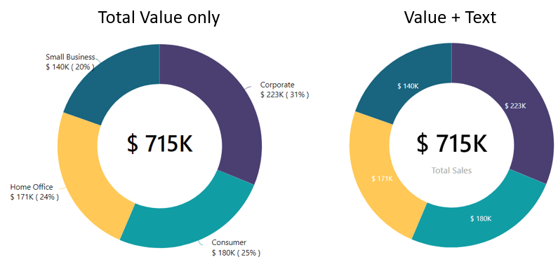
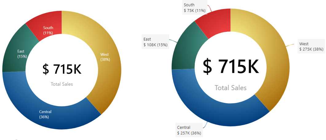
3. Total section for Donut
Apart from visual appeal, donut charts offer another significant advantage over Pie charts, i.e display Totals. The xViz Advanced Pie and Donut come with an inbuilt feature to display Total values in the hollow space of a donut and arc donut chart for better data intensity ratio. You can either display value + text or value only.
4. Visual Highlighting
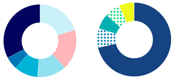
The xViz Advance Pie and Donut chart provide 2 different options for visual highlighting which are as follows:a. Styling
You can set different patterns for each of the slices to make them visually stand out to drive user attention. A classic use case of such a feature would be to highlight the ‘Others’ slice from the rest of the items.
b. Conditional Formatting
Another, universaly endorsed visual highlighting option is conditional formatting which is a standard feature across all xViz Visuals
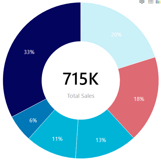
5. Data Labeling
The xViz Advanced Pie and donut chart provides extensive data label formatting options where users can choose from different display options – value, percentage of Total, and category field. Apart from this, you can choose to customize the label positioning and placement along with connector line styling options.
6. Gradient coloring
You can enhance the visual appeal of the pie and donut chart by choosing the custom color and gradient coloring options

***
Get your xViz Suite for Power BI Desktop with all the pro features unlocked here.
Learn about all the advanced Power BI Visuals offered in the xViz Suite here.