Visualization is a huge topic with a pedigree that goes back decades. Within this topic are interests from fields ranging from medicine to geography to business. It is partly an art and partly a science. Visualizing data requires consideration of attractiveness, of how people comprehend information, of how they digest it, and how they use it. It neatly straddles the boundaries between art, science, and technology. Over the last two decades, there has been an explosion of visualization techniques and practices along with technological advances with computing power. Visualization has followed every advance in analytics, with input from analysts, from psychology, from sociology, from neurology, from artistic and creative thinkers, and most recently from the addition of AI and ML to the analytics toolbox.
Data visualization has many luminaries but few who are famous and visible in print, online, and in person. There are advocates for different types of charts, for different approaches to presentation, different methods of using visualizations, and for a host of other specialty areas. But there are a number of people who have had a seminal effect upon the development of today’s data visualization tools. Of special interest, we can point to John Tukey, Edward Tufte, Stephen Few, and Rolf Hichert. Each of these has made an important contribution to current data visualization.
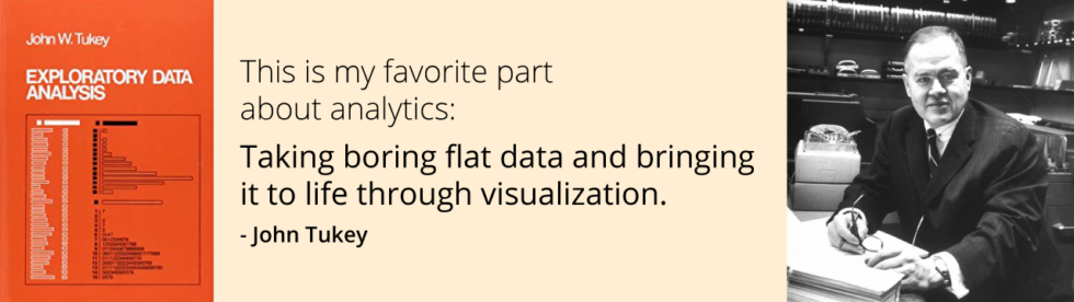
John Tukey
In 1962, John Tukey wrote his landmark paper “The future of data analysis”. Within this paper, he called for recognition of data analysis as a special and legitimate branch of statistics. He followed this through the ‘70s with the development of a variety of new and effective graphic displays published in his book, Exploratory Data Analysis (1977). These included stem-leaf plots, boxplots, hanging rootograms, two-way table displays, and others. Many of these have entered into the vocabulary of the field and thence into the software. Tukey’s statistician viewpoint of along with the breadth of his approach gave validity to visualization at this critical time. In Exploratory Data Analysis, he wrote: “The greatest value of a picture is when it forces us to notice what we never expected to see.”
Edward Tufte
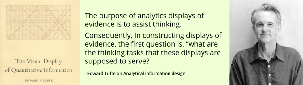
A bit later, Edward Tufte, a statistician, and artist wrote the book Visual Display of Quantitative Information (1983). This seminal book looks at the theory and design of data graphics with illustrations of the best and worst examples. It set the stage for progress in visualization and remains a classic today. Tufte provided an introduction to core visualization theories and demonstrated these ideas throughout his book. He went on to write, design, and self-publish three other popular books on data visualization. Tufte was able to balance his statistical background with his artistic inclinations to create a comprehensive picture of what is meant by data visualization today.
In a 2004 interview, Tufte said “effective analytic designs entail turning thinking product principles into seeing principles.” He was looking at how visual displays gain attention and provide reinforcement by speaking visual processing of information. In his The Visual Display of Quantitative Information, Tufte defines the principles of graphics displays as follows: “Excellence in statistical graphics consists of complex ideas communicated with clarity, precision, and efficiency.”
Stephen Few
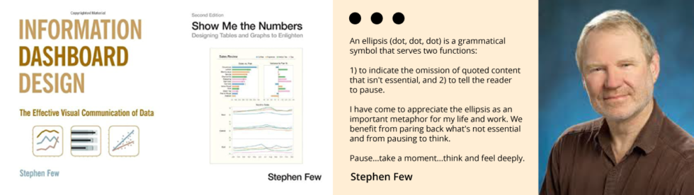
Stephen Few is a prolific writer on visualization, author of Show Me the Numbers: Designing Tables and Graphs to Enlighten (2004), Information Dashboard Design: The Effective Visual Communication of Data (2006), Now You See It: Simple Visualization Techniques for Quantitative Analysis (2009), and The Data Loom: Weaving Understanding by Thinking Critically and Scientifically with Data (2019). Few has worked for more than 25 years as an IT innovator, consultant, and educator.
Few’s goal is to guide people to create simple, clear, and practical data visualizations for analyzing and presenting quantitative information. His recent work extends beyond data visualization itself to address other aspects of data and its use.
In the second edition of his book Show Me the Numbers, Few writes “The ability to find what’s useful in the mounds of data that surround us, to make sense of it, and to then present it clearly and accurately, forms the foundation on which the information age will finally fulfill its promise. Unless we give information a clear voice, its important stories will remain unheard, and ignorance will prevail.”
Few continues to monitor visualization trends. He has popularized bullet charts and panned the use of pie charts and gauges which had previously been common. He remains a harsh critic of major visualization vendors and visualization techniques that pander to popularity or suggest dubious theories rather than promoting techniques that foster good design.
Rolf Hichert
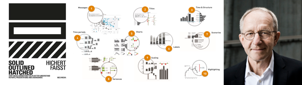
Rolf Hichert is another important luminary in Data Visualization. He is principally known as the developer of core ideas for the International Business Communication Standards (IBCS). He recently co-published the book, Solid, outlined, hatched: How visual consistency helps better understand reports, presentations, and dashboards (2019) with Jurgen Faisst. Hichert is concerned that decision-makers find analytics boring and confusing, and analysts are not getting their points across. He viewed the problem chiefly as a lack of standards in visual communication, which could be remedied by IBCS.
To support the ideas that would go into IBCS, Hichert created the SUCCESS model for the presentation of visualizations. SUCCESS is an acronym for: Say, Unify, Condense, Check, Express, Simplify, and Structure. Each corresponds to a set of design guidelines which are now generally accepted as best practices. It charts a highly structured approach for visualizations and arranges recommendations into about 120 numbered and illustrated guidelines for information design. IBCS Institute presided over by Hichert, is the only visualization standards body that actively promotes its standards by partnering with software vendors to incorporate them. Currently, there are only a handful of Independent Software Vendors (ISV) who have obtained the IBCS Certified Software badge but it is becoming a gold standard for financial reporting packages across the world.
To quote from Hichert’s presentations, “If musicians are able to visualize a symphony with the help of sheet music, then business people should be able to find a standard notation for monthly sales.”
Wrapping it Up
These experts have provided some of the foundations upon which modern data visualization is built. They are not alone. The field is vast, and many notable figures have brought clarity to theory, practice, and performance–both generally, and for niche areas. As the next wave of innovation continues, the next DaVinci might be just around the corner but who do you think will be remembered 100 years from now–Tukey or Tufte or Few or Hichert?