The 2019 n-CoV, commonly known as the Novel Corona Virus has been continually spreading around the world at an alarming rate and has reached the level of a global pandemic. The 2019 n-CoV was first reported in Wuhan, China in December 2019 and it has been spreading endlessly across the world causing high fatality among the people.
An interactive Power BI dashboard with various xViz visuals has been designed to help us visualize how the Corona Virus has spread across all regions of the world.
Major insights gathered from the dashboard:
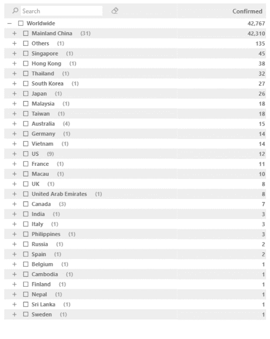
- 42,000 People Affected from China – Most Number of Confirmed Cases
View the consolidated data of all the confirmed cases across countries of the world using xViz Hierarchical Filter. The Collapse / Expand Node feature allows you to drill down to every node thus helping you gather deeper insights on individual countries as well.
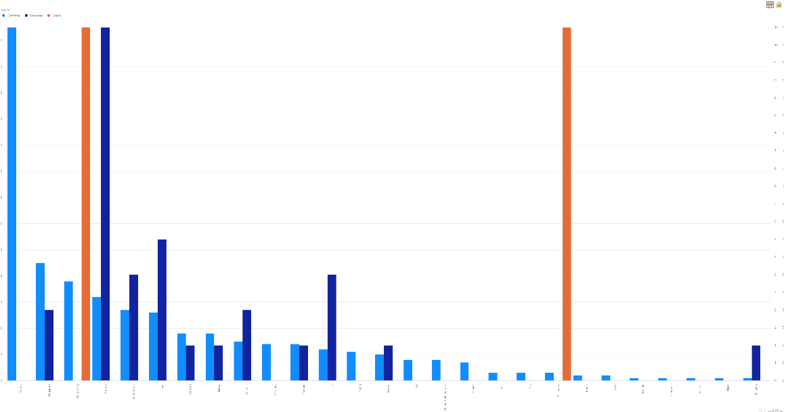
2. Hubei – Most Affected in China with 974 Deaths & 32K Cases Confirmed
The data tags are arranged in an appealing way to give a brief idea on how the provinces in China are affected. The tooltip feature in xViz Tag Cloud also captures the number of deaths and the number of recoveries, thus providing additional information.

3. 2,222 Recovered in Hubei. Increasing confirmed cases in other Countries
The death, recovery and confirmed cases differ concerning each region/ country. Thus it would be helpful if we use the xViz Multiple Axes Chart to visualize the various parameters on different scales for both within China and the other countries.
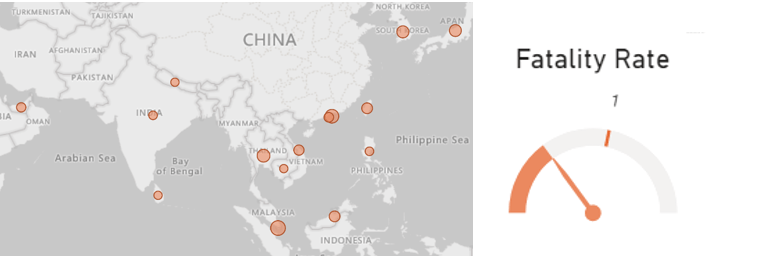
4. Fatality Rates increasing Worldwide
The Corona Virus is proving to be very fatal to humankind while researchers are trying to figure out a solution to this bio crisis. The xViz Advanced Gauge in the dashboard gives us an overview of how the fatality rates are around the world.
Visualize the interactive dashboard here.
Let’s all stay safe by following the best practices recommended by the World Health Organization: https://www.who.int/emergencies/diseases/novel-coronavirus-2019/advice-for-public
***
Data presented in the dashboard may vary with time.
Know more about the visuals in the dashboard here
To get the latest version of the custom visual, reach out to us here.