The xViz Radar/ Polar Chart is the latest addition to the xViz suit of Visuals for the Month of April 2020. As the name suggests, it supports Radar and Polar Chart use cases along with the Radial Chart option.
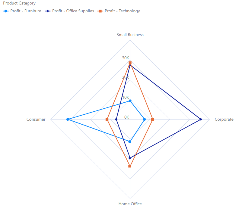
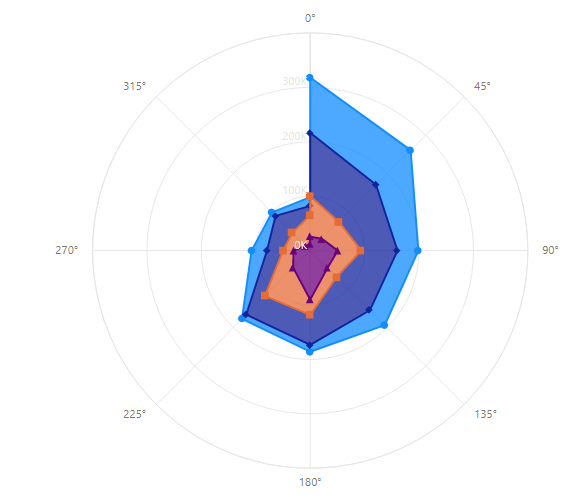
The Radar Charts (aka as spider charts, polar charts, web charts, or star plots) are ideal for visualizing multivariate data similar to Parallel Coordinates chart. They are used to plot one or more groups of values over multiple common variables. As an example, you could use this visual to compare the score of students across different courses. Now, let’s take a look at some of the key features offered by xViz Radar/Polar
Key Features
- Chart Types
The xViz Radar/ Polar supports 3 chart options –
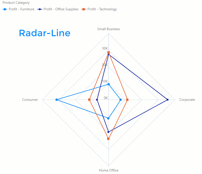
Radar
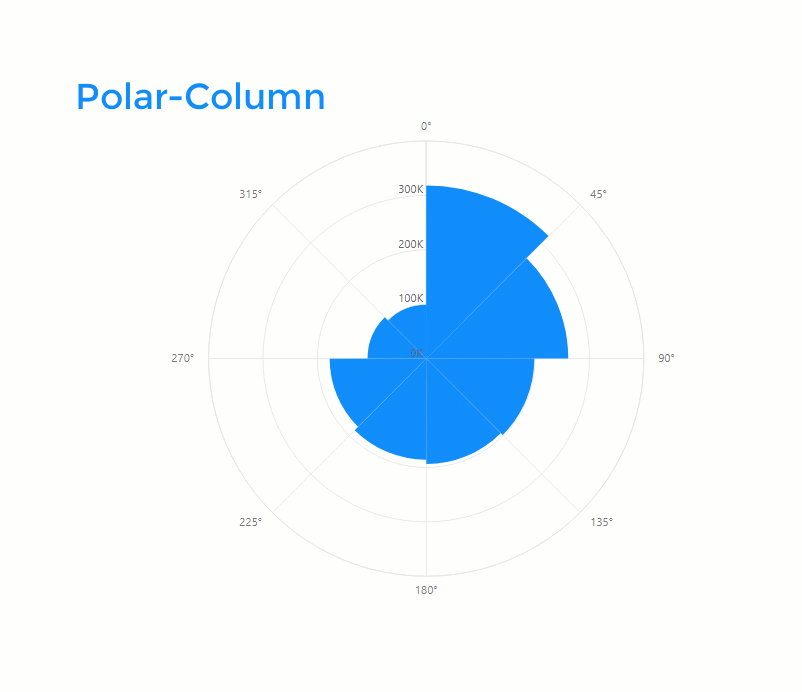
Polar
Radial
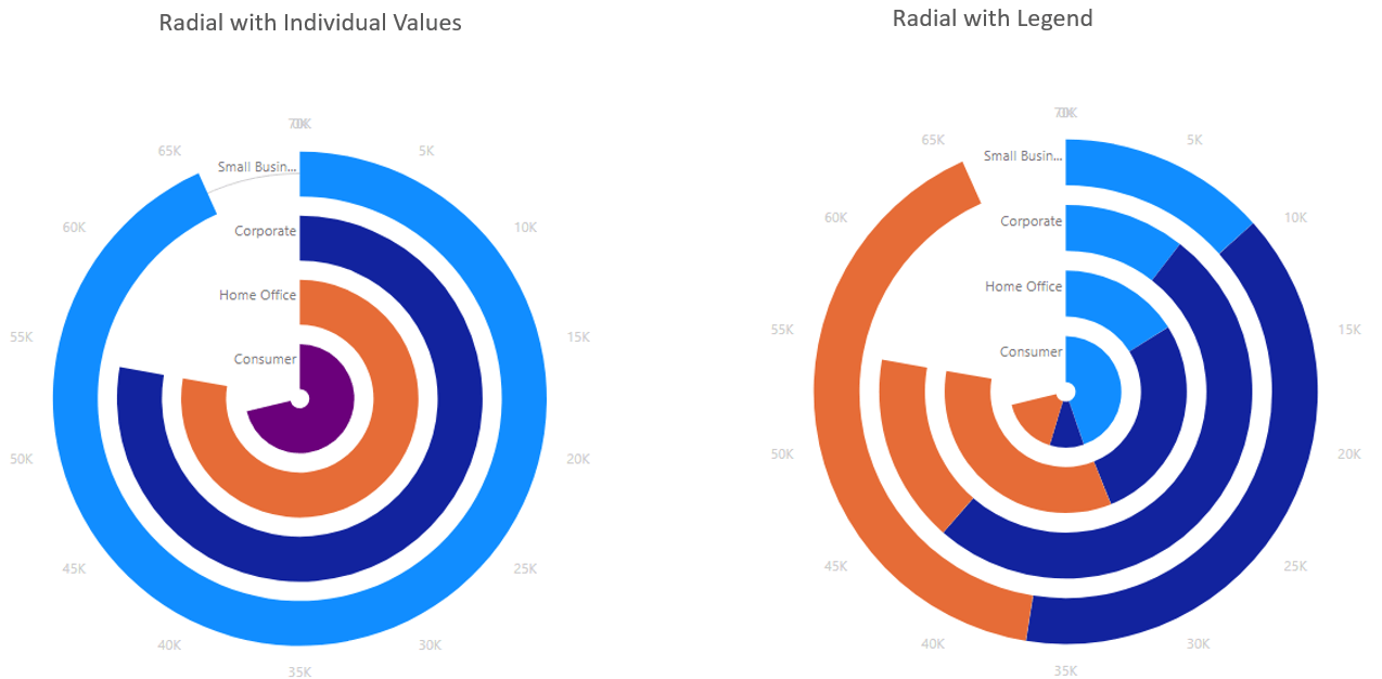
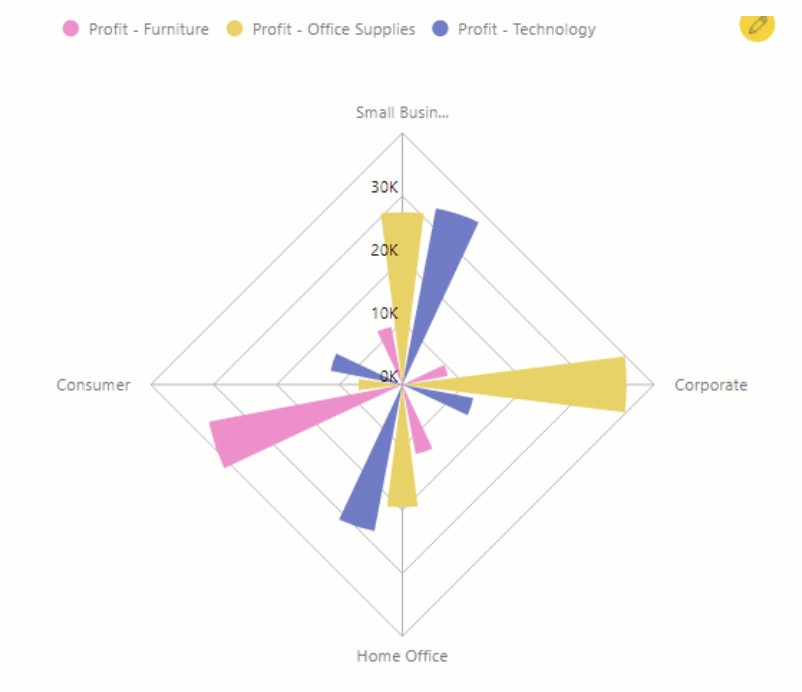
The Radial Chart type is like the column/bar chart, just that the data is present in radial nature rather than columns. They may not be the best type of visualization as compared columns/bars which give you a better visual interpretation of the value being measure by the length of the bars but are catchy and attractive and may suit businesses with different taste and needs
2. Series Types
The xViz Radar and Polar Chart both have different series options depending on the chart configuration i.e. without a legend field. The 10+ series options are as follows:
Radar
Polar
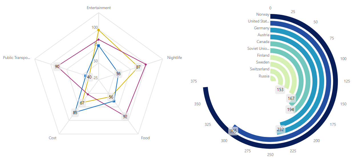
3. Interactive Legends
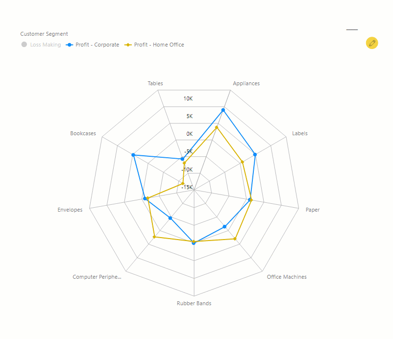
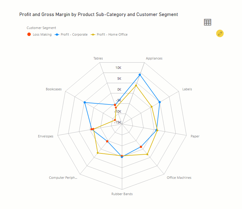
The Radar /Polar chart is great for comparing a small number of categories or variables. However, they start becoming cluttered and confusing with the increase in the categories of variables and are often prone to reading errors. One way of overcoming this issue is by limiting the number of category members being viewed with the help of interactive legends in the xViz Radar/ Polar chart. You can enable or disable the legend items with simply clicking them and focus on a few to avoid cluttering.
4. Data Label
Data labels make charts look more informative and easy to ready without the need to hover. All the 3 chart types – radar, polar and radial chart support data labels.
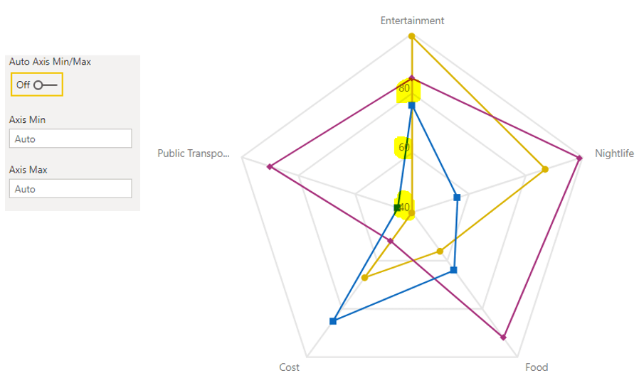
5. Axis Scaling
The Axis in the case of xViz Radar and Polar Chart scale automatically based on the values provided. As seen in the below example the axis starting point is 40 instead of 0 and max is 100 thus making the chart easier to read. However, you can also set the scale limits manually if you would prefer by turning off the ‘Auto Axis Min/ Max’.
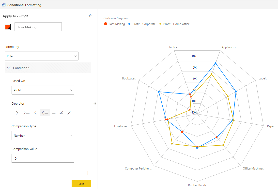
6. Conditional Formatting
Just like other xViz Charts, the xViz Radar / Polar Chart supports conditional formatting for visually highlighting the outliers based on different rules.
7. Conditional formatting in Legends
Legends help understand the data by displaying the meaning each color has on the chart. You can display the Conditional Formatting rules in a legend of the xViz Charts by enabling the ‘Conditional Formatting Legends’ from the property sheet. This will not only help you understand the rule behind the visual alerting but also give you the ability to disable the conditional formatting rule in case you don’t need it.
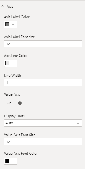
8. Axis Formatting Options
The xViz Radar/Polar Chart provides extensive Axis formatting options including value Axis formatting and the Label formatting options.
9. Summary Table
The xViz Charts natively provide a toggle option to a tabular format for users who would like to view the detailed data in a table.
To get the latest version of the custom visual, reach out to us here.
You can take a look at the other advanced custom visuals by xViz here.