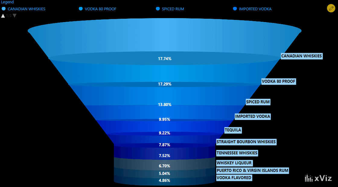
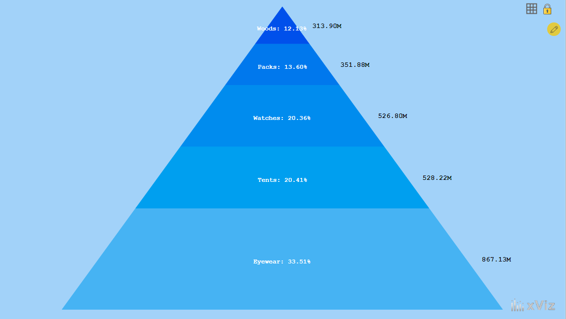
The recently released Microsoft Power BI Desktop Summary Blog (February 2020) extensively features the xViz Funnel / Pyramid Chart. The Funnel and Pyramid Chart for Power BI acts as two in one visual. It functions in two different visualization modes – Default and 3D. It is highly customizable with an extensive deck of properties for configuring every aspect of the visual.
Check out the blog by Sujata Narayana here.
***
To get the latest version of the custom visual, click here.
You can take a look at the other advanced custom visuals by xViz here.