The data label defines the information displayed by a chart or a layout. Labels are always considered to be an integral part of reporting and application documents. Data labels add meaning to the chart and provide the necessary information desired by users.
Let us look at some of the unique data labels features and customizations available in xViz Funnel/Pyramid Chart for Microsoft Power BI.
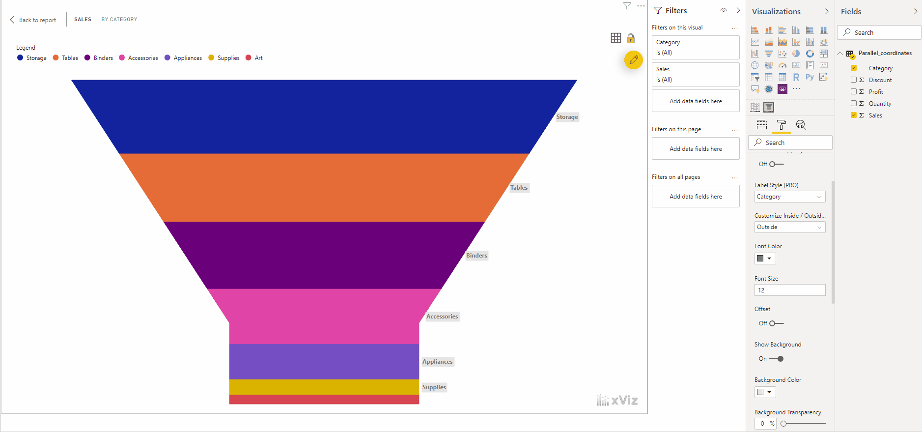
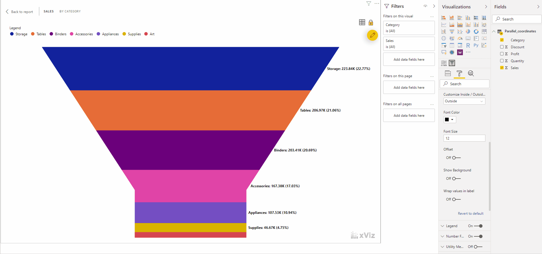
- Label Style
Based on business requirements, users can choose from a galore of label styling options which are as follows:
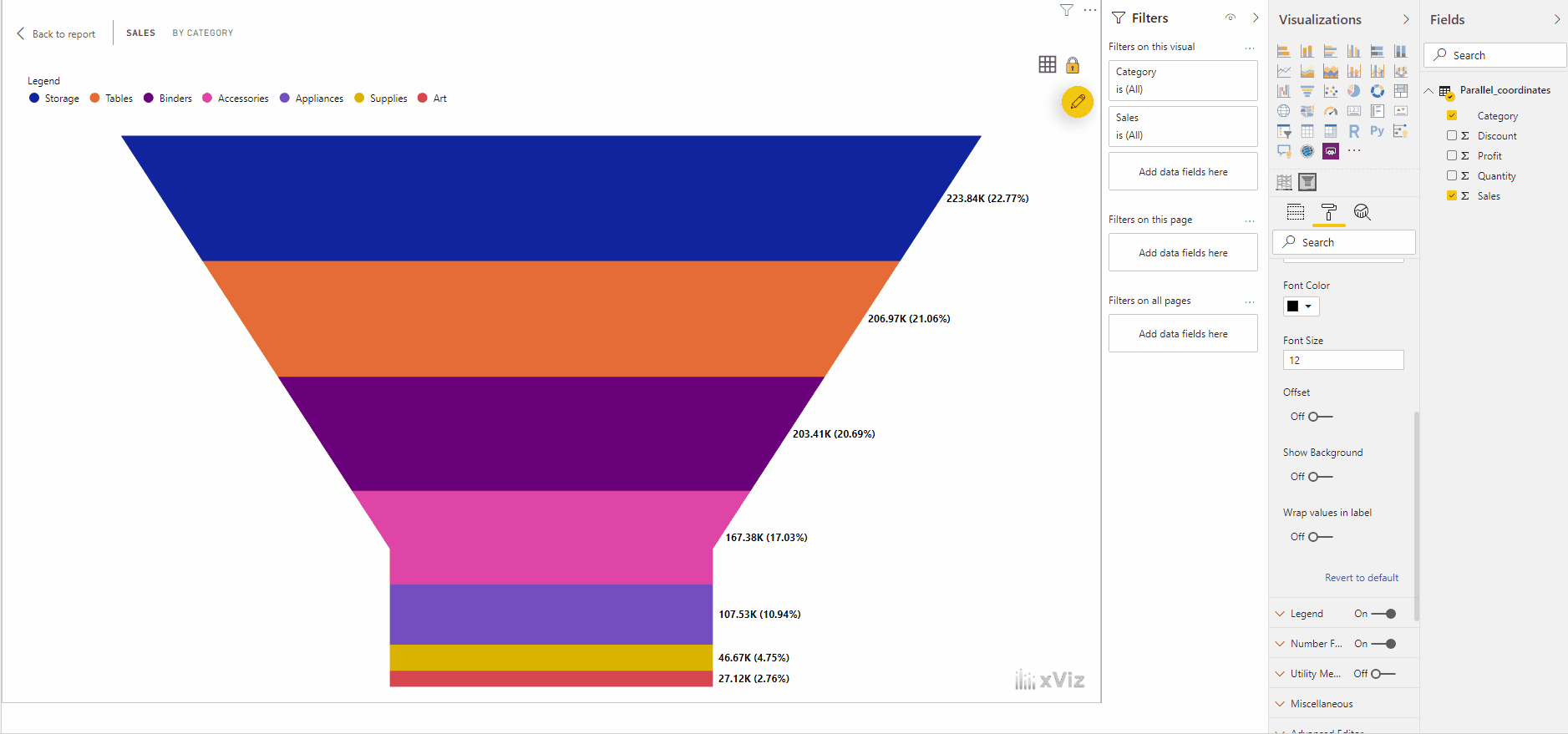
2. Label Position
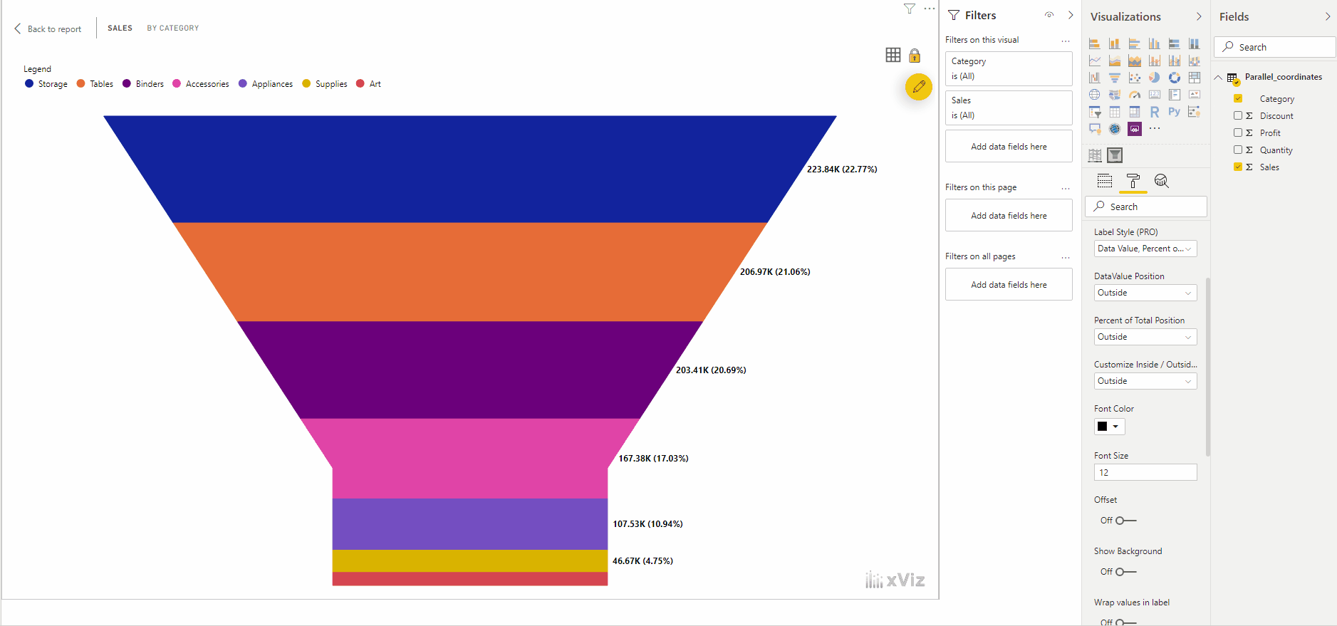
Assume that we are viewing data value and percent of the total in the data label – showing both the values together might be confusing sometimes. In this case, we could arrange the position of the labels to be positioned inside/outside.
3. Data Label Wrap
Assume if we are showing all the data values – label, percent of total and the value there will be space constraints when developing a dashboard. This feature overcomes the issue allowing us to wrap the labels and make it look more arranged.
4. Labels Offset and background
This visual allows us to adjust the X & Y position (offset) of the labels based on our requirements. Similarly, the background is more of a highlighting feature for the data labels which gives more focus to the numbers.
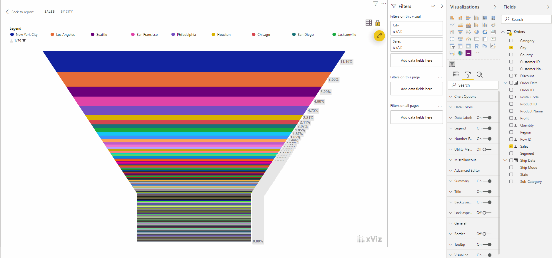
5. Overlapping labels
Consider if there are a plethora of members in our dimension across a measure, then obviously the labels would get overlapped which in indeed makes the information more scattered and unorganized. In this custom visual, we could control the overlapping labels showing only a few of the values required which indeed makes the information look more organized.
***
To get the latest version of the custom visual, reach out to us here.
You can take a look at the other advanced custom visuals by xViz here