Thanks to the Microsoft Power BI team for the valuable endorsement to our product xViz for Power BI, by getting featured at length in their October 2019 Power BI Desktop Summary Blog.
The October Summary talks about the three new visuals as part of xViz Suite. xViz is a suite of Enterprise Custom Visuals specifically built to enable BI Practitioners to create compelling data story narratives. You can use all the visuals within the suite for free with the branding and some data row restrictions or you can pay one price to unlock all the visuals.
The new visuals of xViz suite can help analysts and executives to visualize, understand and analyze business data in a whole different way to make better informed decisions anytime.
The custom visuals discussed in detail are:
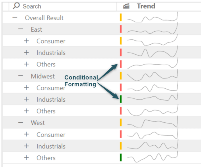
1. Hierarchical Variance Table – lets you compare to measures within a hierarchical table layout and see the variance, % variance, and how that contributes to the whole.

2. Linear Gauge – allows you to compare a value to a target goal.

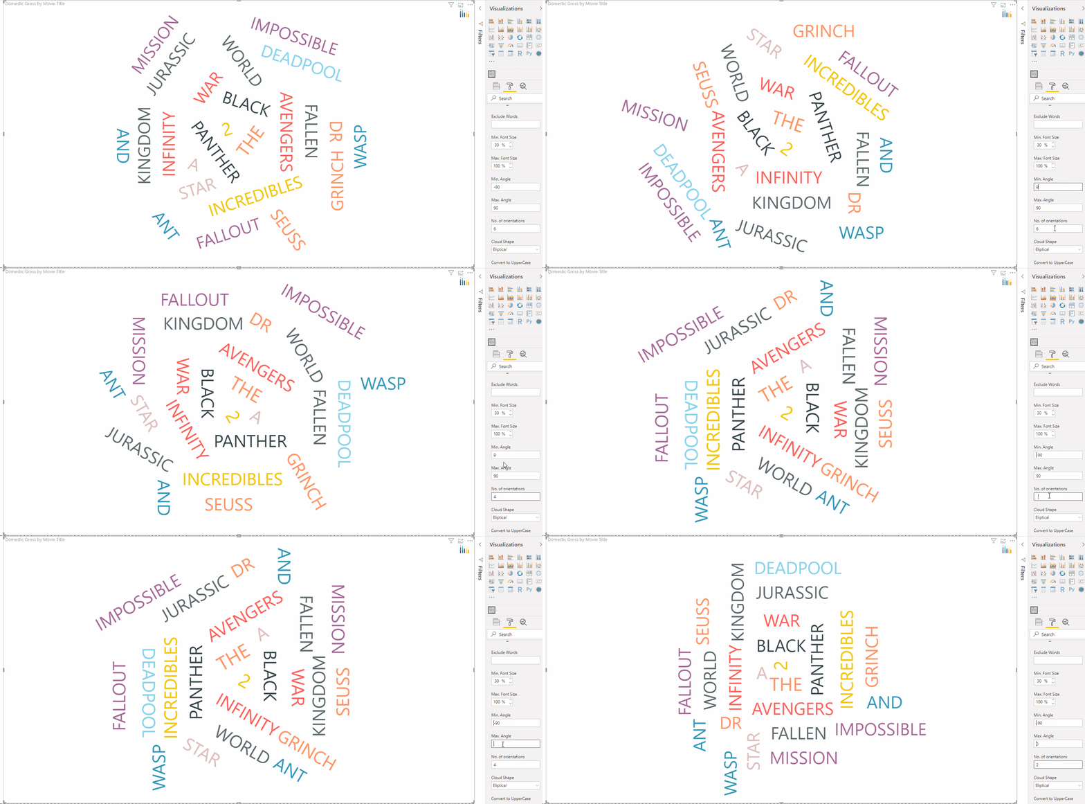
3. Tag Cloud – allows you to get instant insights of the more prevalent terms in your data, such as product descriptions, tweets, and feedback comments.

Hear from Amanda Cofsky Program Manager, Microsoft Power BI about xViz in the Microsoft Power BI desktop summary blog. Read here.
To get the latest version of the custom visual, reach out to us here.
You can take a look at the other advanced custom visuals by xViz here.


