Note: This blog addresses some features of the custom visual that will be available in the App Source in Sep 2019. To get this latest build, reach out to us here.
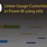
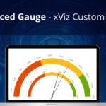
Linear Gauge, an xViz Custom Visual can be best used to visualize a KPI. The Linear Gauge gives one the ability to compare the actual and target values. The color bar in Linear gauge shows you how much progress an organization has made toward key targets such as month on month or year over year. Let us look into some one the key features of this custom visual in brief.
Key Features – Summary
- Conditional formatting
- Actual and Target values
- Dynamic and static minimum and maximum values
- Number formatting
- Additional tooltips
Use Cases
- Linear Gauge can be used for following comparisons:
- Sales – Target vs Achieved
- CPG (Consumer Packaged Goods) – Demand vs Production
- Retail – Goods vs Sold
- Rainfall – Predicted vs Received
Key Features – Description
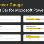
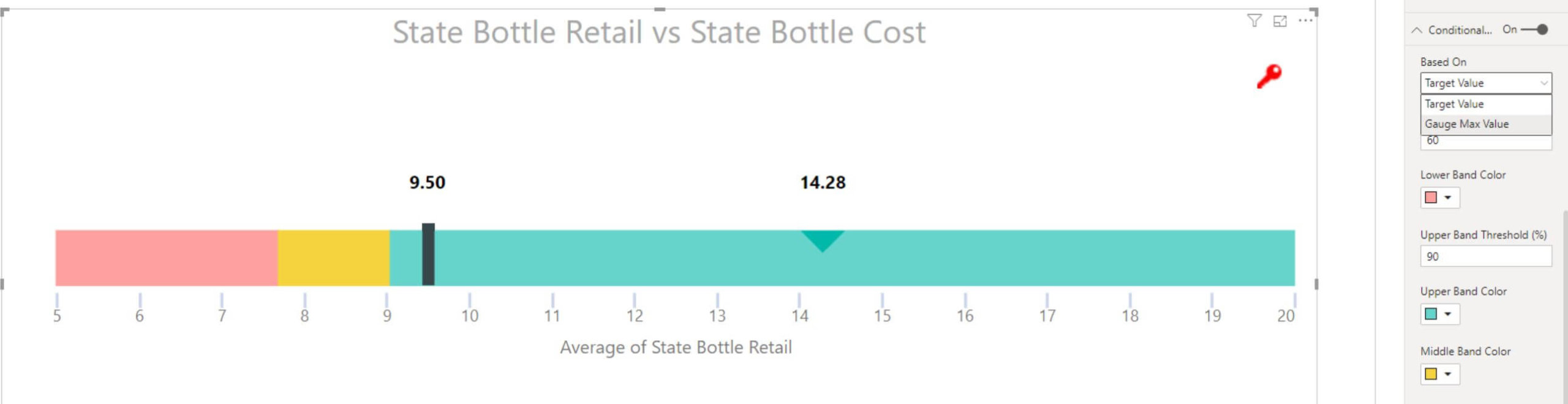
- Conditional formatting
This feature allows one to split the linear gauge into bands. This splitting can be done based on target and maximum values. The bands can further be configured by adding different colors.

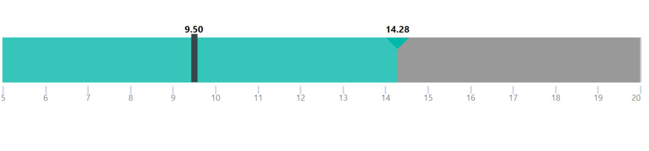
2. Actual and Target values
By default, when a value is added to the linear gauge, a pointer shows up marking the value. This is the actual value. The band color, pointer shape and color can be customized.

Now, we can add a target value to the linear gauge. It shows a defined line with the marked target value. It shows a clear picture of the comparison between actual and target values.
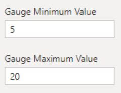
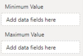
3. Dynamic and static minimum and maximum values
This custom visual provides fields to add minimum and maximum values.
4. Number formatting
The axis of the liner gauge can be marked with numbers. The numbers in turn can be formatted based on the pattern followed in that location or according to the user requirements.
5. Additional tooltips
Multiple fields can be added to a tooltip which provides the user with the required information.

We have covered the key features of xViz Linear Gauge Chart so far but there is more.
***
To get the latest version of the custom visual, reach out to us here.
You can take a look at the other advanced custom visuals by xViz here.