Dashboards provide business users with the key information they need at a single glance. They contain all the metrics and KPIs that need to be monitored to enable effective decision-making. When it comes to quick, actionable insights, dashboards are generally considered more effective than their elaborate counterparts – Reports. This is because, while reports span across multiple pages and provide very detailed information, dashboards provide a more holistic view in a concise manner in the form of visualizations.
For dashboards to be truly impactful tools to the relevant business users, it is essential that the information presented in the dashboard be logically connected, and tell a story – information in disarray would only detract the end-users from arriving at the right conclusions quickly.
In this article, when we say dashboards, we are referring to reports in Power BI, that consist of key information in the form of visualizations or tables on a single page. This allows users to view dashboards while on the go, even on their mobile devices.
There are a few tips and tricks that you can leverage to get the most out of Power BI dashboards. Here they are!
Use Well-known Standards of Representation
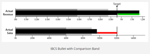
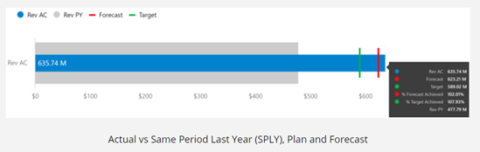
Information being displayed needs to be relevant to the business users viewing the dashboard. According to IBCS standards of representation, reports and dashboards need to be free of clutter. It is also important to be consistent throughout while using elements, fonts, colors, and layouts. It is recommended to minimize empty space on the dashboard to increase the information density. The visuals that are shown on the dashboard, should have a logical flow so that it is easy for the users to make sense of it quickly. Add scenarios such as ‘Planned’ or ‘Previous Year’ wherever possible for comparison.
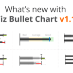
Following these standards becomes a lot easier when you use visuals that allow for such customizations inherently. For instance: the xViz Bullet Chart follows IBCS Bullet Chart templates as shown below:
Reduce Non-Data Ink
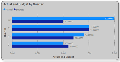
Any piece of information such as backgrounds, logos, pictures, or cluttered layouts needs to be avoided if they do not contribute to the storyline. It is best to refrain from using colored or filled backgrounds, animation, or decorative styles. All of this will divert the user’s attention from the key takeaways. According to Edward Tufte, the data-ink ratio needs to be high. The ink that is used to represent anything that is not data should be kept to a minimum.
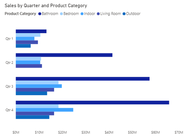
Below is an example of a visual with a high non-data to ink-ratio:
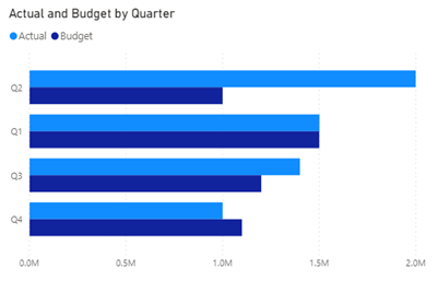
The below visual with minimum non-data to ink ratio is more readable:
Use Colours and Themes effectively
Choose a theme for your Power BI dashboards and stick to it. Most corporates already have a color palette defined, which can be leveraged. Wherever possible, it is preferable to stick to conventions to illustrate trends. Example: Using traffic light colors for analyses. It is always preferable to use a complementary color scheme, and not contrast. In most cases, a plain white or off-white background is most soothing to the eyes and works the best. According to Stephen Few, we can make use of soft and natural colors to display most information and bright colors to draw attention to parts that require our attention. Instead of only using traffic lights, we can use colors of the same hue in varying intensities to display information in a sequential range.
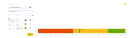
It is possible to implement conditional formatting to capture the attention of the users and highlight outliers, using xViz visuals. You can display color ranges based on percentages of maximum or target value. You can choose to highlight the difference using different colors (traffic light colors) or using different intensities of the same color. Both examples are shown below.
Interactive Storytelling
Help users narrow down their search by using selectors where there are many categories splitting the data. This can come in either by aggregating, grouping, or binning categories when these features are available in the visualization. Alternatively, this can also be brought in by making use of filters and time slicers. For instance, in an Accounts Receivable Dashboard, instead of showing the entire list of vendors, one could simply show the Top 10 receivables and group the rest under “Others”. This can be done using the xViz Advanced Pie and Donut chart in case you have 7 or more slices. Another way to implement grouping is to use the xViz Packed Bubble Chart.
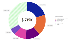
Below is an example of xViz Advanced Pie and Donut Chart, with an ‘Others’ category.
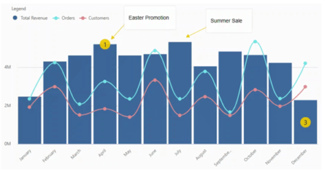
Annotations can also be provided using xViz visuals in the Power BI dashboards to enhance the experience of the user. It helps to draw the attention of the users and provide context.
By default, Power BI cross-filters and cross-highlights the visuals in your report depending on your selection. If the dataset is narrow, filtering it might skew the representation. In this case, we have an option to turn off interaction by clicking on ‘Edit Interactions’. We can choose to either filter or highlight the data sets of related visuals when an element in the slicer is selected. It is a good practice to group together the visuals that are related. This will improve readability.
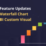
Provide the option of drilldown
C-level executives may only be interested in viewing data at a consolidated level. If the option of drilldown is provided, managers can drill down to a more detailed representation of information pertaining to their respective teams. Depending on the type of dashboard, different viewers may be interested in different skews or details of the same data. In a typical example, executives may be interested in monitoring performance at a cost-center or a departmental level, while managers may be interested in viewing the performance of individual team members. Making use of the option to drilldown on the data would be a good way to ensure that the same data can be viewed differently by different users based on their requirements.
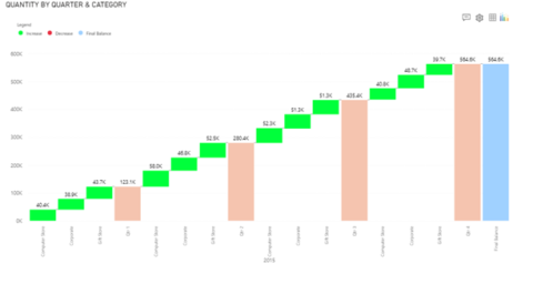
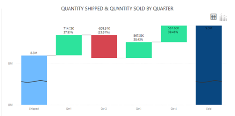
Below is an example of xViz Waterfall Chart with drilldown enabled.
Choose the right visual
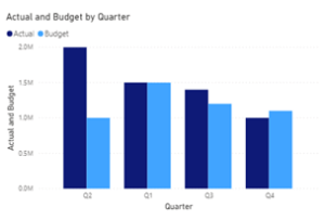
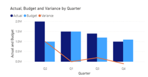
It is important to get the right message across. Bar and line charts are easier to read and assess. For instance, in a financial review scenario, there could be a bar chart displaying Actual vs Budget over a period. This can be most effectively shown using a column chart. To show actual vs budget vs variance, a line and clustered column chart will convey the message most accurately. It will be straightforward to work out which period had the most deviation. Use cards to draw focus to the end goal, e.g.: revenue. It is also advisable to avoid using pie or donut charts if the number of categories is more than 2 – 3. Pie and donut charts can be used to depict part to the whole contribution, and not for comparison. In many cases, a stacked bar chart is easier to read than a pie chart. For more detail on the right usage of pie charts, you can refer to one of our articles on pie charts.
Customize the elements of your charts
If the title of the chart is not self-explanatory, you can give a title for the x-axis and y-axis, respectively. It is also possible to choose how the data labels need to be displayed. One of the guidelines suggested by IBCS is to avoid showing long numbers as data labels. It is better to display them as thousands or millions. Data labels for small values can be avoided. It is also good to include an axis break where necessary. xViz visuals can auto-scale the Y-axis if certain parameters such as the variance are small.
***
xViz offers 20 advanced visuals for Microsoft Power BI. Enable powerful visualization in your Power BI dashboards by downloading them for free !
![Latest Features of xViz Multi Axes Chart in Power BI [v1.1.5]](https://xviz.com/wp-content/uploads/latest-features-of-multi-axis-chart-in-power-bi-150x150.png)
