Microsoft Power BI enables organizations to transform raw data into meaningful insights, making it a powerful tool for visualizing Microsoft Entra ID (formerly known as Azure Active Directory) tenant data. The Microsoft Graph API provides access to this data, offering IT teams a comprehensive view of users, groups, and resources within the organization.
IT Teams manage Microsoft users, groups, and resources for an organization tenant on the Microsoft Entra ID (formerly known as Azure Active Directory). The Microsoft Graph API provides raw data about the tenant from Entra ID, but its true value lies in uncovering hidden insights within it. To visualize the Microsoft Graph API data of an organization in Power BI, xViz Performance Flow provides a neat, insightful view of an organization’s structure. With the power of the Microsoft Graph API and xViz Performance Flow, IT teams can efficiently manage storage allocation, assigned plan services, license management, app usage security, detect potential security risks in file sharing, etc.
In this blog post, we’ll explore six impactful insights that IT teams can uncover by visualizing Microsoft Entra ID data in Power BI using xViz Performance Flow. From streamlining resource management to enhancing security monitoring, these scenarios will demonstrate directions for data-driven decision-making.
Note: To learn how to import data from Microsoft Entra ID (formerly known as Azure Active Directory) using Power Query, refer to our documentation on Importing AAD Data with Power Query.
Let’s dive into the insights:
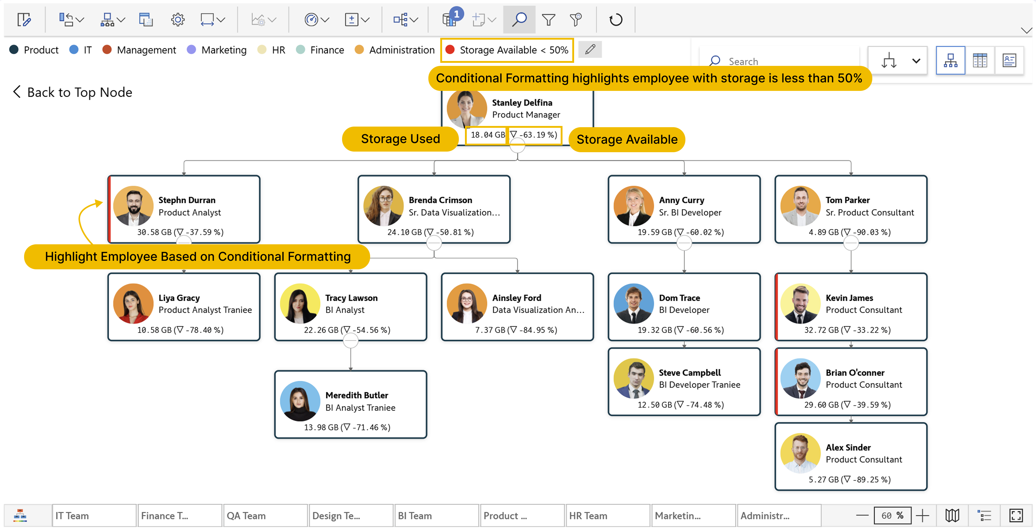
1. OneDrive Usage and Storage Details
Managing storage across employees' drives is a critical task for IT teams to prevent storage limitation. By populating the "Storage Used" and "Storage Allocated" columns in the Performance Flow visual, IT teams can easily see the remaining storage space on each employee’s OneDrive.
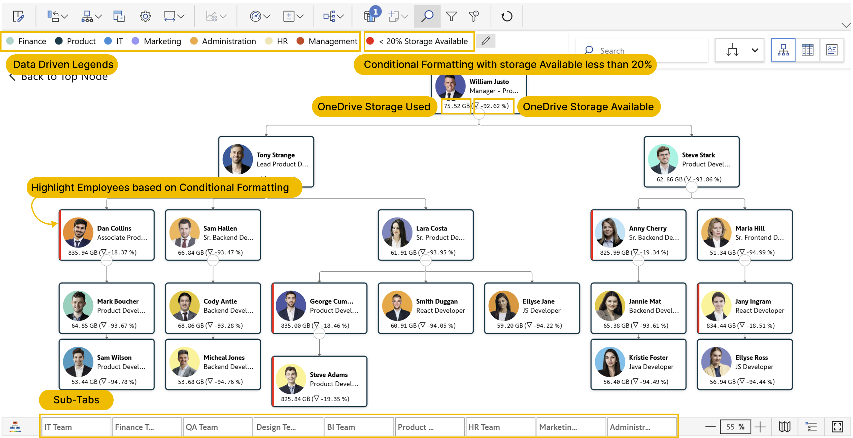
Drive Usage and Storage Details with Organizational Structure.

Drive Usage and Storage Details - Single Node Representation
As shown in the above image, use the “Storage Used” and “Storage Allocated” columns from Microsoft Graph API in the visual. Populate “Storage Used” as a KPI and use “Storage Allocated” for variance - to calculate “Storage Available” within the visual. This effectively displays the remaining storage for each employee in percentage. Additionally, applying conditional formatting based on specific criteria can visually emphasize employees whose storage is running low, ensuring quick identification and proactive management.
2. Assigned Plans
Managing license assignments and ensuring compliance with organizational needs can be challenging. With the Performance Flow visual, IT teams can easily display the total number of assigned licenses on each employee’s card.
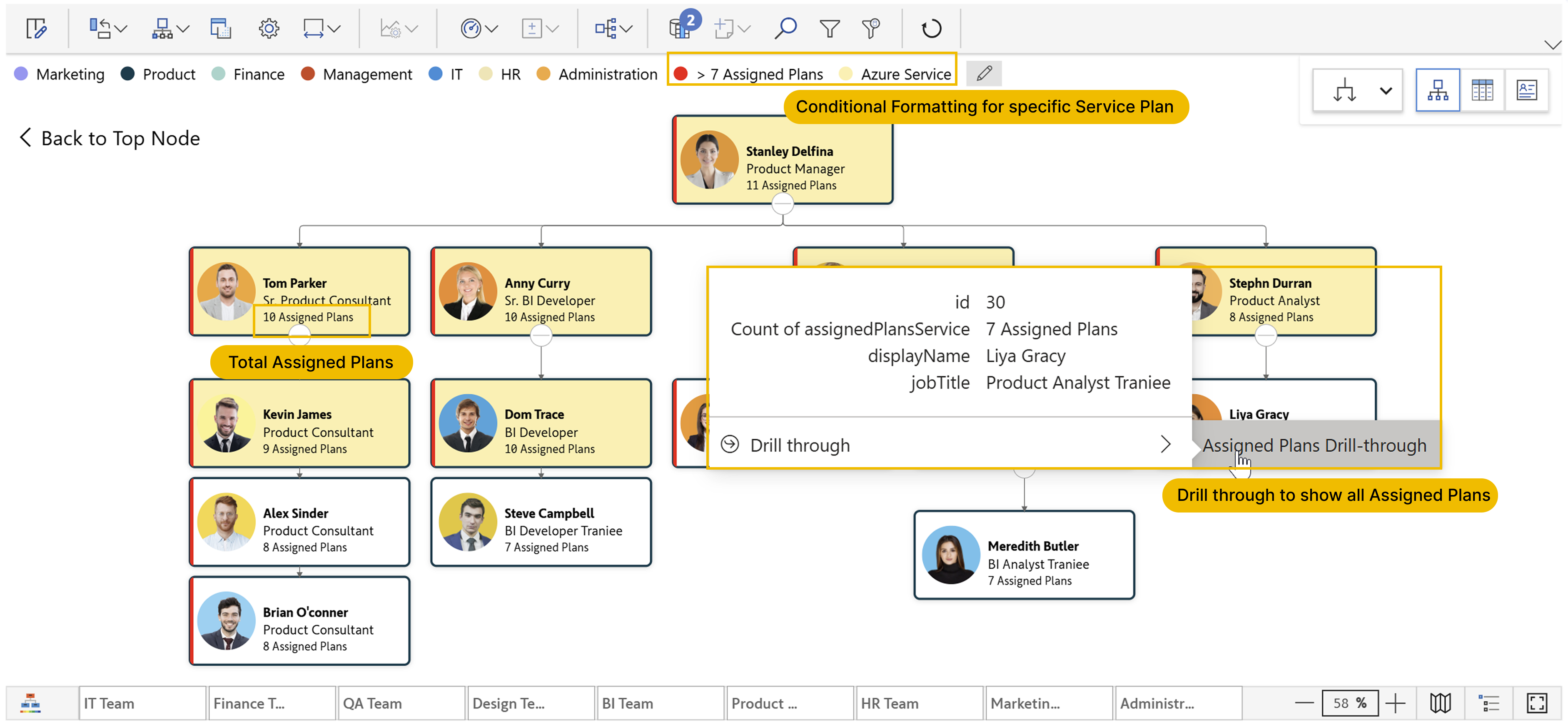
Assigned License Planes with Organizational Structure

Assigned License Planes - Single Node Representation
By displaying the count of the “Assigned Plans Service” column from Microsoft Graph API, we can show the total number of licenses assigned to each employee. This visibility helps IT teams to identify the underutilized licenses, allowing organizations to optimize costs by downgrading unused services. Additionally, conditional formatting can be applied based on specific assigned plans, making it easier to identify employees using a particular service. For deeper insights, we can set up a drill-through page to view detailed information, including the type of service plan assigned, the assignment date, and the current status, providing a comprehensive breakdown for each employee.
For more details about setting up drill-through, check out the blog on Drill through in xViz Performance Flow.
3. Active Office 365 License Users
Monitoring active users is crucial for managing licenses, providing support, and maintaining security. With the Performance Flow visual, IT teams can effortlessly track active users for specific licenses by selecting the license type. Microsoft Graph API provides six columns—"Exchange License”, “OneDrive License”, “SharePoint License”, “Skype License”, “Yammer License”, and “Teams License”—each shown as a Boolean value to indicate whether a user is active on that platform.
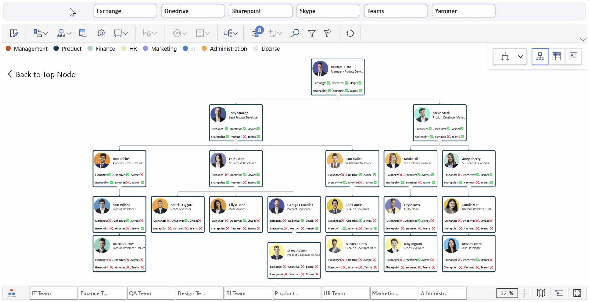
Active Microsoft 365 Users with Organizational Structure

Active Microsoft 365 Users - Single Node Representation
To enhance visibility, we can use a custom template in the visual, displaying all license types along with their status for each employee. Conditional formatting can further highlight employees with active licenses for the License Type selected in the Power BI filter, ensuring a more intuitive and data-driven approach to license monitoring.
4. Office 365 Apps Usage
Understanding how Microsoft 365 apps are being consumed across various devices and environments in the organization is essential for making informed decisions on app provisioning and security. Use the Boolean columns from the App usage Microsoft Graph API to visualize this information across the organization.
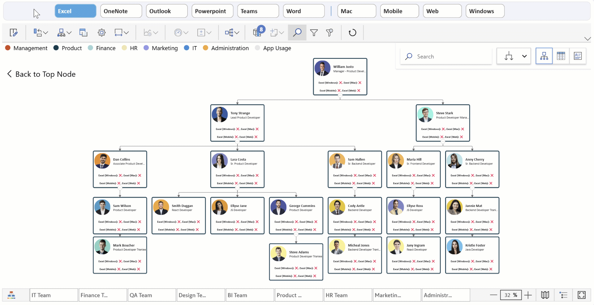
Office 365 Apps Usage with Organizational Structure

Office 365 Apps Usage - Single Node Representation
To enhance visibility, we can use a custom template to display the application and environment used by each employee, providing a clear and structured view. Conditional formatting can further highlight employees who have used a selected application in a specific environment, ensuring a more intuitive and data-driven approach to monitoring app usage within the organization. Also, it provides better insights for managing resources and ensuring secure usage.
5. Mailbox Storage and Details
Tracking Mailbox Storage is crucial for ensuring communication systems function optimally. In the Performance Flow visual, populating the "Storage Used" and "Warning Quota" columns allows IT teams to easily monitor storage usage relative to the warning level, identifying employees who are nearing their storage capacity.
Mailbox Activity and Details with Organizational Structure

Mailbox Activity and Details - Single Node Representation
In the visual, the "Storage Used" column serves as a KPI, indicating the amount of storage currently consumed. The "Warning Quota" column is used for variance calculation, showing the available storage before reaching the warning limit. Conditional formatting can be applied based on specific criteria to highlight employees whose storage is approaching the warning level. With these insights, IT teams can take timely action to prevent potential storage issues, ensuring smooth operations and uninterrupted communication.
6. SharePoint Site Usage and Details
SharePoint is a critical collaboration tool, and monitoring its usage is essential to ensure it is being utilized effectively and securely. With the xViz Performance Flow visual, IT teams can gain valuable insights into SharePoint activity by visualizing metrics such as “Synced File Count”, “Internal and External File Sharing”, “Page Visit Counts”, and “User Engagement”.
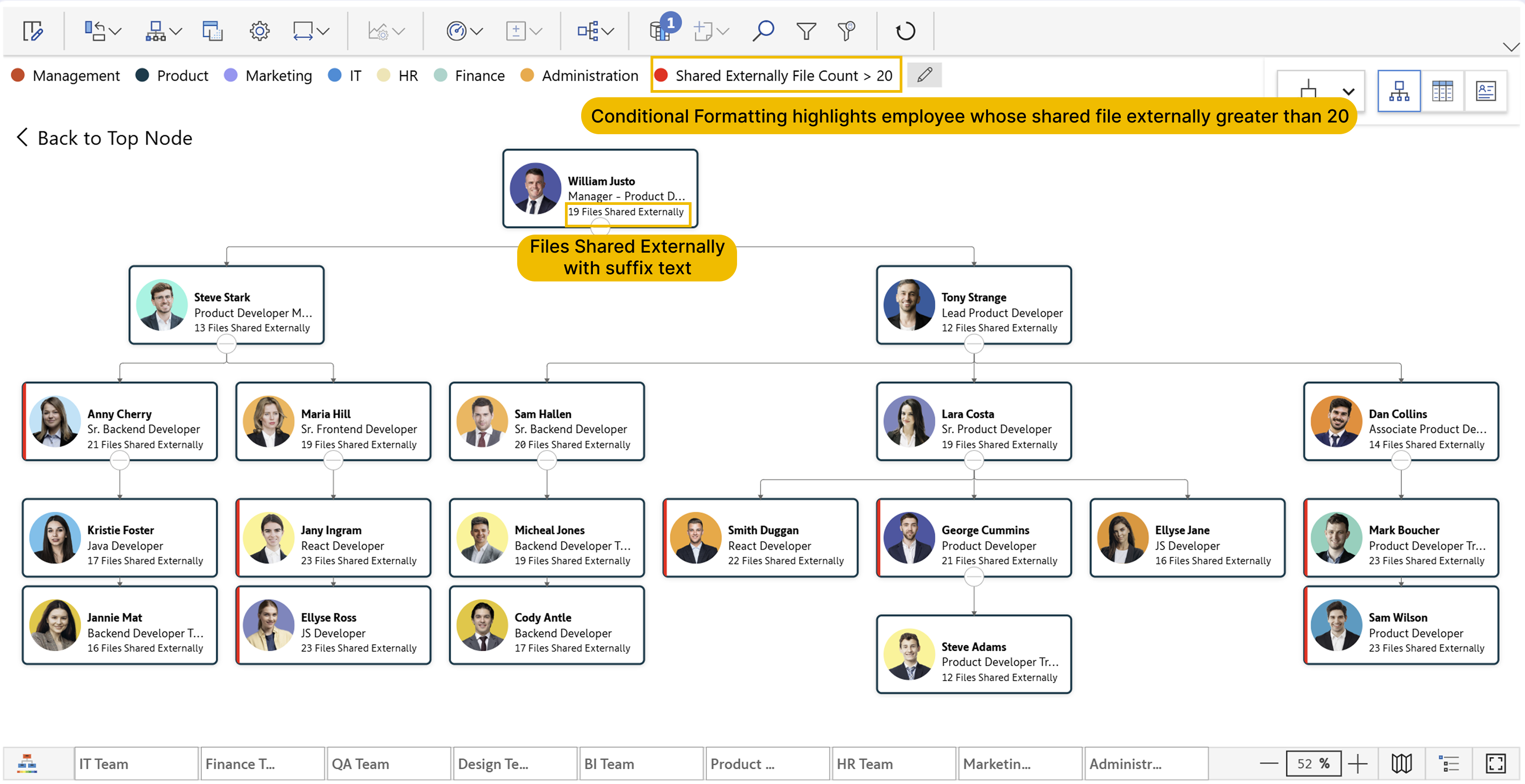
SharePoint Site Usage and Details with Organizational Structure

SharePoint Site Usage and Details - Single Node Representation
These metrics serve as key performance indicators (KPIs) in the visual, providing valuable insights at a glance. Highlight the employees who exceed the limit of file sharing to the external users, enabling users to identify collaboration patterns, detect potential security risks in file sharing, and optimize user adoption.
IT teams can transform raw data from Microsoft Graph API into meaningful insights using xViz Performance Flow in Power BI, for better decision-making and security management. This ensures secure and efficient access management for all employees. Explore the scenarios shown in this blog in the downloadable report here.
xViz Performance Flow visual offers extensive versatility, supporting a wide range of use cases, including Process Flow, Cost Center Analysis, Sales Performance Analysis, and Supply Chain Network, among others. Explore the interactive report showcasing these use cases here.
For more information on the features, check out our documentation here.
Explore the different features of the xViz Performance Flow (Microsoft Certified) from Microsoft AppSource here.