The xViz visualization suite has 19 visuals to offer. Each of these visuals can be used for various reporting needs. In this article, we’re going to have a look at some of the unique xViz visuals that can be used to represent your data differently to help give you a new perspective and derive new insights. Depending on your use case, the visuals listed below will help you in viewing and comparing your data more accurately.
Line and column charts can be used where there are fewer data values, which enables insights to be derived quickly. When the data set gets larger, we need to start exploring other visuals for display. You will also get a whole new view by using a different visual, which slices and dices data with more intricacies. Some of the alternative visualization techniques and charts are discussed below.
Parallel Coordinates:
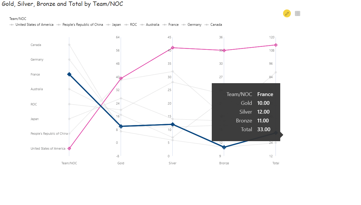
One such visual is the Parallel Coordinates visual. Although it may not be used quite often in dashboards, it provides you with an alternate view to analyze trends across multiple variables using a common category axis. As the name already suggests, the data variables are parallel to the category axis in this visual. It is most useful when used to analyze and compare the relationships between multiple variables.
As depicted in the below image, the chart shows the number of gold, silver, and bronze medals won by each team in the Tokyo Olympics. The data categories which are Gold, Silver and Bronze are shown as lines parallel to the team.
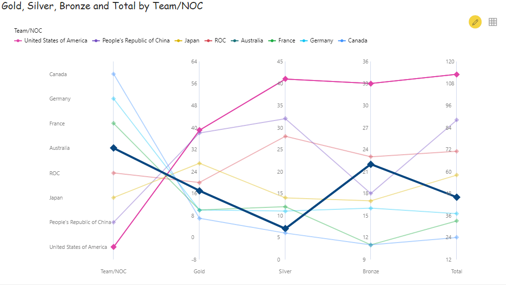
You can opt-in for a single monochrome color (like all gray) for display, or you can opt-in for a theme as shown in the above image. You can customize the color to be shown on hover and on select. In the below image, we have hovered over ‘France’ (highlighted in blue) and selected ‘United States of America’ (highlighted in pink).
Some interesting features of this visual are:
- You can reverse the Y- Axis if needed
- You can click on any of the legends and interact with the chart. The legend you click on will get enabled/disabled
- You can highlight the lines by hovering over them or selecting any of them. You can customise the color for highlighting
- You can perform zoom-in, lasso and inverse lasso
- You can display the data as a summary table
- You can choose to not show the category axis if you just want to focus on the values
- You can export the visual as an image or a pdf
Tag Cloud
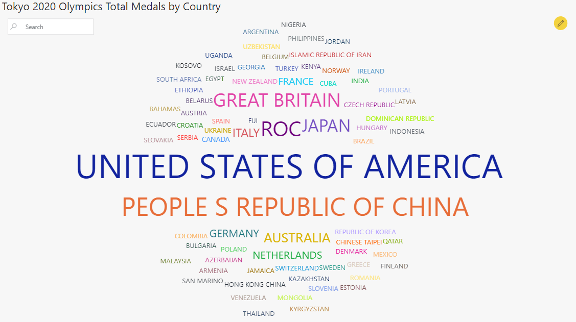
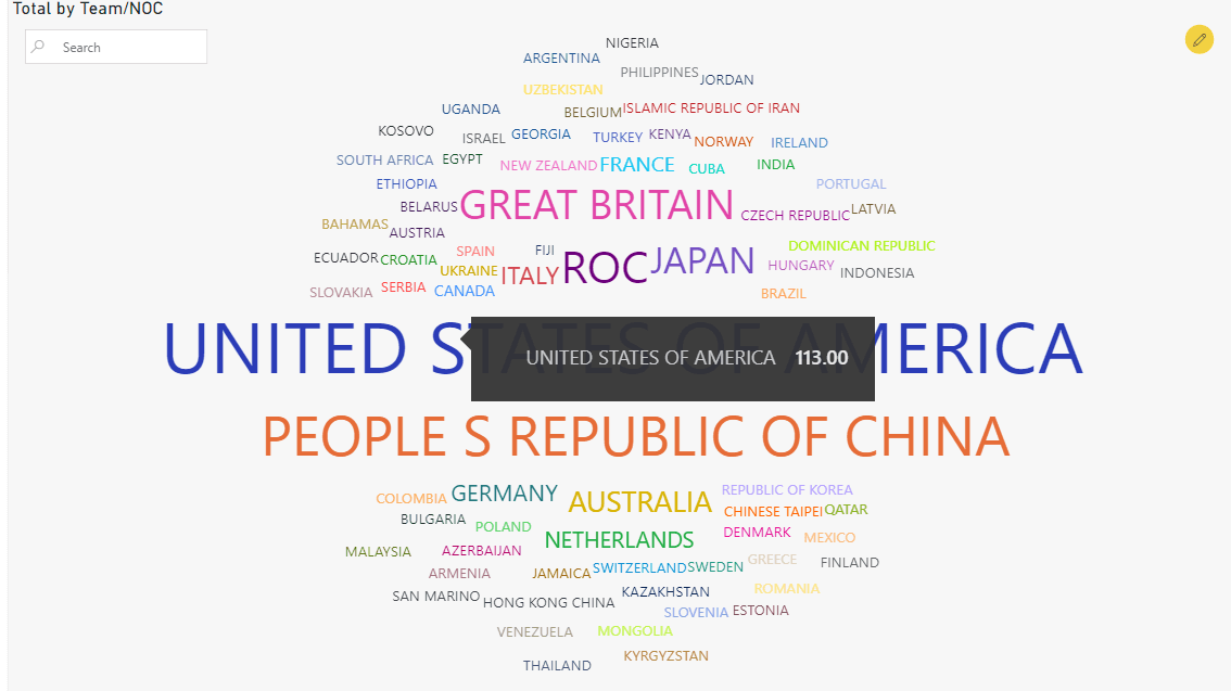
The xViz Tag Cloud visualization can be used to gauge sentiment and view the most used words or tags with respect to a logical criterion. The data could be coming in from Twitter, product descriptions, reviews, etc. The criterion based on which we could analyze these words could be market share or sales value. Depending on the criterion chosen, the size of the tags will vary.
In the below example, once again we are analyzing the number of medals won by each country/team in the Tokyo Olympics. The United States of America is the largest size because it won the greatest number of medals, i.e., 113 medals as shown in the tooltip.
The USA has then followed China which won the second the greatest number of medals. The nations/teams with a lesser number of total medals are shown in smaller font sizes.
Some interesting features of this visual are:
- You can use the search option to search for a particular tag
- You can check the size of each tag in the tooltip
- You can remove special characters, numbers, and split phrases into words
- You can have up to 2 orientations. In the above example, we have opted to show only one orientation
- You can perform conditional formatting by choosing the scheme type to be either sequential, diverging, or qualitative based on the parameter chosen. Example shown below:
Horizon Chart
Consider you have several stores or regions that you want to compare sales performance against. You also want to do this over a longer time duration, say from 2012 to 2015 on a more granular level. Viewing this on a line chart would be extremely messy and not give you any valuable insights. This is where the horizon chart comes into play. There are different color-coding schemes for you to choose from.
You can think of the horizon chart to be like a heat map visualization. You can view several stacked or area chart slices into categories, where each category has its own chart over the time range selected. Color coding is done based on the baseline value entered. The default baseline will be 0. This chart allows you to easily identify outliers over a time series.
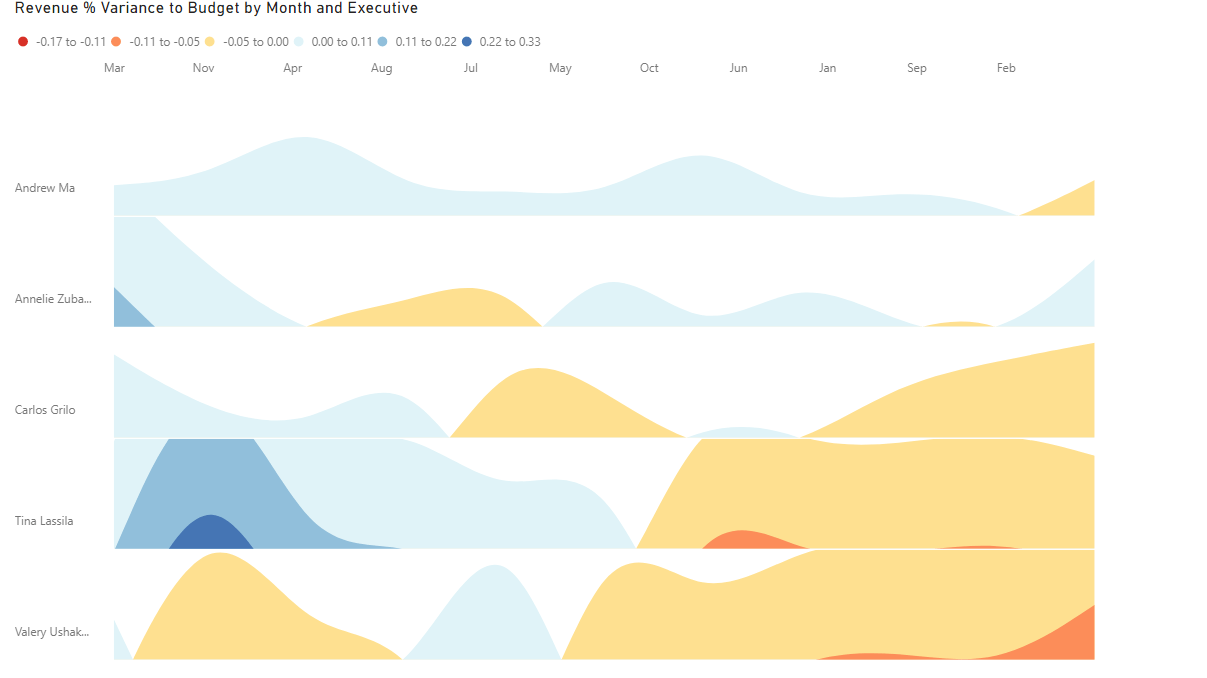
As you can see, the horizon chart is much easier to read and interpret. You can also analyze the data quickly. For instance, if you look at the grid of ‘Tine’, you can see clearly which are the months in which she out-performed and which are the months that she performed poorly.
Some interesting features are:
- You can define the baseline value and number of layers
- You can choose from 9 available color schemes to display the data
- You can have multiple categories, where each category has its own chart with a common axis
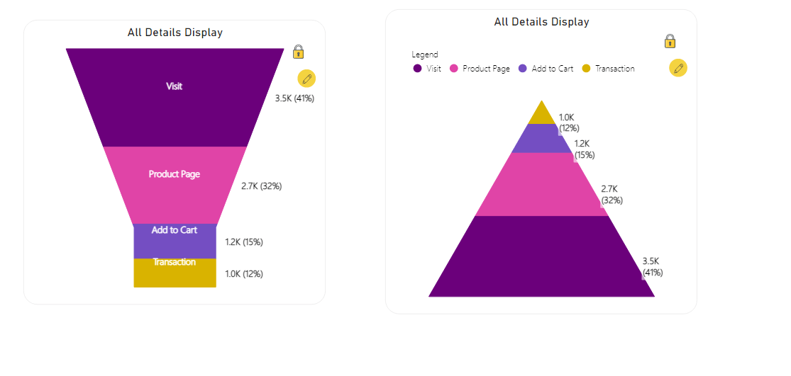
Funnel/Pyramid Chart
The Funnel/Pyramid chart allows you to illustrate data in the form of a pipeline while showing the % contribution of each item in the pipeline in the data label. It comes in handy while trying to understand the areas of improvement when there are 4-5 steps involved to reach the result.
For example, while checking the pages that lead to the customer completing the purchase, you can analyze where the drop-offs are happening, or which are the steps that could be more intuitive and user-friendly. A funnel/ pyramid chart is ideal for checking drop-off rates and exit rates on websites.
Some interesting features of this visual are:
- You can choose to display the data as a funnel or pyramid
- You can turn on the 3D mode
- You can choose what data labels are to be displayed and how they are displayed (In the first example, we have displayed all the details i.e., category, value and % to total)
- You can perform conditional formatting
- Width of the funnel/pyramid can be adjusted depending on the real estate available on the report
As you can see, xViz visuals provide alternate and interesting methods of visualization for varied audiences and purposes. They are versatile and can be used in several scenarios. As seen in the above examples, they give an alternate view to drive more discussions around the KPIs being analyzed.
******