You have probably been using the concept of the Waterfall chart to visualize a chain of positive and negative data intuitively, resulting in the final net value. But did you know that using the same concept, you can represent data in a bunch of different variations? This blog will cover 7 of these variations that the xViz Waterfall chart provides you and how to configure each of those.
1. Basic Waterfall
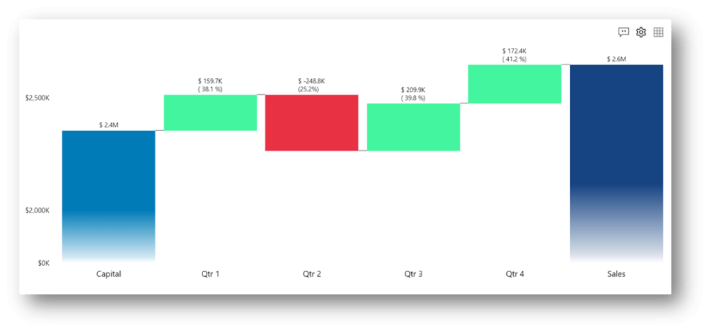
The Basic waterfall mode is the classic representation of the Waterfall chart, using a Category and a Value. In the image below, we can see a company’s annual Profit by Quarter. The upward green steps indicate profit, whereas the downward red steps show a loss.
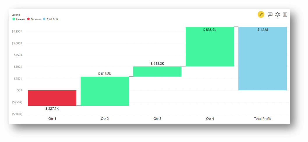
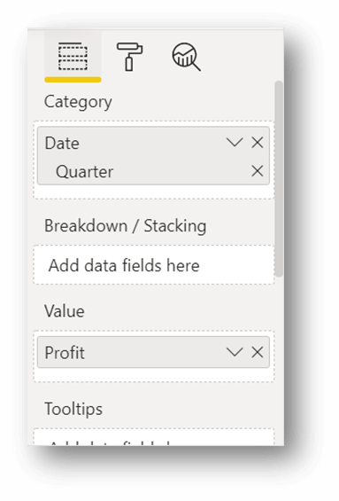
To achieve the above view, we must insert Quarter in the Category data field and Profit in the Value data field.
2. Variance Analysis
The xViz Waterfall visualization can also be used to analyze the variance between two KPIs across a category, thereby eliminating the need to create additional variance measures in the model.
Consider a manufacturing company, where investors provide the Capital Investment for the initial expenses and generate the revenue through the Sales Amount. To visualize the gain or loss for every Quarter, we need to find the variance between Capital and Sales for every Quarter.
Refer to the image below for the above scenario:
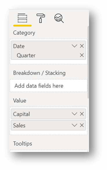
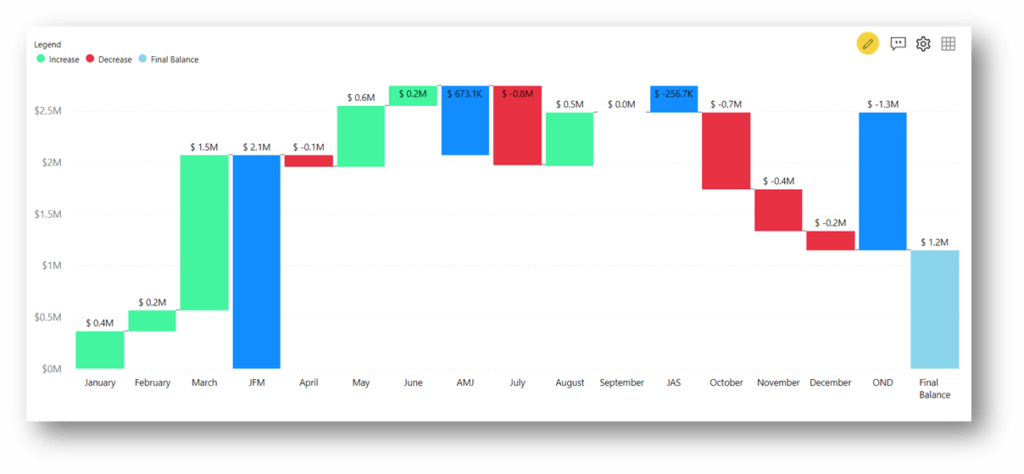
For every Quarter, the visual calculates the difference between Sales and Capital. Positive differences are shown as upward steps to indicate Profit. Negative differences are shown as downward steps to indicate Loss. To perform the above variance analysis, populate the Category field with Quarter and Capital Investment and Sales in the Value field.
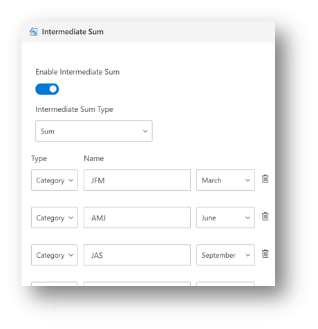
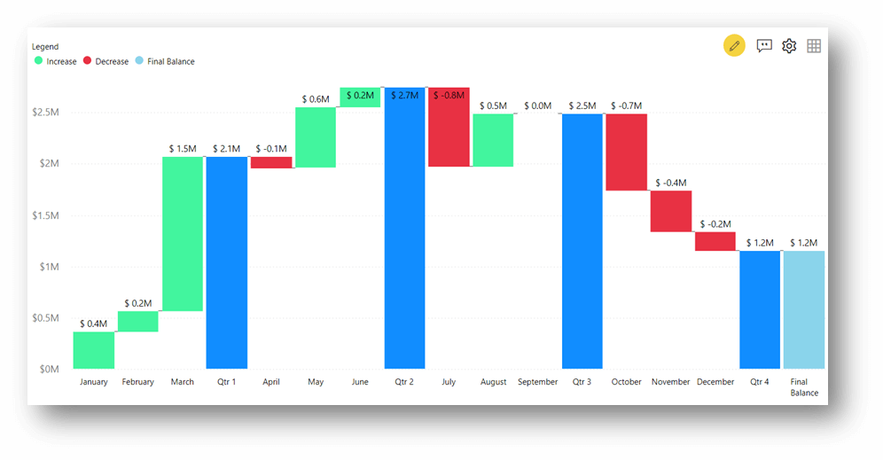
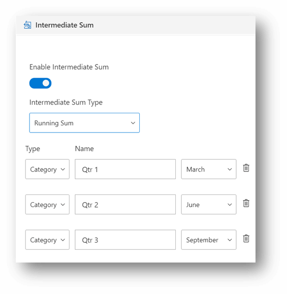
3. Intermediate Sum
For certain use cases, we may want to visualize the sum of the values in intermediate stages. For example, when analyzing sales at a monthly level, having the intermediate sums for every quarter.
To visualize custom intermediate sums, add Month in Category and Sales in the Value data fields.
In the visual canvas, click on the Advanced Editor icon and enable Intermediate Sum. Select the type of aggregation as ‘Sum’ for simple sum or ‘Running Sum’ for cumulative sum.
Simple Intermediate Sum:
Running Sum View:
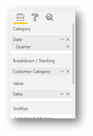
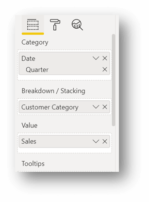
4. Stacked Waterfall
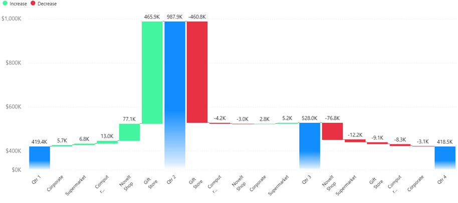
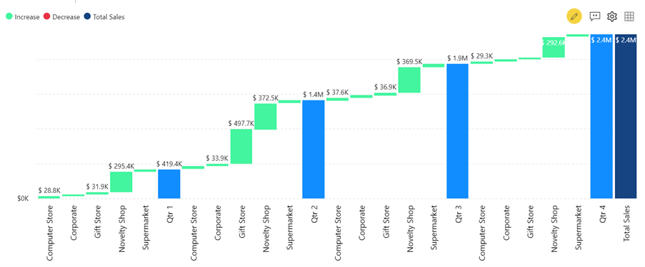
A stacked Waterfall is helpful to visualize the decomposition of individual categories’ contributions. Consider the image below, where the Sales are analyzed by quarter, further broken down by Customer Category in a stacked fashion.
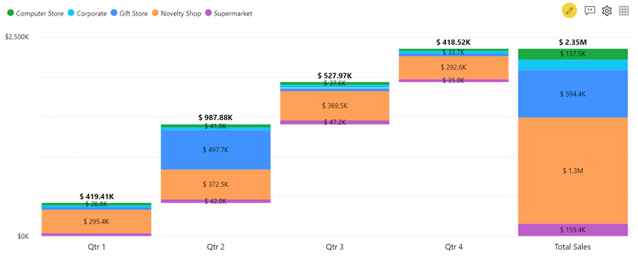
This view is quite insightful. For instance, Customer Category ‘Novelty Shop’ has been the highest contributor of Sales across all quarters. And hence, it is the highest contributor in the Total Sales as well. However, the contribution by second-highest Customer Category ‘Gift Store’ in the Total Sales, is majorly by its contribution in Qtr. 2 alone.
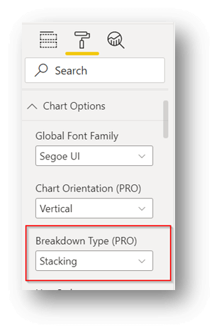
To create a Stacked Breakdown view in an xViz Waterfall visualization, populate the Category, Breakdown, and Value fields. Additionally, set the Breakdown Type to ‘Stacking’ from the Format pane.
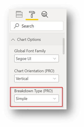
5. Simple Breakdown
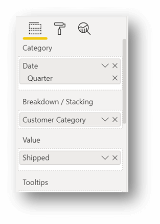
Consider a scenario where we want to see how many additional products are shipped for every Customer Category in Qtr. 2, as compared to Qtr. 1. With a simple breakdown of the Waterfall chart, we can analyze the variance of Products shipped from one Quarter to another, broken down by Customer Category.
Populate the Category, Breakdown, and Value data fields to achieve the above view. Ensure that the breakdown type is ‘Simple’ in the Format pane.
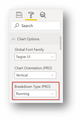
6. Running Breakdown
Running Breakdown is similar to the Simple Breakdown, where we visualize a KPI by a Category, further grained by the Breakdown column. The difference is that Breakdown bars indicate absolute numbers and not the variance, unlike the Simple Breakdown. And hence, the bars for the Category show cumulative values in waterfall visualization.
In the image below, we have the Sales by Customer Category and cumulative sum across the Category Quarter.
For the Running breakdown view, populate Category, Breakdown, and Value data fields. Set the Breakdown Type to ‘Running’ in the Format pane.
7. Only Value Waterfall
The Only Value Waterfall is a variation to the Waterfall visualization that can be created with only Measures! Consider a manufacturing company having multiple Sales channels and Expenditures. The Total Profit for the company would be the mathematical sum of Income and negatively valued Expenditure amount. The Only Value Waterfall helps to visualize all such metrics that attribute to a final aggregated KPI.
As shown in the image below, the upward steps indicate the Sales Amount from a particular channel, whereas the downward steps show the Expenses.
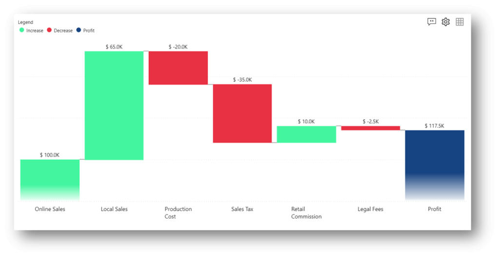
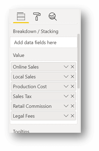
To achieve the above view, insert all the measures in the Value field with no Category and no Breakdown.
Summarizing the data representation techniques in the xViz Waterfall as follows:
- Basic waterfall – Use it with a Category and a KPI to show the upward and downward contributions to the total value.
- Variance Analysis – It caters to visualize the variance between two KPIs across a Category.
- Intermediate Sum – Define custom intermediate sums with a Category and a KPI.
- Stacked Waterfall – Like the Basic waterfall, but bars are further broken as a stack, using the Breakdown column.
- Simple Breakdown – Capture the variance of a KPI from one Category value to another, broken by the Breakdown column.
- Running Breakdown – The KPI value is shown cumulatively across the Category, with the distribution across the Breakdown column.
- Only Value Waterfall – Visualise the contribution of multiple KPIs towards the Total value.
**********
The xViz Waterfall Chart is a part of the xViz Pro Suite, check out all the resources for Waterfall Chart including other blogs, and FREE Power BI Desktop Version!
Check out all the Power BI Visuals in the xViz Pro Suite here