This blog is a part of the Hierarchy Filter Blog Series.
Since Microsoft Power BI’s recent release of native Hierarchy Slicer, we have a number of customers questioning why we would need this xViz Advanced Hierarchy Slicer. While native Power BI Hierarchy Slicer covers the hierarchy slicing capabilities very well, there are still numerous use cases that are still unmet.
So, here are 10+ such features which could be helpful for your hierarchical filtering needs:
Key Features – Summary
- Display value(measure) along with hierarchical category field
- Value Filter
- Conditional Formatting
- Search
- Support for Ragged Hierarchies
- Single Child Display
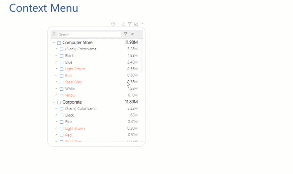
- Context Menu
- Node Level Formatting
- Filter Interactions – On hover and selection
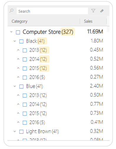
- Display Child count
- Hierarchy Icon Customization
- Default Expand to level
- Column Header for category and value
Key Features – Description
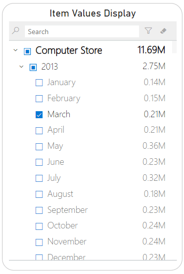
- Value Display
Unlike traditional slicer visuals, the xViz Hierarchy filter supports a Value field(measure) as well. You can assign a value field to the xViz hierarchy filter along with the categories to add more meaning and context to influence your selections.
2. Value Filter
Once you have assigned a value field to the xViz Hierarchy Filter, probably the next thing you want to do is also filter by value. For example, you may want to focus on a product with gross margins under a specific range or below a certain threshold.
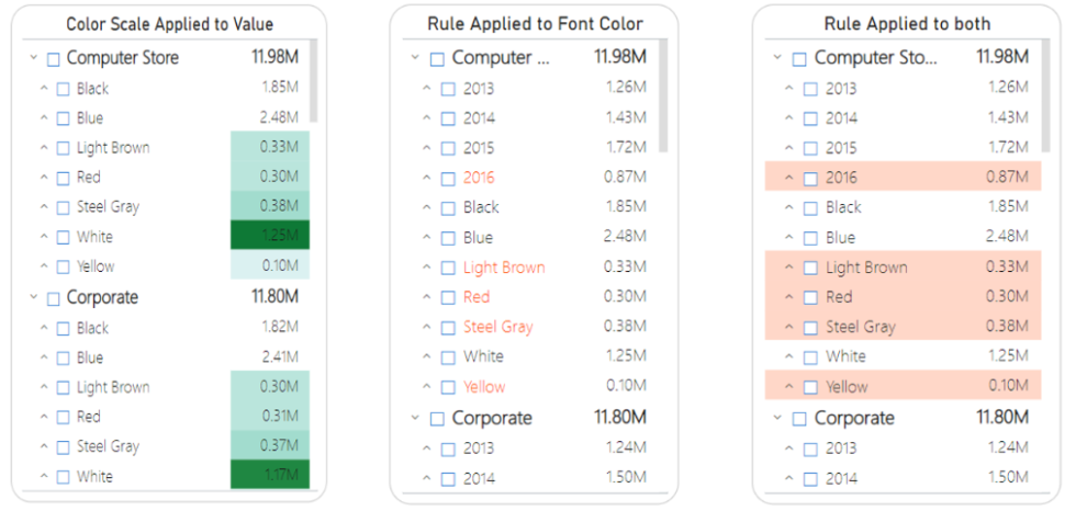
3. Conditional Formatting
The advanced slicer supports alert induced selection, thanks to the conditional formatting options! You can color-code both category and value across different hierarchy levels – top, parent, and child level.
Conditional Formatting can be applied on both value and category, in the form of text or background color.
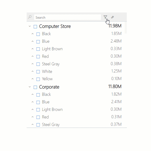
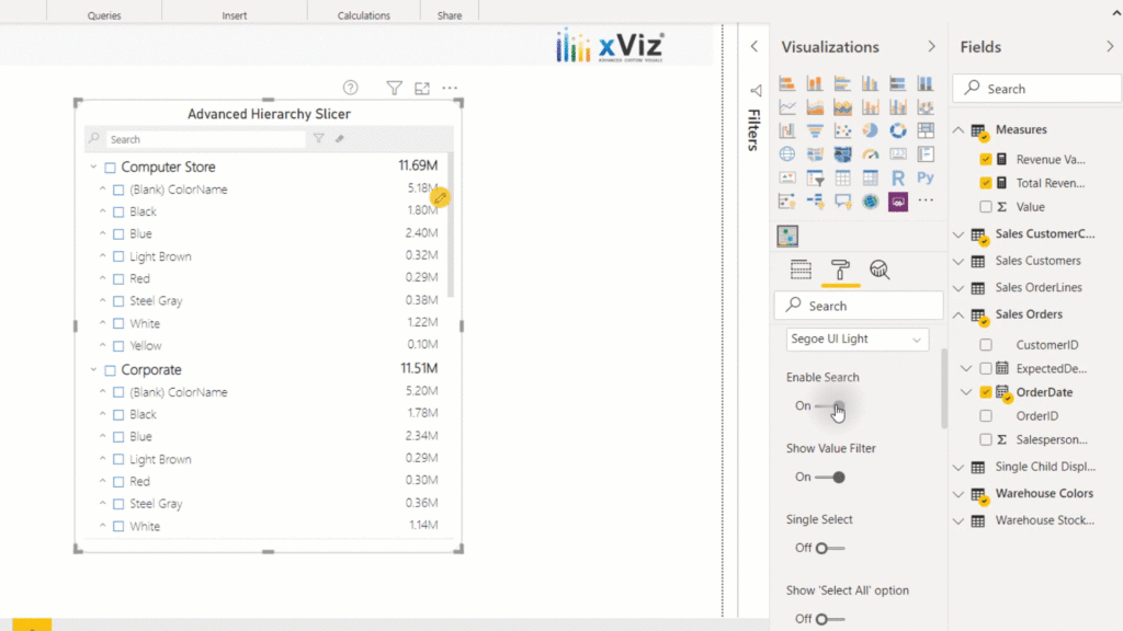
4. Search
Navigating through large hierarchies could be cumbersome. So, we added a search capability to help you search the desired nodes quickly. The search is available both in the list and dropdown mode.
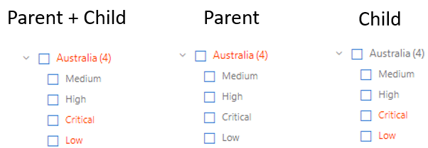
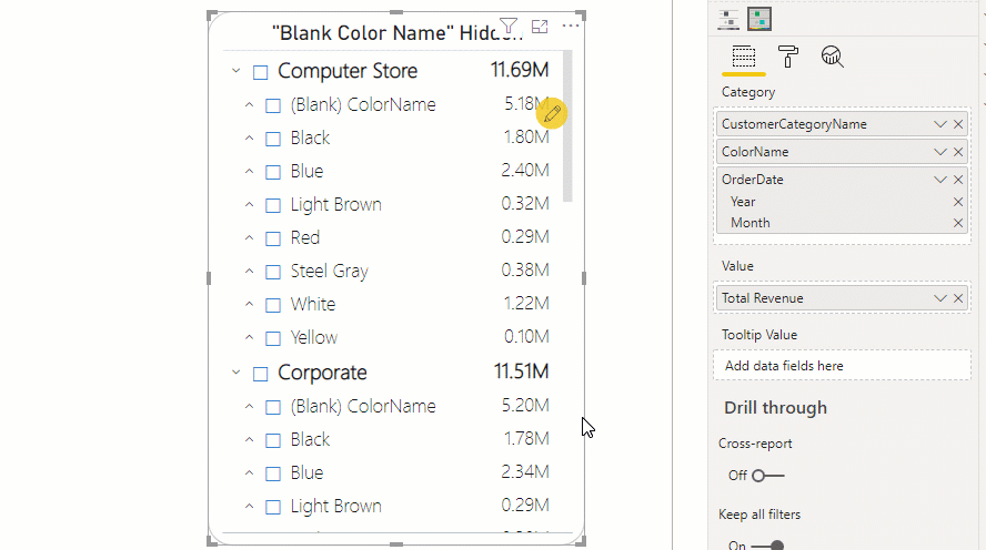
5. Support for Ragged Hierarchy (Hide Blanks)
One of the main reasons that you would notice blank values and category fields is due to ragged hierarchy levels. For example, you could have certain parent nodes which are 5 levels deep and some which could be 3 levels. To solve this, the Advanced Hierarchy Slicer provides the capability to hide such blank values and categories:
- Hide blank Values
- Hide blank Categories
- Hide both blank Values and Categories
6. Single Child Display
This feature is useful for ragged Hierarchy scenarios where there could be a series of one or more parent nodes with a single child. The different single child display options are as follows:
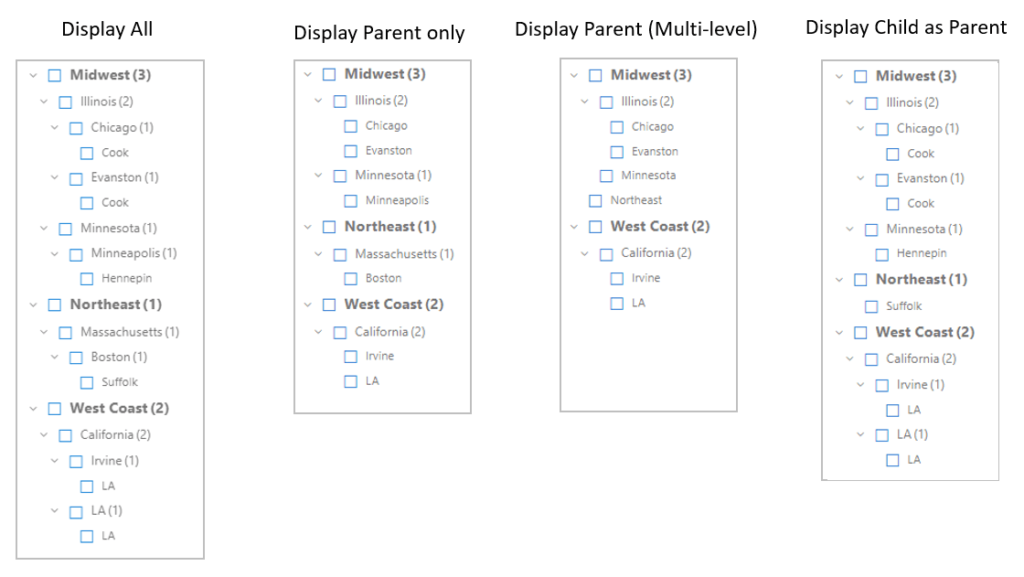
- Display Parent Only – Display till last parent node having a single child. The child level is hidden in case it is the only child. e.g. The Northeast region expands only till Boston thereby hiding the only child Suffolk.
- Display Parent (Multi-Level) – similar to Display Parent only option but this will work for more than one level. This means that if there is more than 1 level having a consecutive single child then all the following parents will be hidden e.g. Since the Northeast region has only one child at each level. Therefore, it shows only Northeast
- Display Child as Parent – Skips the parent node having a single child. The child node will move one level above if it’s the only child. e.g. Since Suffolk has parent nodes having a single child, therefore the Northeast region ends directly into Suffolk and skips Massachusetts and Boston
- Expand/ Collapse All – Expand and collapse the hierarchy for easier navigation
- Conditional Formatting – Ability to enable or disable multiple conditional formatting rules and analyze value based on different alerting rules.
- Rearrange nodes – rearrange different category levels on the fly
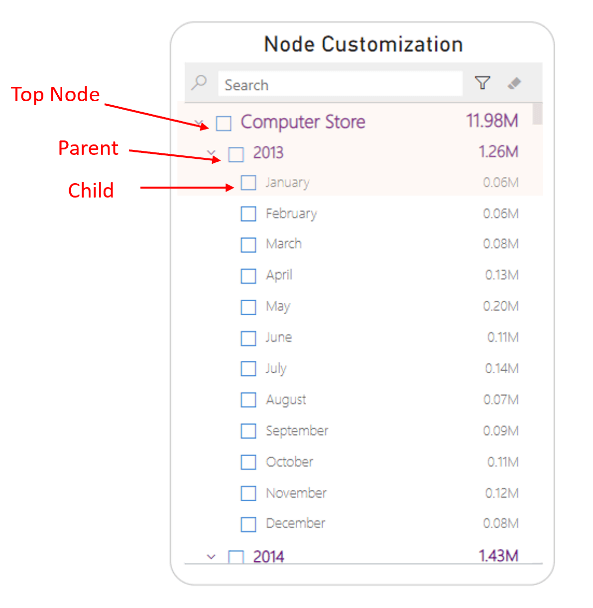
8. Node Styling options
Node styling helps the hierarchy levels stand out so that you can easily visualize the hierarchy flow and differentiate the top node, parent node, and child from the list. You can assign a different color, font style, and size to pop out from the norm visually
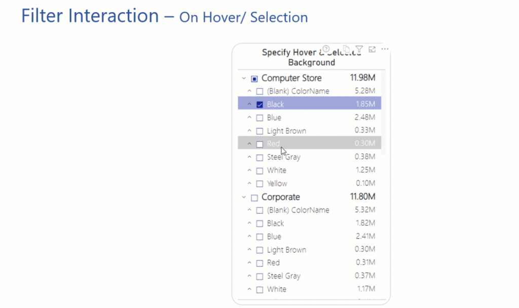
9. Interactions – On hover and selection
For better UI/ UX capabilities as a designer, you can define advance filter interactions like ‘On hover’ and ‘On selection’ for your end consumer. You can choose a different font and background color to make your selection or hover experience stand out from the rest of the nodes.
10. Display child count
The display child count feature is beneficial as it displays the count of subsequent child nodes each node has at that level. The count keeps updating as we drill deep into the hierarchy, thereby giving a sense of navigation and which field has more members.
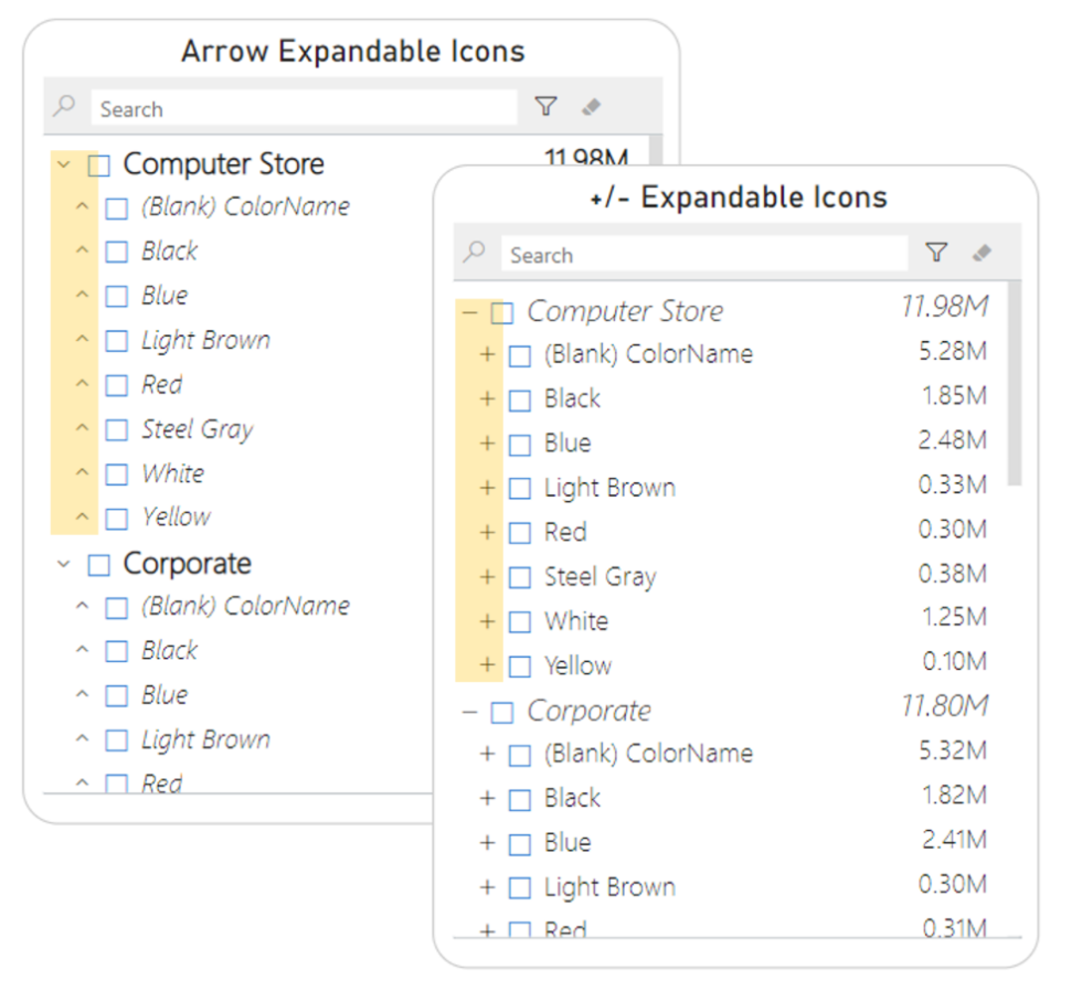
11. Hierarchy expand/ collapse Icon customization
The Advanced Hierarchy Slicer provides two different icon types to choose from. You can either select the arrows or plus & minus style of hierarchy icons
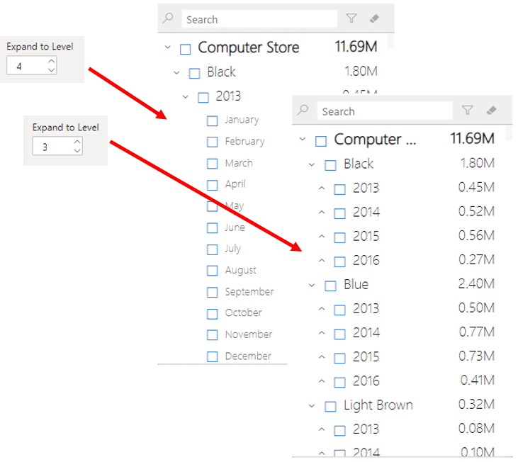
12. Expand to level
For better UX, the xViz hierarchy filter provides a default expand to the level so that users can start directly from the set level instead of starting from the first level and expanding further
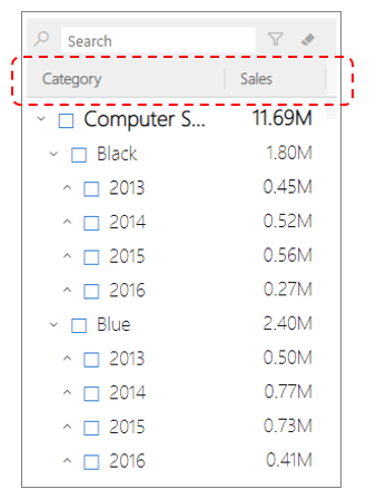
13. Column Header
You can enable the column header to add context to the type of hierarchy and value displayed.
***
Check out the Live Demo and Download xViz Hierarchy Filter Sample PBIX for FREE here.
Download xViz Pro Suite with all the Pro Features unlocked for Power BI Desktop here.