A Bubble Chart is an extension to the Scatter Chart where along with the X and Y coordinates, the data points also have a size dimension as the third variable. By definition, a bubble chart does not use a category axis — both horizontal and vertical axes are value axes and the bubble size is also associated with a value. You can also pack more information by using color as the fourth variable, either value or category, with conditional formatting.
The category field well is used to label the bubbles and with additional category fields, you can enable the drill-down mode. The legend field further splits the bubbles into different groups, which can be assigned specific colors and shapes for visual identification under the Appearance Tab. The xViz Scatter/ Bubble chart focuses on 3 main scenarios –
- Standard Bubble by Definition
- IBCS Bubble
- Strategic Bubble Use Case
Now let’s look at some of the important features offered by xViz Scatter/ Bubble chart with a focus on Bubble chart use cases.
Key Features – Summary
- 4 Quick Start Templates
- IBCS Bubble
- Ranking – Top/Bottom N with Others
- Bubble Customization [ Appearance Tab]
- Conditional Formatting
- Analytics Section
- Axis Ranges
- Annotations
- Data Label Customizations
- Chart Interactivity – Zoom In/Out, Lasso/Reverse Lasso
Key Features – Description
- Bubble Chart Templates
The xViz Scatter/ Bubble chart provides 10+ commonly used chart templates, out of which 4 are dedicated to Bubble chart. These templates’ goal is to quickly help you achieve the desired use case without even navigating the property sheet. Once a template is selected, you would need to assign the respective values unique to each template, and the chart would be ready on clicking Apply. Following are the list of templates –
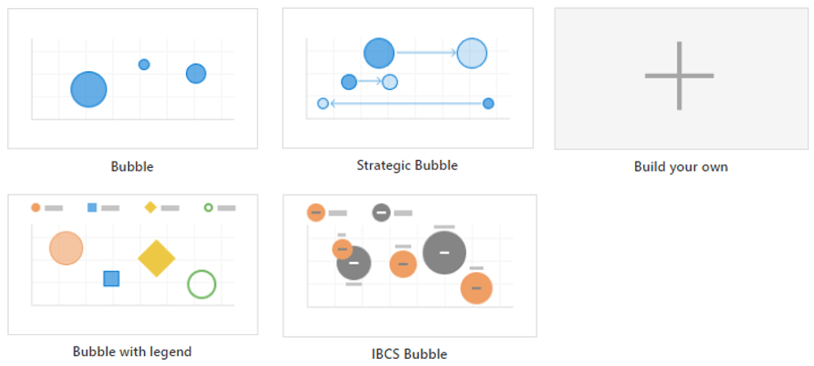
2. IBCS Templates
The xViz Scatter/ Bubble chart along with supporting the standard Bubble chart definition also provides support for the IBCS standard Bubble chart and has a dedicated template for a quick start.
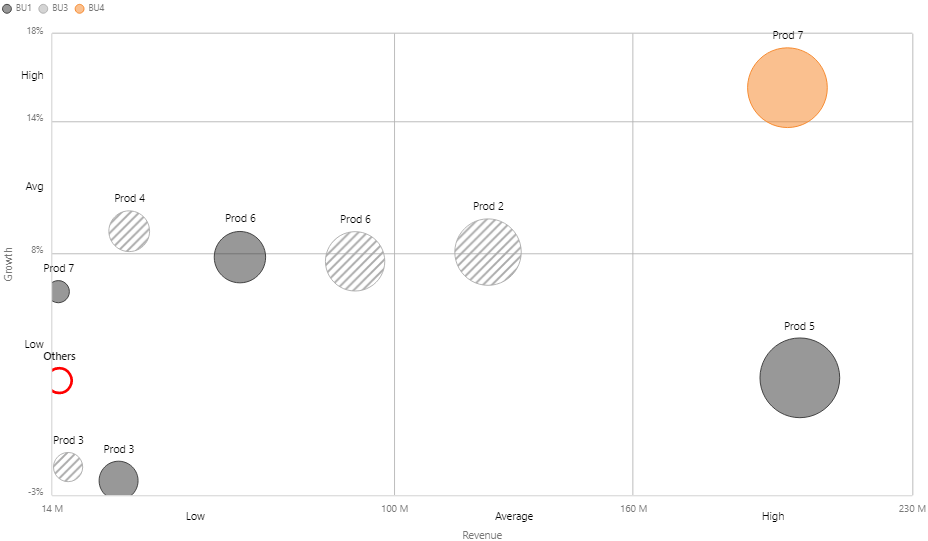
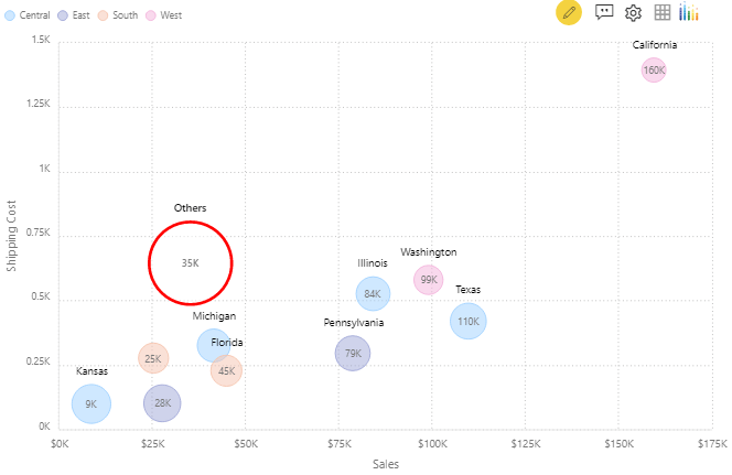
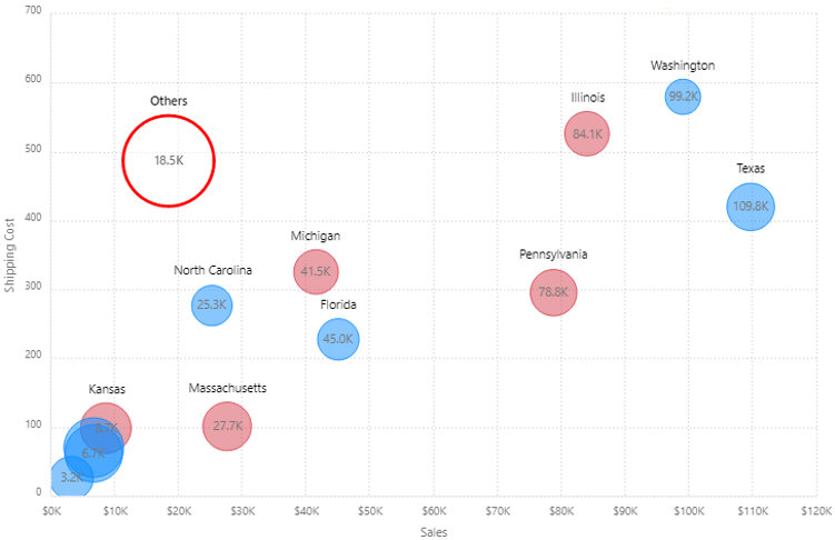
3. Ranking (Top/ Bottom ‘N’) with ‘Others’
The Power BI Bubble chart from xViz can compress and visualize large volumes of data. One downside of this is that the bubbles start overlapping each other as data increases and becomes hard to read. The xViz Scatter/ Bubble by default displays Top 10 Bubbles based on X Value and groups the remaining data points into the ‘Others’ bubble to overcome this issue. However, this behavior can be changed or disabled as desired by the user. Also, the ‘Others’ bubble is styled differently (red ring) to provide a visual differentiation so that users don’t confuse it with the remaining bubbles.The ranking feature is part of the Utility Menu option and is available both at design and runtime for the end audience to make changes. You can perform top, Bottom, and both (Top + Bottom) ranking on the following values –
- X Value
- Y Value
- Size
4. Bubble customization
The xViz Scatter/ bubble chart offers different bubble customization options, which can be found under the Appearance Tab. You can choose the bubble display to be the same for all or customize them differently based on the legend and category field. The following is the list of bubble properties which can be customized –
- Shape – choose from different shapes and styles like solid, border and both
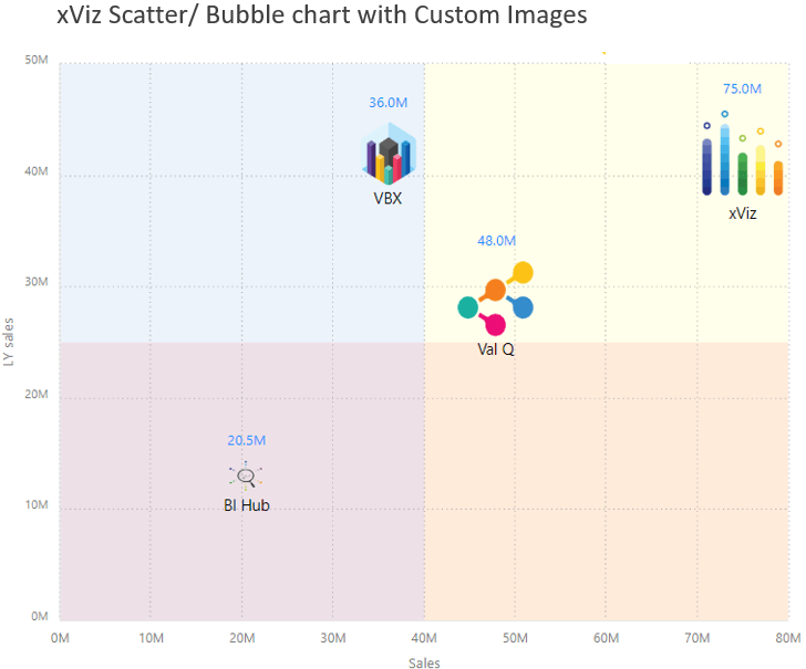
- Custom image – Display custom images(Data URI) instead of standard bubbles display
- Marker/ Bubble size – Define min and max bubbles size
- Color
5. Data Label customization
The Bubble chart offers the option to add both the category and value field along with different positioning options as part of the data label section. Users can choose from –
- Category
- Legend
- Value only – Choose between X, Y, and size value
- Category + Value
- Legend + Value

6. Conditional Formatting
Conditional formatting helps visually highlight data points by changing color based on a set of criteria or rule and are usually preferred for outlier detection. In the case of Power BI Bubble chart from xViz, this property can be used both for –
- Conditional formatting – a standard features across all xViz charts
- Color field (fourth variable) – Assign the fourth variable(value) to the tooltip section and set conditional formatting using either color scale or rule option
7. Analytics section
- Reference lines – You can add a reference line based on a constant or calculated value. The calculated values are based on different aggregation types including min, max, avg etc. There are three types of reference lines-
- Custom – Line connecting two coordinate points
- Horizontal – Static and dynamic reference line
- Vertical – Static and dynamic reference line
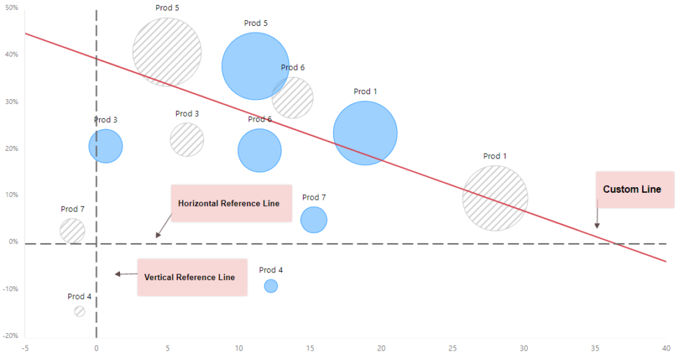
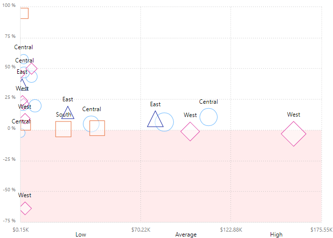
- Reference Band– Reference bands are used to highlight a given area by adding a gradient of shading to indicate the values’ distribution along the axis. Distribution can be defined by percentages, percentiles, quantiles (as in the following image), or standard deviation. xViz allows you to set up both horizontal and vertical reference bands with the option of a custom label.
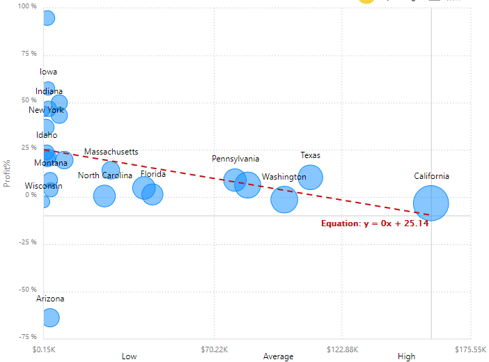
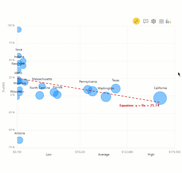
- Trend lines – Trend Lines provide a direction of the trend for the underlying data. xViz provides four options; they are Linear, Logarithmic, Exponential, and Polynomial. You can style the trend line using different line styling options and display the line equation..
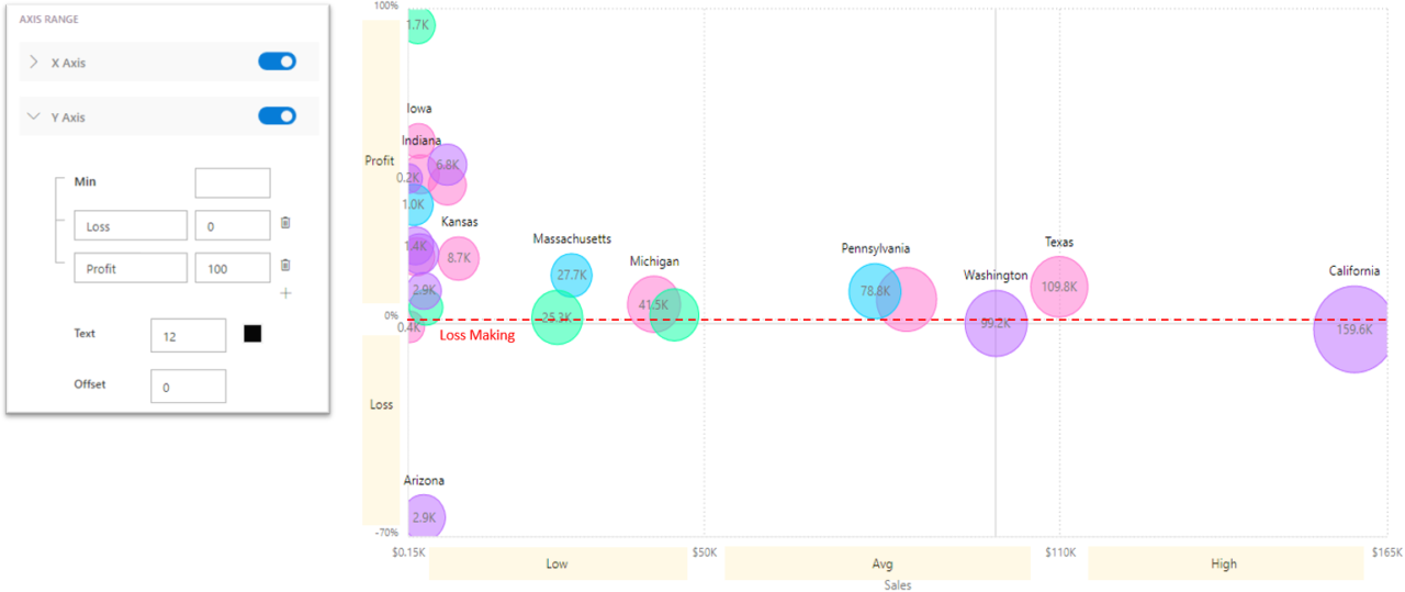
8. Axis Ranges
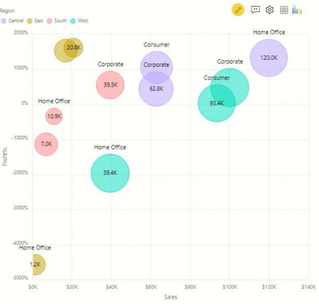
One way of dividing the bubble chart into different zones or quadrants is by dividing the axis into respective segments or bands. For such use cases, it is more important to view under which zone the data points lie than the exact X and Y coordinate. In the following example, one can easily view that Arizona is low sales and loss-making business with the help of axis ranges. You can set the Axis ranges on both the X and Y axis and set up to a max of five bands.
9. Annotations
Annotations provide context to enhance your storytelling experience with textual call outs and drive attention to important areas. Like other xViz charts, the xViz Scatter/ Bubble chart also supports the Annotations feature as part of the Utility Menu and is available both at runtime and design time.
10. Chart interactivity (Drag Select Actions)
The drag-select action option, located under the utility menu provides the following interactivity options.
- Zoom – Zoom in and out on data points
- Lasso – Select multiple data points at once by creating a rectangular lasso
- Inverse lasso – Reverse of lasso option. Select all items except for the selected items
The Bubble Chart is a part of the xViz Pro Suite, download your FREE Power BI Desktop Version here!