This blog is part of the xViz Bubble/Scatter Chart Blog Series
A scatter chart, aka scatterplot , scatter graph or scattergram uses dots to represent values for two different numeric variables. Each dot’s position on the horizontal axis(X) and the vertical axis(Y) indicates values for an individual data point. Scatter plots are used for correlation analysis between the X and Y variables and view patterns in large data sets, for example, by showing linear or non-linear trends or clusters. You can also add a third variable to the visual to color code the data points and assign a different shape for better visual identification.
For November 2020, xViz has launched a new Power BI custom visual- xViz Bubble/Scatter advanced visual covering the need for both scatter and a Bubble in one. The visual supports advanced use cases with some of the frequently requested customer requirements like ranking, variance bar for strategic use cases, and advanced marker customization options with support for custom images and Annotations.
Now let’s looks at some of the unique features offered by the Scatter chart.
Key Features – Summary
- 5 Quick Start Templates
- IBCS Scatterplot
- Variance Bar
- Scatter/Marker Customization
- Data Label Customization
- Conditional Formatting
- Analytics Section
- Axis Ranges
- Annotations
- Play Axis
Key Features – Description
- Scatter Chart Templates
The xViz Scatter/ Bubble visual provides 10+ commonly used templates, out of which 5 are dedicated to Scatter. Simply select the template and map the data field unique to each template and the chart is ready. The following are the list of templates –
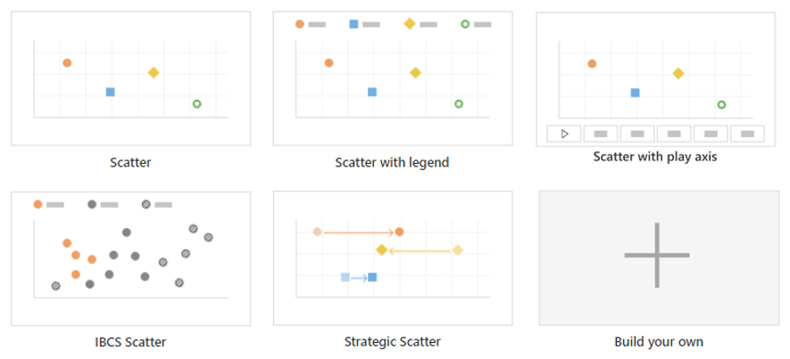
2. IBCS Scatter
The xViz advanced visual along with supporting the standard Bubble chart definition also provides support for the IBCS standard Scatterplot visual and has a dedicated template to quickly get started.

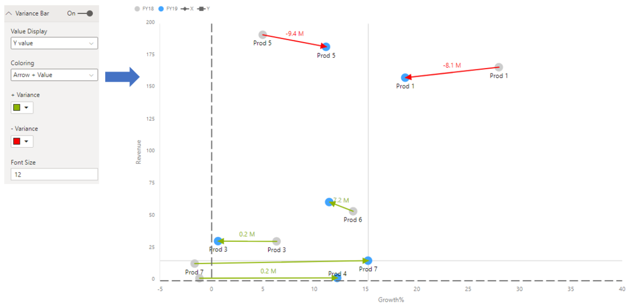
3. Variance Bar
The variance bar helps you visualize the difference or track the movement between the markers (data points) over different time intervals. In the below example, one can view the increase or decrease in revenue across different products between 2018 and 2019. You can achieve this use case by selecting the Strategic scatterplot template, which requires the legend field to have only 2 items – 2018 and 2019 in the following example.
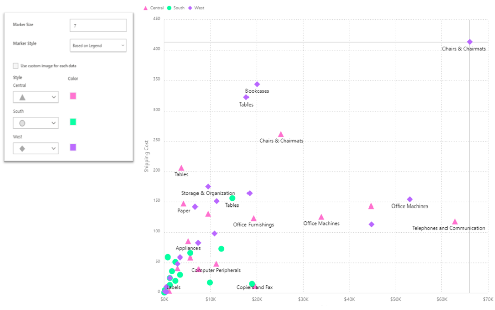
4. Marker Customization
The xViz advanced visual offers different marker customization options, which can be found under the Appearance Tab. You can choose the marker display to be the same for all or customize them differently based on the legend and category field. The following is the list of marker properties that can be customized –
- Shape – choose from different shapes and styles like solid, border and both
- Custom image – Display custom images (Data URI) instead of standard bubbles display
- Marker size
- Color
5. Data Label Customization
The Scatter visual offers the option to add both the category and value field along with different positioning options as part of the data label section. Users can choose from –
- Category
- Legend
- X Value
- Y Value

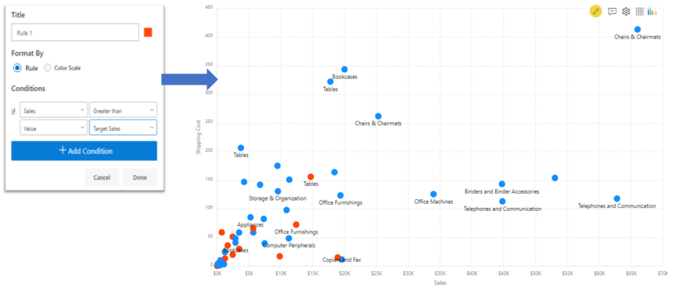
6. Conditional Formatting
Conditional formatting helps visually highlight data points by changing color based on a set of criteria or rule and are usually preferred for outlier detection. You can set rules to highlight individual marker or use the color scale option to color markers differently based on the range of the assigned value field.
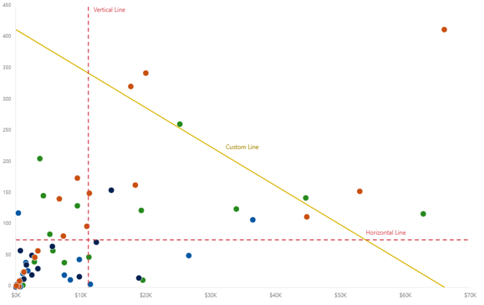
7. Analytics Section
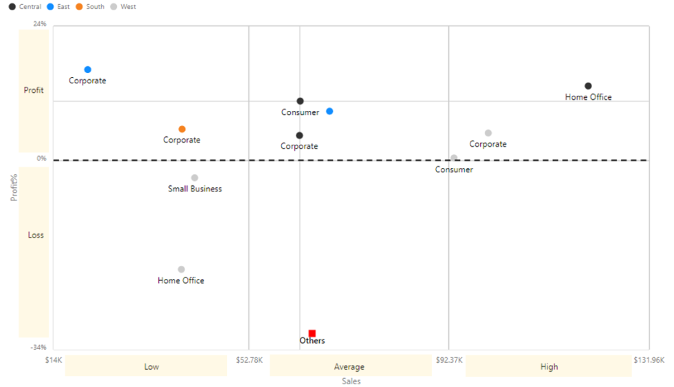
- Reference Lines – You can add a reference line based on a constant or calculated value. The calculated values are based on different aggregation types including min, max, average etc. There are three types of reference lines-
- Custom – Line connecting two coordinate points
- Horizontal – Static and dynamic reference line
- Vertical – Static and dynamic reference line
- Reference Band – Reference bands are used to highlight a given area by adding a gradient of shading to indicate the values’ distribution along the axis. xViz allows you to set up both horizontal and vertical reference bands with a custom label option.
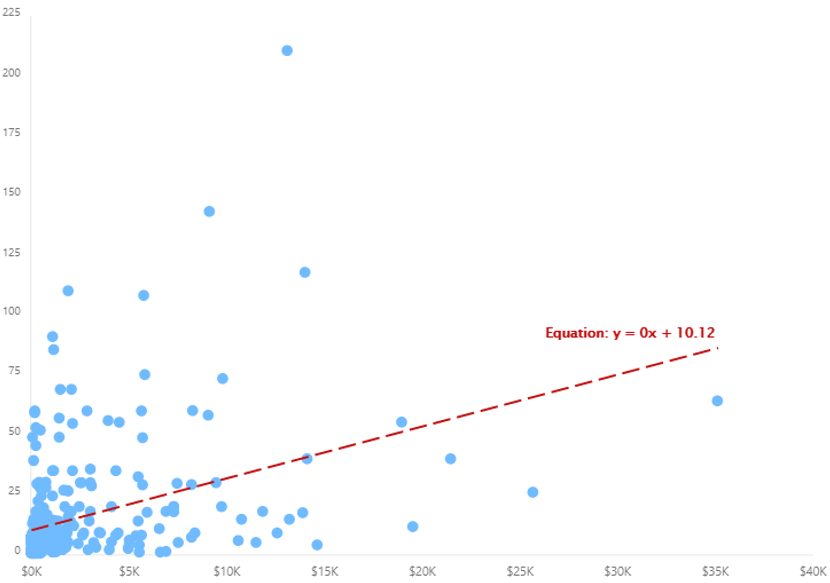
- Trend lines– Trend Lines provide a direction of the trend for the underlying data. xViz offers four options; they are Linear, Logarithmic, Exponential, and Polynomial. You can style the trend line using different line styling options and display the line equation
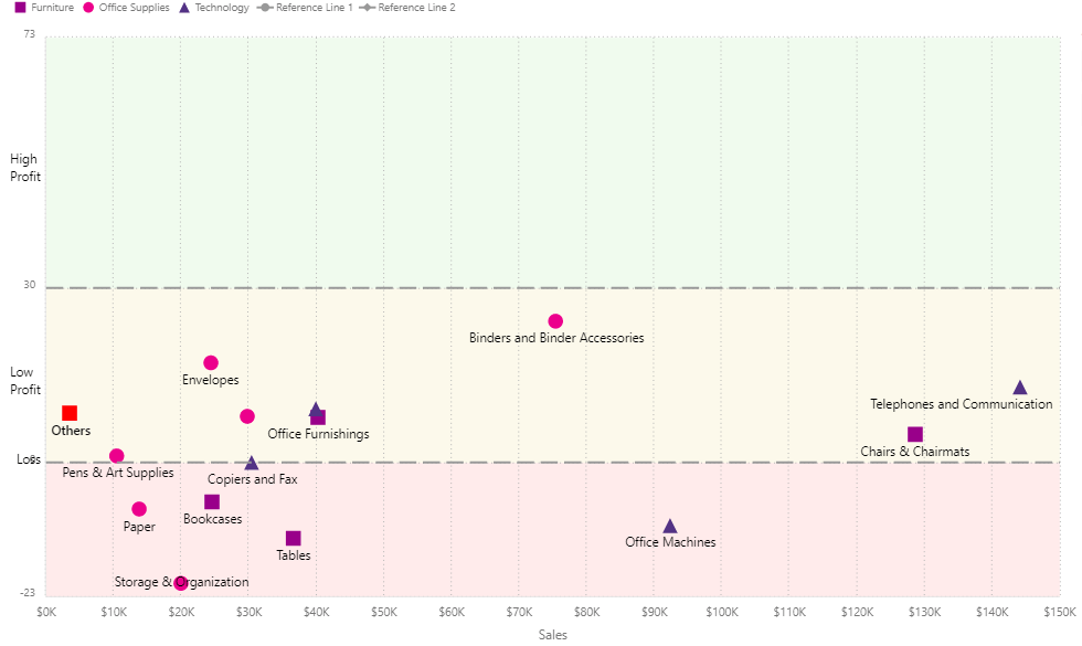
8. Axis Ranges
Instead of viewing a continuous axis, you can divide the axis into different groups by using the Axis range feature. In the below example, the Y axis has been divide into two groups- profit and loss to quickly identify which products fall under the profit and loss-making region.
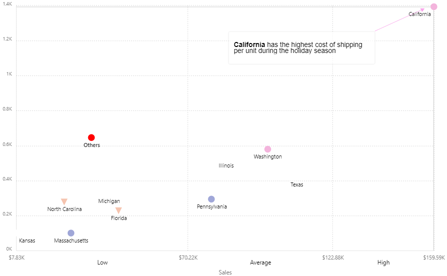
9. Annotations
Annotations provide context to enhance your storytelling experience with textual call-outs and drive attention to important areas. Like other xViz charts, the xViz Scatter/ Bubble visual also supports the Annotations feature as part of the Utility Menu and is available both at runtime and design time.
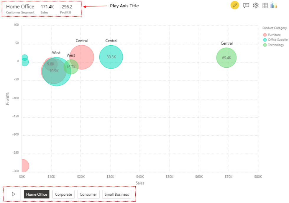
10. Play Axis
The Play Axis feature is part of the latest enchantments made to the advanced visual. It helps visualize the change in trends across the assigned category or value field in a short span of time without manually filtering through the dashboard. You can choose between a button or slider control and display the summarized values across each Play axis field using the Play axis title option.
***