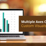
This blog is a part of the Multi-Axes Chart Blog Series
The xViz Multi-Axes Chart as the name suggests provides the options to display multiple values on the different Y-axis (max 5). For example, you can visualize your sales ($), units (MT) and average selling price($) all at once in the same visual with each value having a separate axis. This way users can do correlation analysis and help analyze the factors driving the increase or decrease of other value.
Along with providing multiple axes as a feature, there a lot of other custom chart configurations provided by the xViz Multi-Axes chart which are as follows:
- Column
- Bar
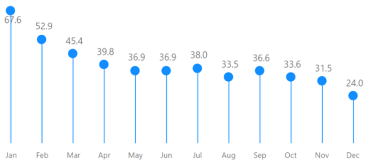
- Lollipop
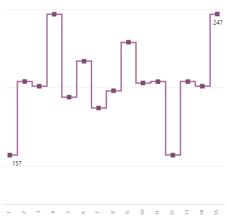
- Line
- Spline
- Stepped Line
- Area
- Stepped Area
- Area Spline
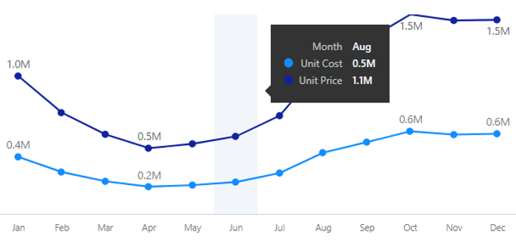
- Dual Axis
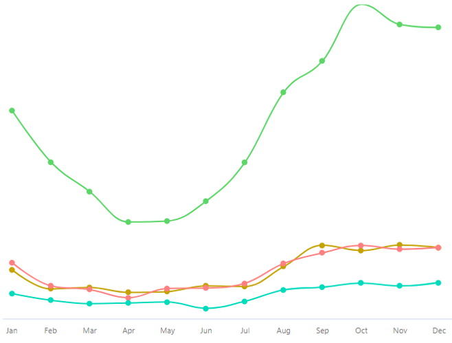
- Multi-Axis
- Combo Chart
- Customizable Combo Chart
- Charts with a Reference Line
- Charts with a Reference Band
- Stacked Column
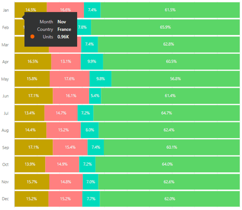
- Stacked Percentage Column
- Stacked Bar
- Stacked Percentage Bar
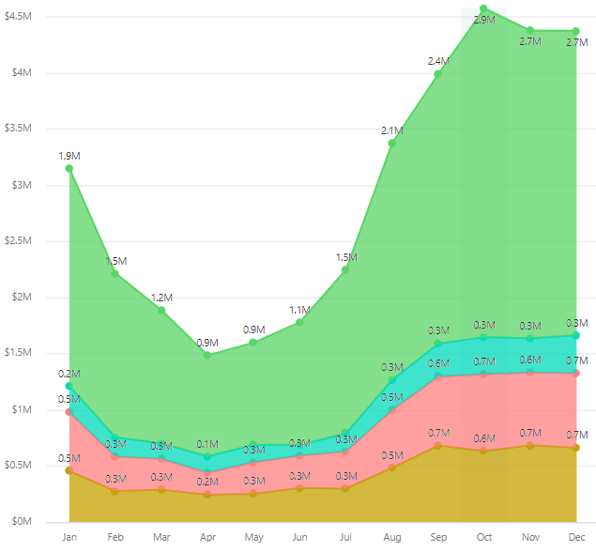
- Stacked Area
- Stacked Percentage Area
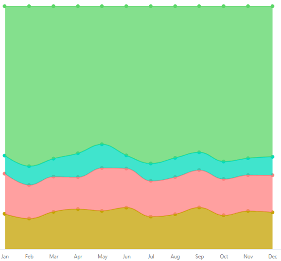
- Stacked Spline
- Stacked Percentage Spline
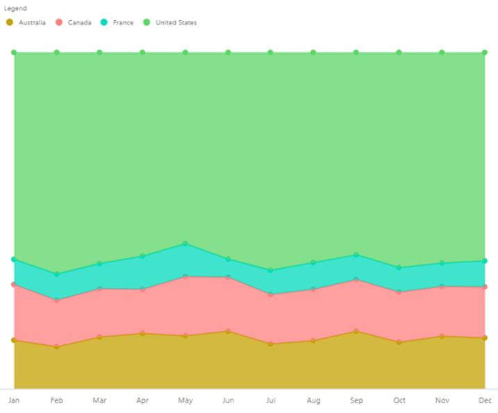
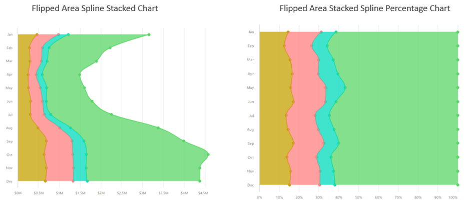
- Flipped Area Charts
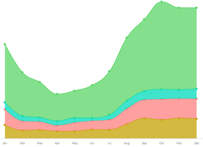
- Flipped Area Spline Charts
Chart Configurations – Visual Representation
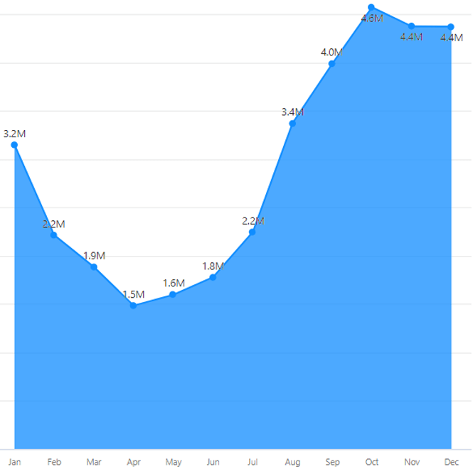
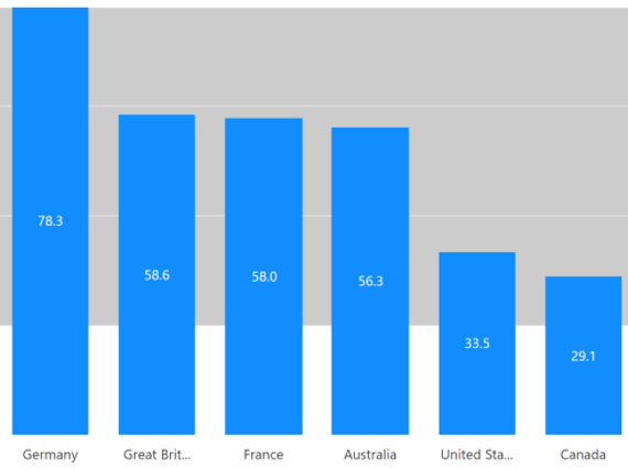
- Column
2. Bar
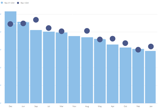
3. Lollipop
4. Line
5. Spline
6. Stepped Line
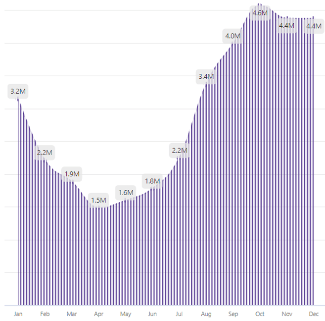
7. Area
8. Stepped Area
9. Area Spline
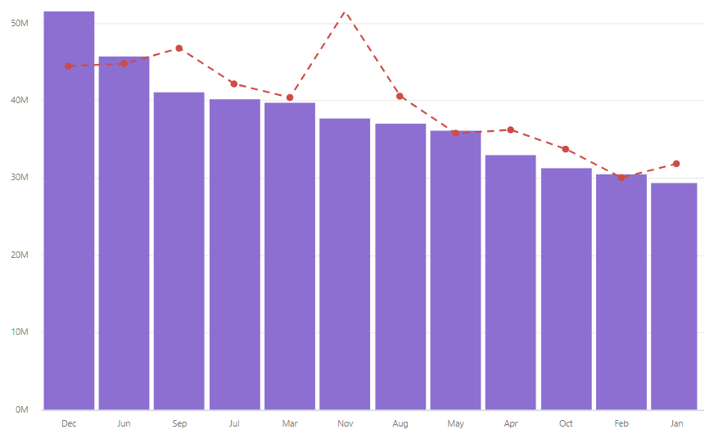
10. Combo Chart
11. Customizable Combo Chart
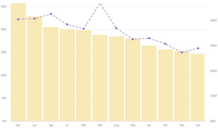
12. Dual Axis
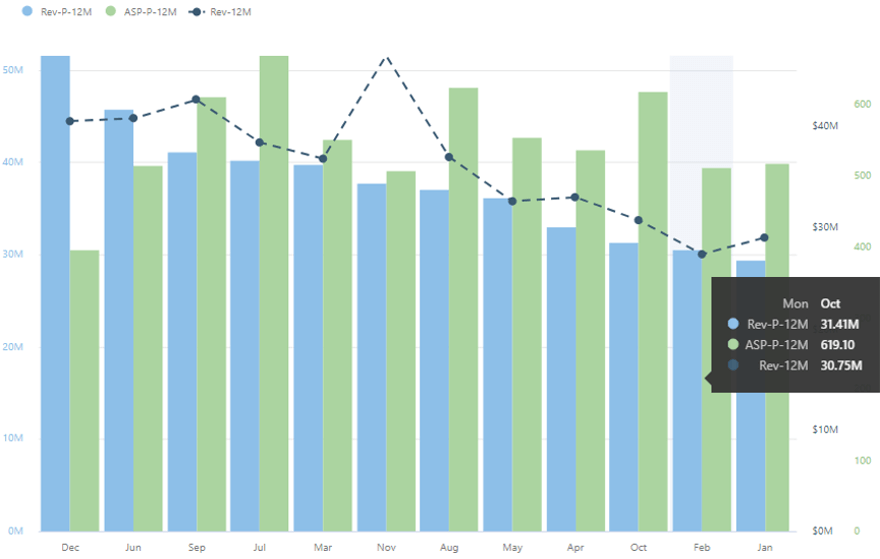
13. Multi Axes Chart
14. Charts with Reference line
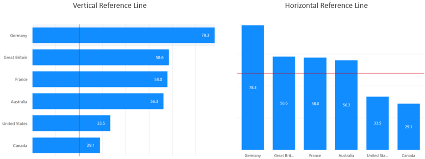
15. Charts with Reference Band
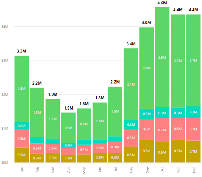
16. Stacked Column
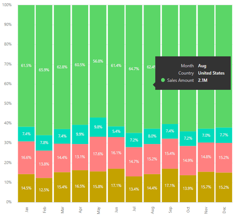
17. Stacked Percentage Column
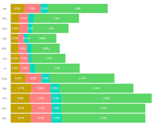
18. Stacked Bar
19. Stacked Percentage Bar
20. Stacked Area
21. Stacked Percentage Area
22. Stacked Spline
23. Stacked Percentage Spline
24. Flipped Area Charts

25. Flipped Area Spline Charts
***
To get the latest version of the custom visual, click here.
You can take a look at the other advanced custom visuals by xViz here.
![Latest Features of xViz Multi Axes Chart in Power BI [v1.1.5]](https://xviz.com/wp-content/uploads/latest-features-of-multi-axis-chart-in-power-bi-150x150.png)