This blog is part of the Multi Axes Blog Series
In this blog, we will be looking at some of the latest feature additions to the xViz Multi Axes Chart v1.1.5 and how they empower better reporting in Power BI.
What’s New – Summary
- Annotation
- New Utility Menu
- Stacked Chart Enhancements
- New Chart Options
- Data Label Customization
- Individual Series – Label Formatting
- Axis Label Customization
- Marker Customization for Line, Area, and Lollipop
- Time Series Capabilities
- Breadcrumb
- Series Visibility
- Series Ordering & Auto Series Order
- Tooltips
What’s New – Description
- Annotations
Annotations provide context to enhance your storytelling experience with textual call outs and drive attention to important areas. Annotations help communicate one’s ideas effectively by drawing attention to the marked areas with different colored icons and arrows. The annotation feature supports 2 types of annotations-
- Datapoint – Pinpoint a data point with the ability to add any data value (Category or measures) as part of the annotation
- Canvas – Annotations made on chart plot area/ background
Apart from this, the xViz Annotation Feature supports different display options –
- Text only
- Icon Only
- Text+ Arrow
- All
![Latest Features of xViz Multi Axes Chart in Power BI [v1.1.5]](https://xviz.com/wp-content/uploads/latest-features-of-multi-axis-chart-in-power-bi-1.png)
Runtime Deviation:
Inspired from xViz Waterfall Chart, the runtime deviation option helps you analyze the difference between two columns at runtime. You can configure to display both the variance and variance% or either one of them from the Utility Menu tab in the additional property sheet.
![Latest Features of xViz Multi Axes Chart in Power BI [v1.1.5]](https://xviz.com/wp-content/uploads/latest-features-of-multi-axis-chart-in-power-bi-2.gif)
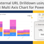
External URL [100+ votes]:
A common request from customers is to drill through external URLs from visuals, such that they can select a data point on the chart and launch an external URL dynamically.
For example, let’s say you have a chart displaying sales by the region where you would like to select a region and open a detailed report which lies in an external system (like SSRS, SAP WebI, etc..) or external websites. With the help of an external URL you can dynamically pass the parameter, ‘Region’ to dynamically created external URLs.
![Latest Features of xViz Multi Axes Chart in Power BI [v1.1.5]](https://xviz.com/wp-content/uploads/latest-features-of-multi-axis-chart-in-power-bi-3.gif)
Drag select actions – Zoom, Lasso, Inverse Lasso –
- Zoom – Zoom into charts
- Lasso – The Lasso operation allows selecting multiple data points together by clicking and dragging over the chart to create a rectangular lasso. You can use these lassoed data points to filter other report elements
- Inverse Lasso – Reverse operation of Lasso. All the items except for the ones lassoed (lie under the rectangular lasso) will be selected
![Latest Features of xViz Multi Axes Chart in Power BI [v1.1.5]](https://xviz.com/wp-content/uploads/latest-features-of-multi-axis-chart-in-power-bi-4.gif)
3. Stacked Chart Enhancements
- Display Column Totals for Stacked chart [1500+ votes]
The xViz Multi-Axis Custom Visual helped address another key idea place requirement i.e. to show columns Totals for stacked charts. In the case of clustered stacked Column/ Bar Charts, you can also choose the series to display column totals.
![Latest Features of xViz Multi Axes Chart in Power BI [v1.1.5]](https://xviz.com/wp-content/uploads/latest-features-of-multi-axis-chart-in-power-bi-5.png)
Styling – Patterns for Stacked Chart
You can now style each legend item by setting the pattern individually in case of stacked charts. For instance, in the below example only ‘center’ has been applied a pattern styling
![Latest Features of xViz Multi Axes Chart in Power BI [v1.1.5]](https://xviz.com/wp-content/uploads/latest-features-of-multi-axis-chart-in-power-bi-6.png)
Color for each stacked segment
With the new release, you will now be able to provide color for each stacking member for all stacked charts as part of the xViz Multi-Axis Custom Visual
![Latest Features of xViz Multi Axes Chart in Power BI [v1.1.5]](https://xviz.com/wp-content/uploads/latest-features-of-multi-axis-chart-in-power-bi-7.png)
4. New Chart Options
Following are the new chart that has been added in this release –
![Latest Features of xViz Multi Axes Chart in Power BI [v1.1.5]](https://xviz.com/wp-content/uploads/latest-features-of-multi-axis-chart-in-power-bi-8.png)
![Latest Features of xViz Multi Axes Chart in Power BI [v1.1.5]](https://xviz.com/wp-content/uploads/latest-features-of-multi-axis-chart-in-power-bi-9.png)
5. Data label customization
- Data Label customization options specific to series
The xViz Multi Axes Visual has been beefed up with you some unique data label customization options which are specific to each series type. This means that you can individually control the data labels settings for each series separately. As seen from the below image, the label format, font color, and background color for target value are styled differently from the actual sales.
![Latest Features of xViz Multi Axes Chart in Power BI [v1.1.5]](https://xviz.com/wp-content/uploads/latest-features-of-multi-axis-chart-in-power-bi-10.png)
Data Label Customization for Line (Line, Spline, and Stepped Line) – The newly added format options selectively display the data label based on different rules, thereby focusing on the key data points and decluttering the chart with multiple series. The different data label format options are as follows:
- Last Only
- First and Last
- Max and Min
- Limited Datapoints – Max and Min + Start and End
- All Datapoints
![Latest Features of xViz Multi Axes Chart in Power BI [v1.1.5]](https://xviz.com/wp-content/uploads/latest-features-of-multi-axis-chart-in-power-bi-11.gif)
Data Label customization for Column/ bar charts – Choose from different placement options for better display of data labels
- Outside
- Inside- Top / Left
- Inside- Center
- Inside – Bottom / Right
![Latest Features of xViz Multi Axes Chart in Power BI [v1.1.5]](https://xviz.com/wp-content/uploads/latest-features-of-multi-axis-chart-in-power-bi-12.png)
Data label customization for stacked charts – the xViz Multi-Axes charts now provides an option to display the stacked chart data labels as either actual value or percentage
![Latest Features of xViz Multi Axes Chart in Power BI [v1.1.5]](https://xviz.com/wp-content/uploads/latest-features-of-multi-axis-chart-in-power-bi-13.png)
6. Number formatting Specific to each Series
Along with data label formatting, you can also customize the number format for each series. In the below example, you would notice different number format- prefix/ suffix, decimal place and scaling for Sales, Quantity and Avg Selling price
![Latest Features of xViz Multi Axes Chart in Power BI [v1.1.5]](https://xviz.com/wp-content/uploads/latest-features-of-multi-axis-chart-in-power-bi-14.png)
7. Axis Formatting
- Axis Break
As the name suggests, the Axis Break property breaks the Y-Axis. It helps scale the difference between the values for better readability, especially when the values are very close to each other and hard to notice any difference between them. You can also customize the amount of scaling you need with the help of Axis break percentage property
Please note that the Axis break property is only available for single Axis charts.
![Latest Features of xViz Multi Axes Chart in Power BI [v1.1.5]](https://xviz.com/wp-content/uploads/latest-features-of-multi-axis-chart-in-power-bi-15.png)
Axis Label Display
Quite often, we come across scenarios where the axis labels tend to overlap each other and get cut off due to limited real estate or long labels, thereby making it hard to read the chart. To overcome these issues, the xViz Multi-Axis Custom Visual provides various Axis label customization options which are as follows:
- Word wrap
- Nth label – Skip labels to declutter
- Stepped labels – Display Labels in Steps format to accommodate long labels
- Rotate Label– Rotate labels to the desired angle or better viewing
![Latest Features of xViz Multi Axes Chart in Power BI [v1.1.5]](https://xviz.com/wp-content/uploads/latest-features-of-multi-axis-chart-in-power-bi-16.gif)
8. Log Axis
Support for Log Axis in only for single series and single-axis
![Latest Features of xViz Multi Axes Chart in Power BI [v1.1.5]](https://xviz.com/wp-content/uploads/latest-features-of-multi-axis-chart-in-power-bi-17.png)
9. Marker Customizations
Customize marker shape, size, and color for the line, area, and lollipop charts.
![Latest Features of xViz Multi Axes Chart in Power BI [v1.1.5]](https://xviz.com/wp-content/uploads/latest-features-of-multi-axis-chart-in-power-bi-18.gif)
10. Time Series Capabilities
The xViz Multi Axes chart now supports time series analysis use cases where the X-Axis automatically scales to accommodate time series data
![Latest Features of xViz Multi Axes Chart in Power BI [v1.1.5]](https://xviz.com/wp-content/uploads/latest-features-of-multi-axis-chart-in-power-bi-19.png)
![Latest Features of xViz Multi Axes Chart in Power BI [v1.1.5]](https://xviz.com/wp-content/uploads/latest-features-of-multi-axis-chart-in-power-bi-20.png)
12. Series Reordering
You can either choose the series order manually or let the visual auto-enable series reordering for you. For example, with auto series ordering line and area charts will always be visible in front of the column chart for better visibility. However, you can change this order by disabling the auto series ordering and move the area chart behind the column chart as seen below.
![Latest Features of xViz Multi Axes Chart in Power BI [v1.1.5]](https://xviz.com/wp-content/uploads/latest-features-of-multi-axis-chart-in-power-bi-21.png)
13. Series Visibility
With too many series being visible at the same time, the chart tends to get cluttered and difficult to read. The xViz Multi-Axes chart, with the help of series visibility, provides the option to display all the series in the chart but disables the ones not need during the default view. In the below example, quality and count of orders for 2 years are shown but by default, only values for 2014 are visible and rest can be enabled during runtime by clicking on the legends if needed.
![Latest Features of xViz Multi Axes Chart in Power BI [v1.1.5]](https://xviz.com/wp-content/uploads/latest-features-of-multi-axis-chart-in-power-bi-22.png)
14. Tooltip Enhancements
- Shared Tooltips – Shared tooltips are native to most of the xViz charts which helps display a quick summary of all the values for a given category member together instead of individually hovering over each value for the given category member separately. In the below example, you would be able to view Revenue, Quantity sold, and average selling price for a given brand.
![Latest Features of xViz Multi Axes Chart in Power BI [v1.1.5]](https://xviz.com/wp-content/uploads/latest-features-of-multi-axis-chart-in-power-bi-23.png)
Stacked chart tooltips – The Multi-Axis chart provides additional capabilities for special scenarios like stacked charts, where you can also view the totals for each value axis along with the split up for each legend item. This makes it easier for business to understand the contribution of each of the segment towards its total
![Latest Features of xViz Multi Axes Chart in Power BI [v1.1.5]](https://xviz.com/wp-content/uploads/latest-features-of-multi-axis-chart-in-power-bi-24.png)
***
The xViz Multi Axes Chart is a part of the xViz Pro Suite, check out all the resources for Multi Axes Chart including other blogs, and FREE Power BI Desktop Version!
Check out all the Power BI Visuals in the xViz Pro Suite here