Note: This blog addresses some features of the custom visual that will be available in the App Source in Sep 2019. To get this latest build, reach out to us here.
This blog is a part of the Multi Axes Blog Series.
Use Case for Multi Axes Chart
When you deal with data of different granularities, e.g. Revenue (in millions), Average Price (say, approx. $1000) and Profit Margin (in %), it’s not possible to fit them in one or even two axes. Cases such as these call for a Multiple Axis Chart.
Let’s take a quick look at some of the key features of the Multiple Axes Chart custom visual for Microsoft Power BI
Key Features- Summary
- Ability to select multiple Y axes
- Choice of Several Series types
- Conditional Formatting
- Conditional Formatting Legend
- Lasso & Reverse Lasso Selection
- Show additional series in Tooltip
- Plot Lines, Bands, Standard Deviations & more
- Customize # of Data Series displayed
- Series Pattern and Color
Key Features – Description
- Ability to select Multiple Y-Axes
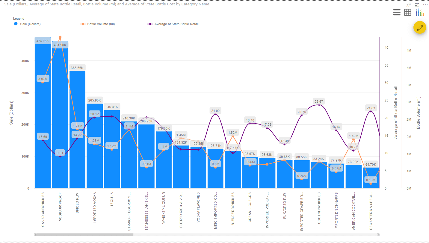
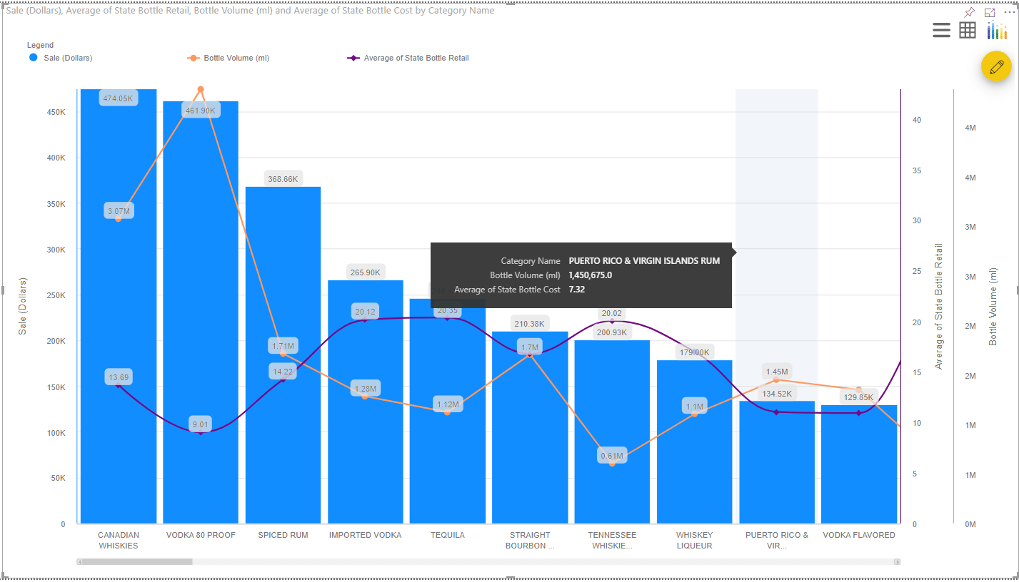
The Multiple Axes Chart that comes with the xViz enterprise suite gives you the ability to have up to 5 axes. An example with three axes is shown below.
2. Choice of Several Series types
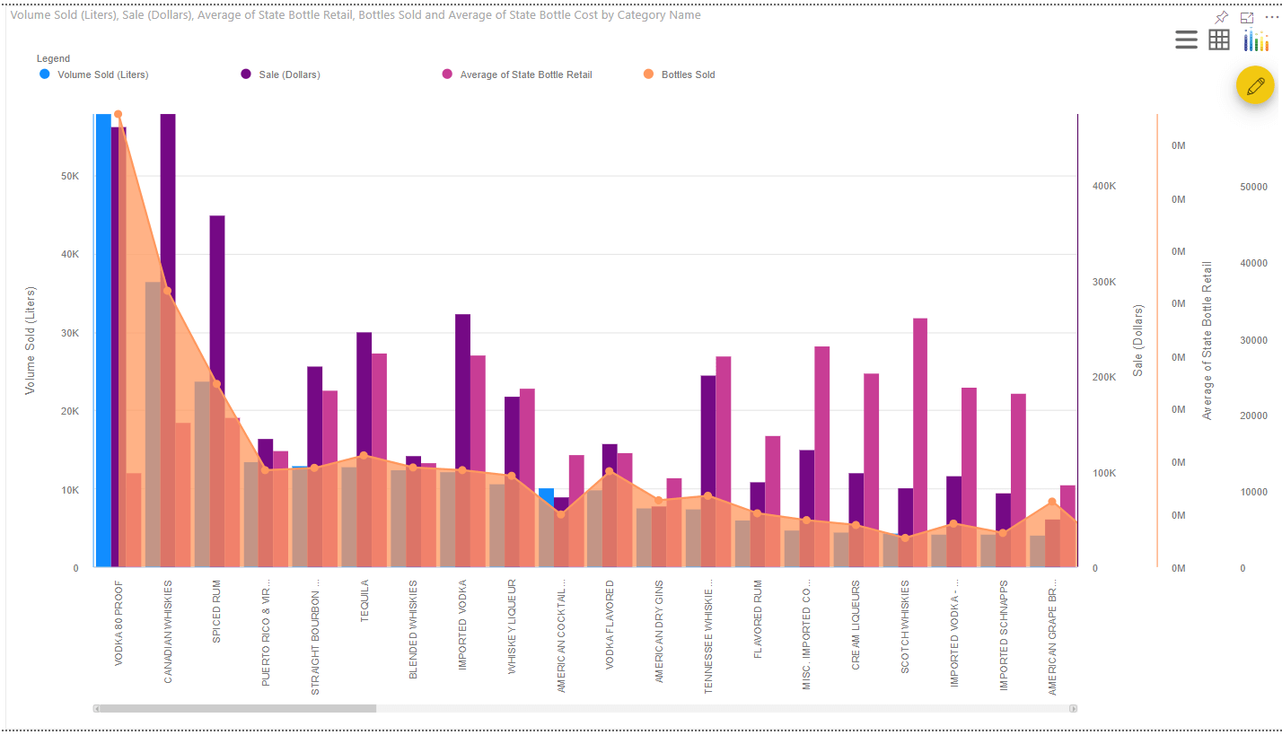
The Multiple Axes chart provides 10 options for choosing series such as line, column, area, spline, stacked column, stacked area, etc.
3. Conditional Formatting
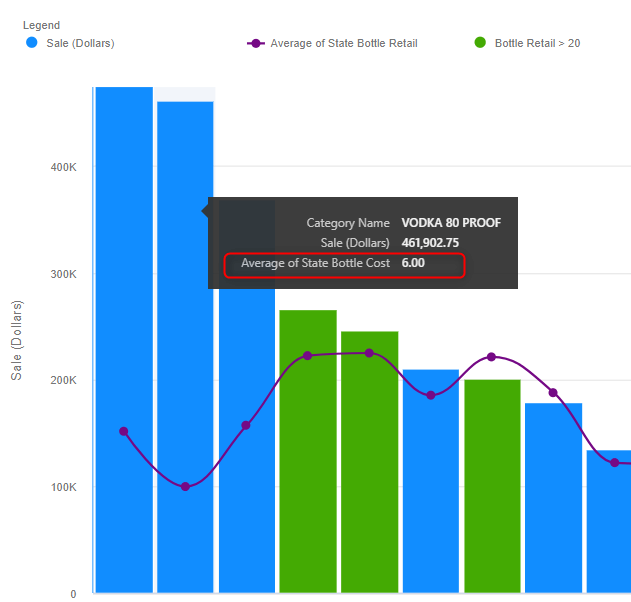
The excel-like Conditional Formatting option allows you to highlight data that meets specific conditions.To create conditional formatting rules, select the icon that opens the advanced editor. In this example below, we have created a conditional formatting on ”Sales (Dollars)” series based on a rule that takes into account the value of ”State Bottle Retail Costs”.
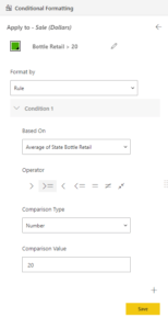
Once you save this rule, you’ll be able to see the all the categories whose Bottle Retail cost is greater than $20 highlighted in green.
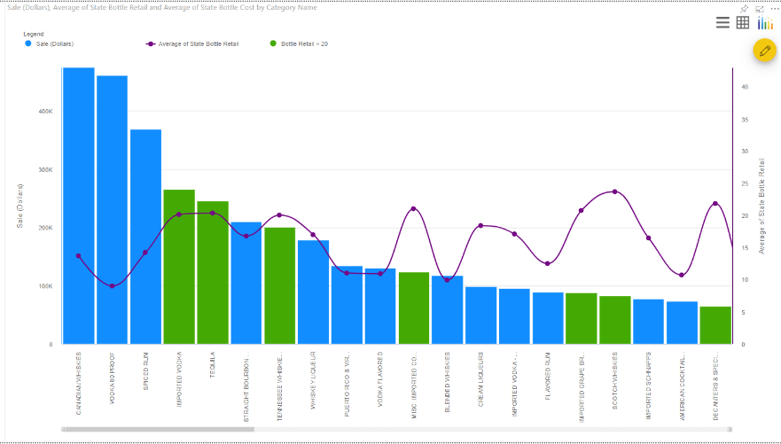
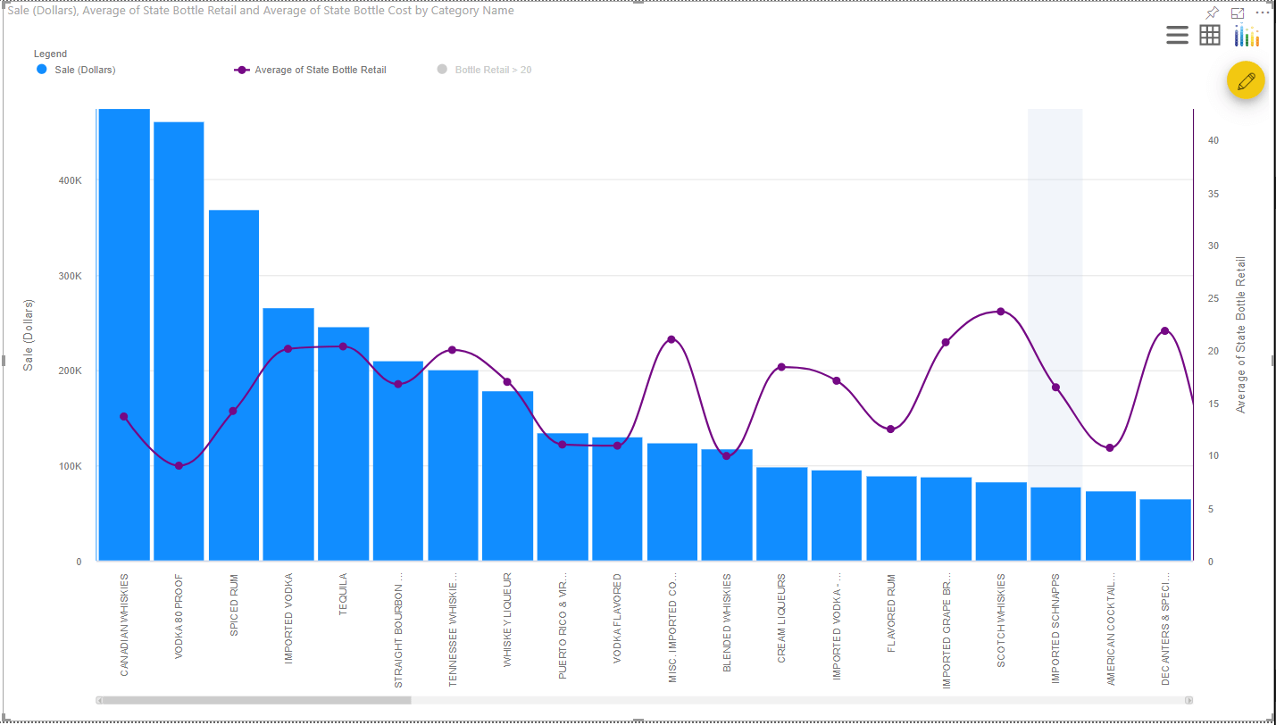
4. Conditional Formatting Legend
This option allows you to display active conditional formatting rules as part of the legend. The user can turn on/off each rule by just clicking on the legend.In the above screenshot, you can see the rule Bottle retail > 20 along with the other members of the legend and once you click on it, the rule will be disabled.
5. Lasso & Reverse Lasso Selection
It allows the user perform include/exclude filter actions.
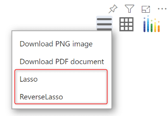
Note:Lasso & Reverse Lasso selection are not available in the Power BI Desktop. They can be accessible only through the Power BI service.
6. Show Additional Series in Tooltip
Sometimes when you display Revenue vs. Expenses, you may also want to get an idea about a third value (such as ‘No. Of customers’). However you may not want to plot them explicitly in the chart.
For cases like this, assign this category ‘# of customers’ to the Tooltip field property, and you would be able to acccess these values in the tooltip.In the example shown below, the chart only plots Category and Sale Dollars, while the avg. Bottle cost is also available in the tooltip.
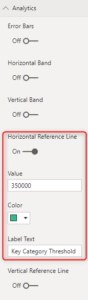
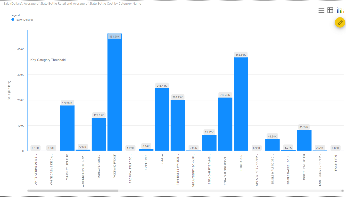
7. Plot Lines, Bands, Standard Deviations & more
The xViz mutliple axes chart allows you to plot static reference lines & bands to track performance against set benchmarks.
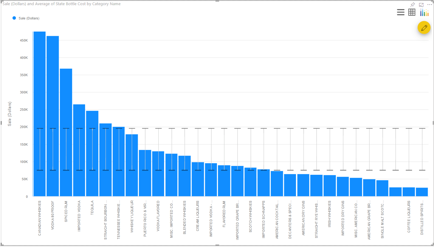
Similarly, you can also track standard deviations. The following visual displays 0.5 standard deviation from the mean for the data provided.
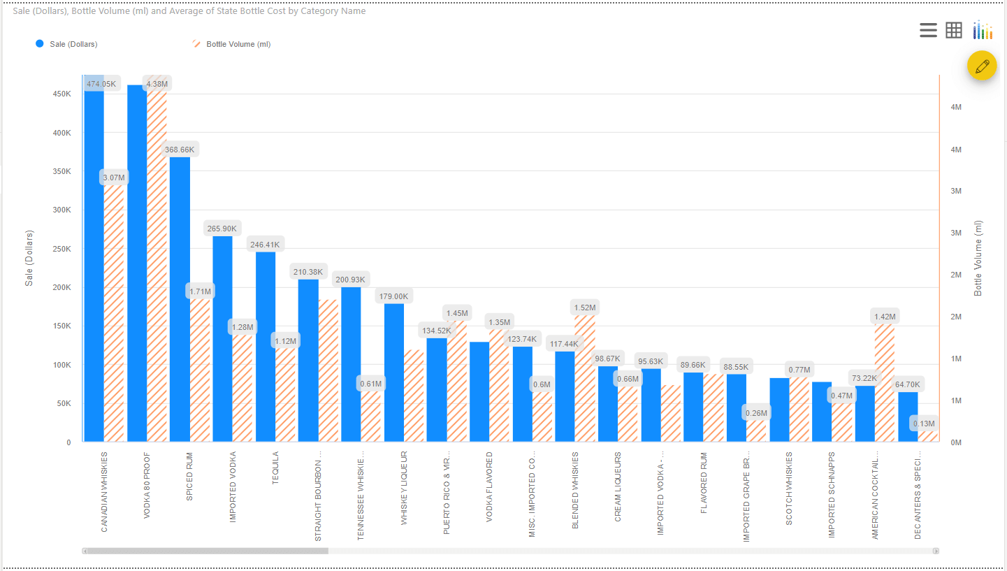
8. Customize # of data series displayed
You can also set the # of data series displayed in a custom visual by default. For example, the following chart shows 10 data series at a time, with the rest accessible through the scroll bar at the bottom.
9. Series Pattern and colors
Colors and Patterns can be added to the custom visual to make it more visually appealing.
We have covered the key features of xViz Multiple Axes Chart so far but there is more.
***
To get the latest version of the custom visual, reach out to us today here.
You can take a look at the other advanced custom visuals by xViz here.