Clear and impactful visualizations are an invaluable tool for transforming complex datasets into actionable insights. The latest version of xViz Gantt Chart delivers even greater clarity and flexibility, empowering users to make informed decisions with confidence. This update includes key feature enhancements that improve data visualization, interactivity, and reporting accuracy, making it easier to analyze project timelines at a glance.
In this blog post, we’ll walk through the latest enhancements and how they elevate reporting in Power BI.
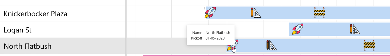
1. Support for custom images & icons in Milestones
Restrictions on predefined shapes in the visual configuration while plotting Gantt Charts in Power BI is a thing of the past. Now, you can upload any icon or image of your choice — company logos, team symbols, or unique graphics — to perfectly match your project’s context. Here is an example:
Custom Icons used to represent Milestones on the bars in xViz Gantt Chart
Tailor milestone markers help to highlight different event types — like a product launch icon, approval stamp, or team avatar — for quick, intuitive understanding. Move beyond standard shapes by adding personalized images that draw attention to key events and make your Gantt chart more engaging. It helps stakeholders instantly grasp the significance of each milestone.
2. Custom format for date/time labels in timeline headers
You can now format the date/time labels in the timeline headers of your Gantt Chart. With this flexibility, you can customize the Gantt Chart date/time context to your preferences. For example, adding the prefix “FY” in Year labels to demonstrate Fiscal Years, or showing week numbers as “W1, W2, W3…” instead of the first day of the week in the week labels or even creating combined labels with different date/time units like Year and month (e.g.: April 2024, May 2025)
Read more about this configuration on our technical documentation here.
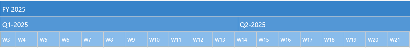
Fiscal Year, Quarter-Year and Week numbers in xViz Gantt Timeline Header
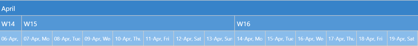
Month, Week numbers and Date with week day name in xViz Gantt Chart Timeline Header
Here is how you can configure the formats as per your dashboard user preferences.
3. Show tooltip on Milestones
One of the most requested features has been the ability to show Power BI tooltips for individual milestones. With the new "Individual Tooltip" option, tooltips now appear separately for bars and milestones, while hovering over data rows—outside of bars and milestones—shows no tooltips.
Tooltip on milestones in xViz Gantt Chart
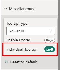
Option enabling Tooltip on Milestones
This option helps stakeholders to understand the exact context of each milestone or task without overlapping information. It makes it easier to interact with complex project timelines by isolating tooltips for bars and milestones, improving user focus. It also reduces clutter by showing tooltips only where relevant, keeping the chart clean and preventing unnecessary pop-ups when hovering over empty areas.
4. Show conditional formatting rule in the Legend
Now you can also show the colors, shapes, and icons driven by conditional formatting rules in the Legend:
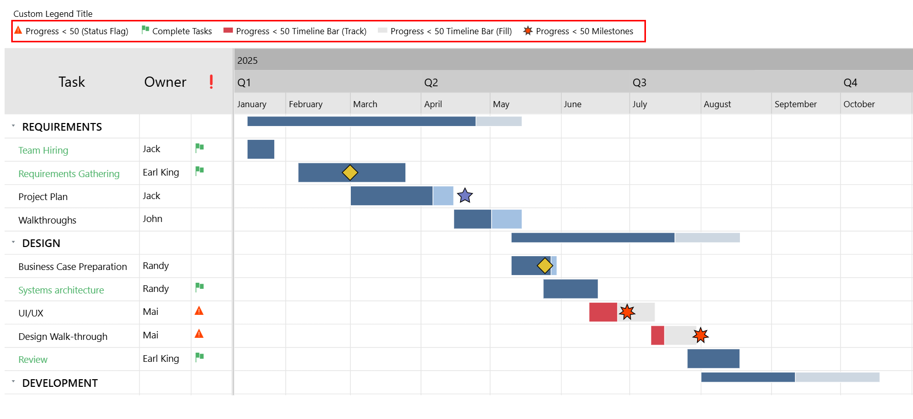
Conditional Formatting rule indicator in xViz Gantt Chart Legend
Quickly understand what each color or symbol represents, making it easy to interpret project statuses, priorities, or risk levels at a glance. It helps stakeholders spot patterns, like overdue tasks or milestones at risk, without digging through data. It reflects your conditional formatting logic directly in the legend, aligning with your project’s unique rules and workflows.
Learn more about this option here.
5. Ability to customize the title of the Legend
You can now add and customize the title of the Legend shown for Milestones and Conditional Formatting rules.
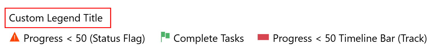
Customized Legend Title in xViz Gantt Chart
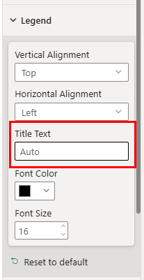
Option where customized Legend title must be provided
Use meaningful titles that match your project's terminology, helping stakeholders instantly understand what the legend represents. Tailor titles to highlight key metrics — like "Task Status," "Risk Levels," or "Phase Indicators" — making the chart more intuitive.
Level up your enterprise timeline reporting with xViz Gantt Chart (Certified) for Power BI today and try it for free on Microsoft AppSource.