Based on our customers’ feedback, we are proud to introduce this host of feature updates in the latest release, designed to further enrich a seamless project management experience.
Feature Update – Summary
- Customizable Timeline Range
- Option to Change the Week Start Day
- Indentation Option
- Option to Change the Color of the Selected Row
- Option to Change the Utility Menu Icon Color
Latest Features – Description
1. Customizable Timeline Range
Until now, the timeline scale range in the xViz Gantt Chart would automatically adjust based on the earliest start and latest end date/times from your data. While this dynamic scaling was helpful, we understood the need for further customization options to better suit your unique project requirements.
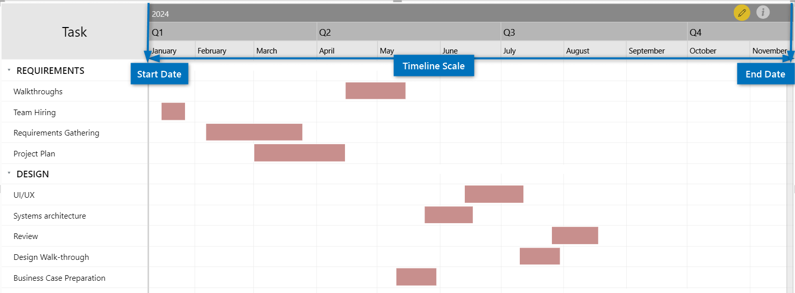
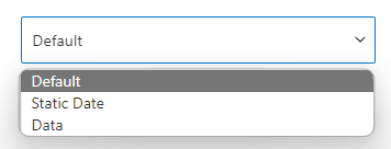
You can now customize the start and end limits of the Timeline scale in two ways:
- Static values – Set static date values for start and/or end limits of the Timeline scale.
- Dynamic values – Utilize measures to provide dynamic values for the start and/or end limits.
Both the Start and End Dates can be configured using these options, offering you unprecedented flexibility in tailoring your timeline scale to your specific needs.
For example, you can easily configure the timeline to display only the current year by utilizing DAX measures that dynamically return the current year start and end dates.
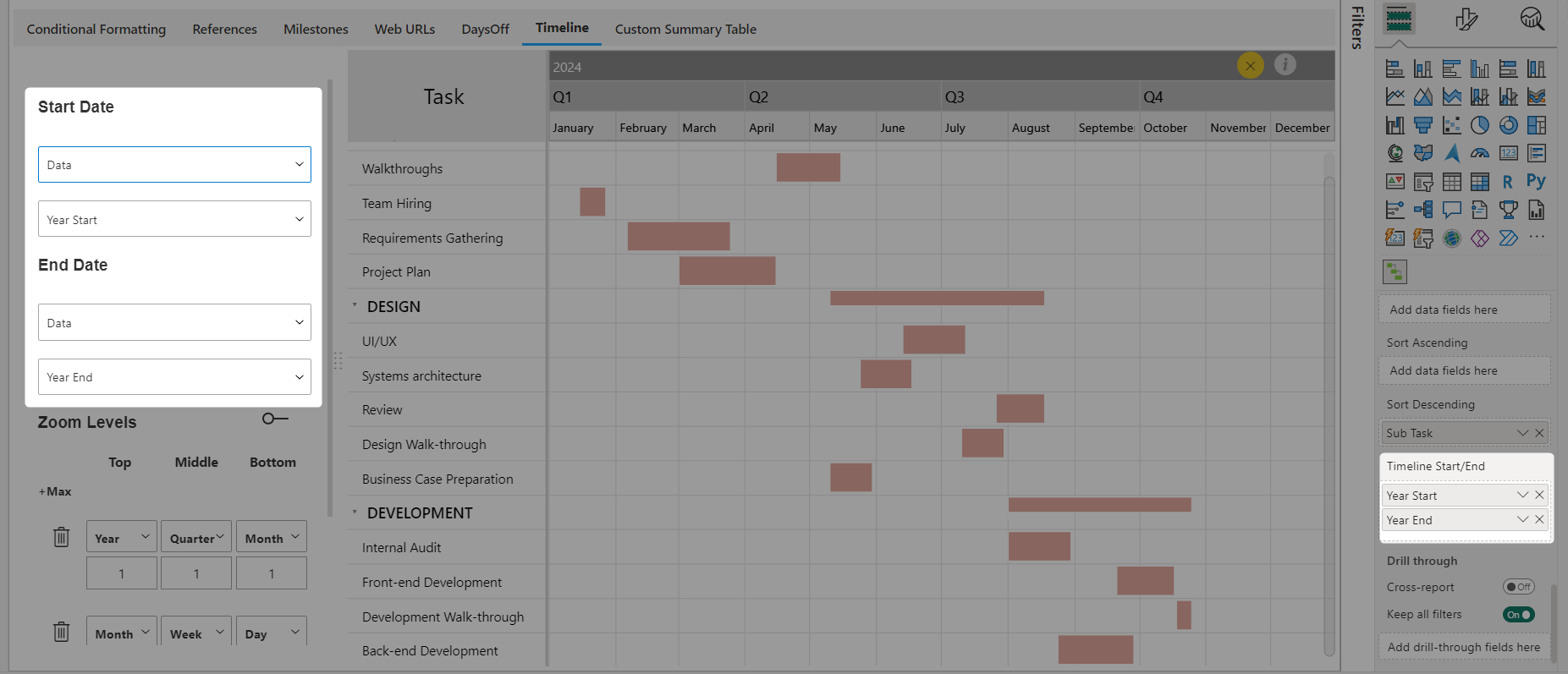
In the above example, “Year Start” and “Year End” are DAX measures that dynamically return the current year start and end dates respectively.
Furthermore, this feature allows the timeline scale to remain fixed even after applying filters, maintaining a consistent view of your project timeline regardless of any applied filters.
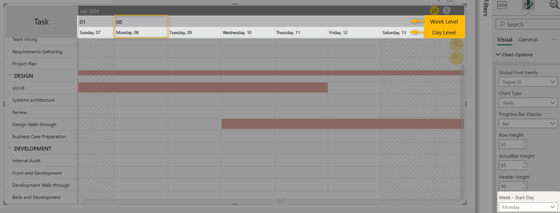
2. Option to Change the Week Start Day
The xViz Gantt Chart offers a versatile timeline feature with three levels of timeline granularity. Each level can be configured to represent any of the eight units of time, like Year, Quarter, Month, Week, Day, etc. For more information on these timeline levels, refer to our detailed guide on the Multi-level Timeline in the xViz Gantt Chart for Power BI.
In the xViz Gantt Chart, the "Week" level displays the date corresponding to the starting day of the week. Historically, this start day defaulted to Sunday. However, recognizing the diverse global practices and regional variations in week structures, we've introduced a new feature: the ability to customize the week's starting day.
With this update, you can now select any of the seven days of the week as the starting day. As a result, the "Week" level will dynamically adjust to display the weekday date chosen as the start of the week. This enhancement offers greater flexibility to align your Gantt Chart with your specific working week preferences.
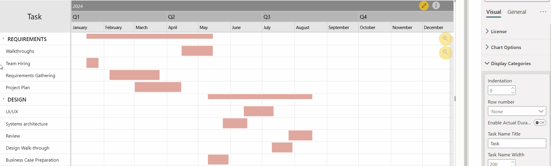
3. Indentation Option
The xViz Gantt Chart provides a dynamic and interactive hierarchical view of project timelines. With our latest update, we're introducing a new customization option to enhance the appearance of this hierarchy: indentation control.
Report developers now can precisely control the level of indentation applied to each hierarchy level. This feature allows for finer adjustments, ensuring that the hierarchy's visual presentation aligns perfectly with your project's structure and layout preferences.
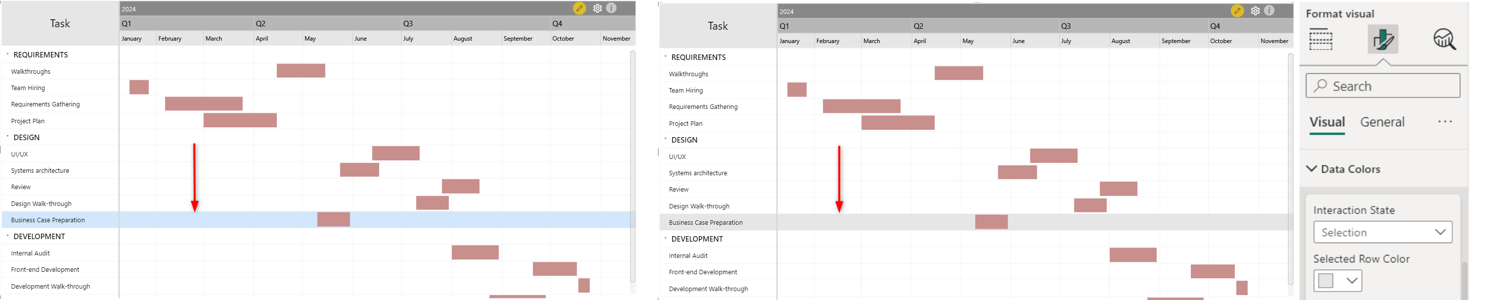
4. Option to Change the Color of the Selected Row
In the xViz Gantt Chart, when you select a data point or row, it triggers cross-filtering and cross-highlighting, visually distinguishing the selected row with a background color. Previously, this background color was fixed.
Now, we're introducing a new option that allows you to configure the background color of the selected row according to your preferences. This customization option gives you greater control over the visual presentation of your data, ensuring that the selected row stands out distinctly in your reports.
5. Option to Change the Utility Menu Icon Color
In response to customer feedback, we've introduced a minor enhancement in our recent updates. The Utility Menu (gear icon on the top right) in the xViz Gantt Chart offers a convenient set of interactive options for report end-users. In our latest update, we have introduced a new customization feature to further enhance the visual aesthetics of your charts: the ability to customize the color of the Utility Menu icon.
This enhancement allows you to harmonize the icon color with your overall report theme, providing a seamless and cohesive look and feel.
We believe these enhancements will empower you to create even more insightful and visually compelling project timelines. Try out the latest version of the xViz Gantt Chart from Microsoft AppSource today and revolutionize how you visualize and manage your projects in Power BI!