Note: This blog addresses some features of the custom visual that will be available in the App Source in Feb 2020. To get this latest build, reach out to us here.
This blog is a part of the Waterfall Blog Series.
Waterfall Charts are powerful visuals that effectively display the cumulative effect of sequential positive and negative values contributing to the final total. They are also known as cascade or bridge charts and are very popular in the financial world. Some of the common use cases for waterfall charts are for visualizing the P&L statements, cash flows, expenses management, etc.
You can also download a sample PBIX file of the Waterfall Chart to get an overview of the visual.
Let’s take a quick look at some of the key features of the xViz Waterfall Chart custom visual for Microsoft Power BI.
Key Features – Summary
- Variance Analysis with Drilldown
- Intermediate Sum
- Breakdown Analysis
- Runtime Deviation Bar
- Breadcrumb
- Axis Break
- Data Label customization
- Context Menu
- Horizontal and Vertical Orientation
Key Features – Description
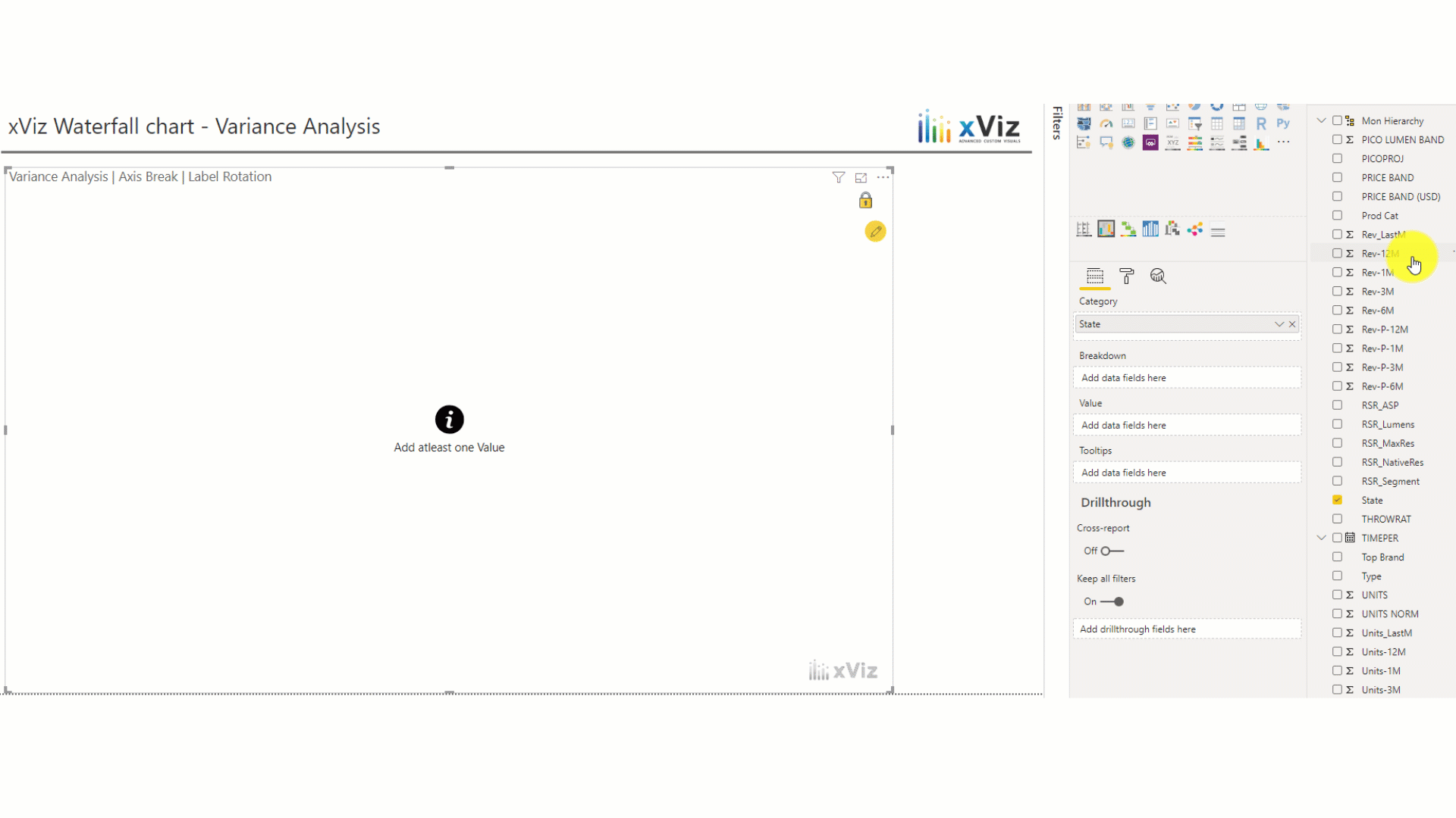
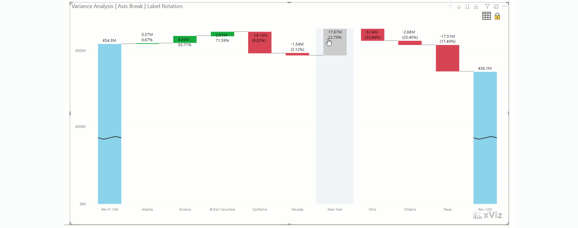
- Variance Analysis with Drilldown
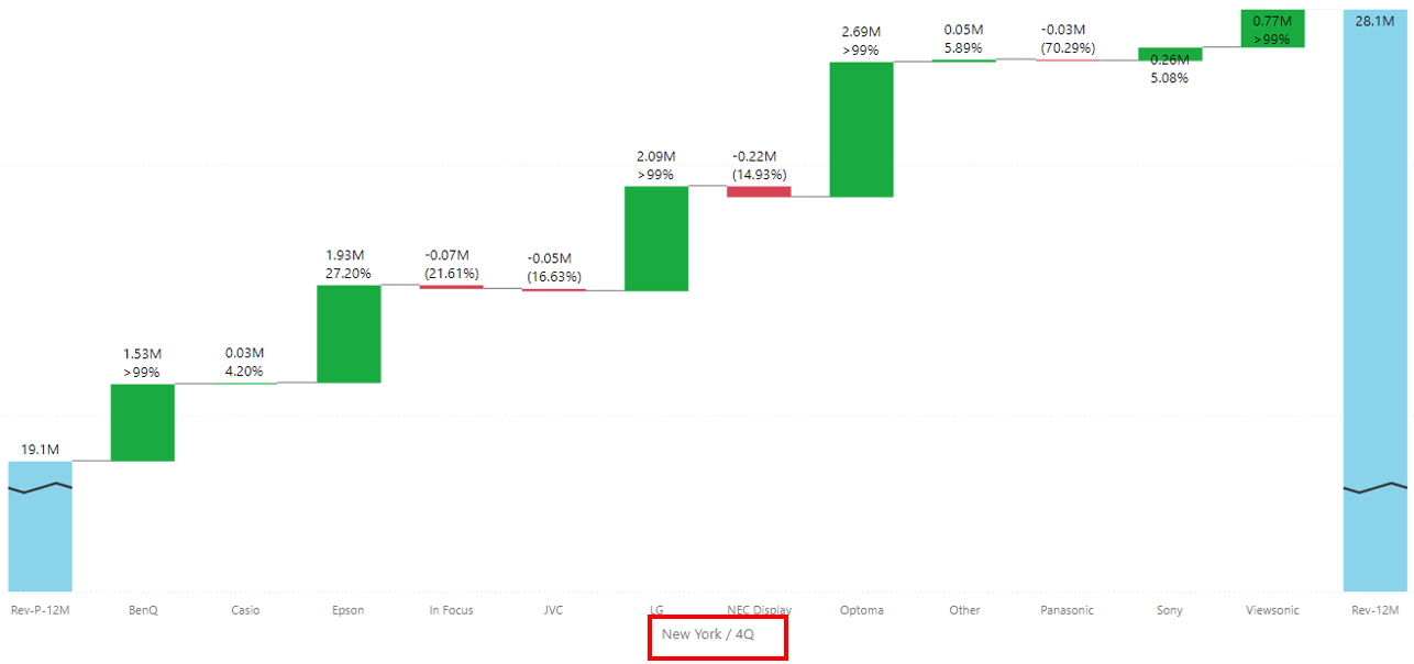
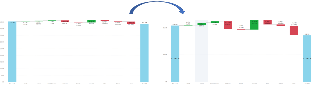
The xViz Waterfall Chart Custom Visual supports one of the most important use cases i.e. variance analysis. One can easily visualize the root cause of a problem by drill down to the lowest level and switching to a summary table in case of more details.
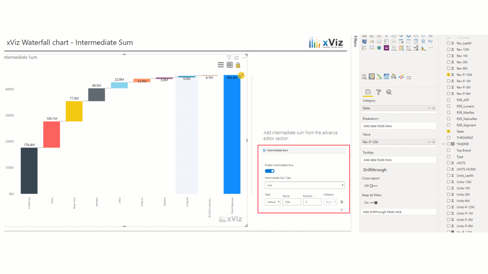
2. Intermediate Sum
For certain use cases, it’s important to display a column as an intermediate sum instead of an additive column (default Waterfall Chart behavior). You can either assign a certain column to be a total column from the data source Display totals or subtotals at any point within the chart.
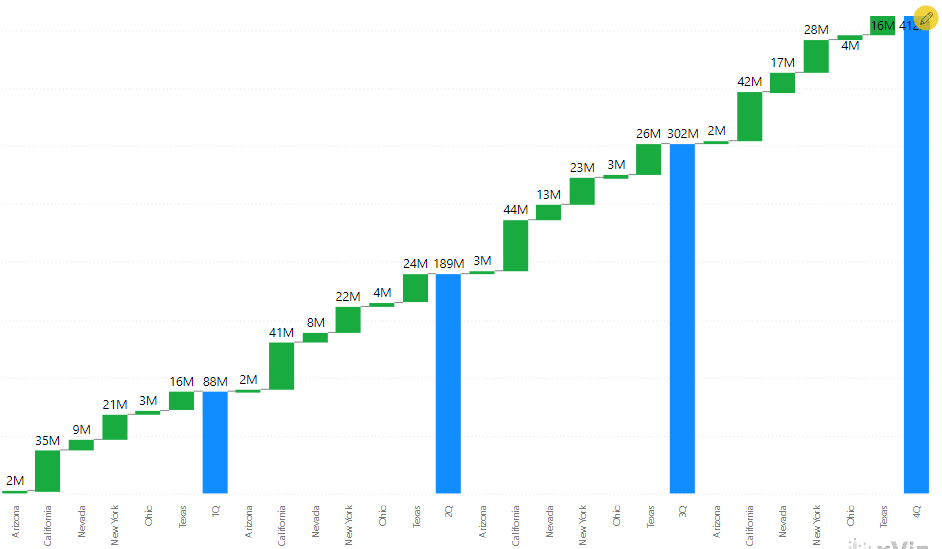
3. Breakdown Analysis
The xViz Waterfall Chart supports breakdown analysis – subdivide the chart by a category field to further analyze the contribution by each segment. The two different types of breakdown scenarios are as follows:
- Simple Breakdown
- Running Sum Breakdown
Simple Breakdown – Similar to the Power BI Waterfall Chart breakdown scenario, where each of the breakdown categories is displayed as a variance. For example, each state represents the variance between the two time periods (the difference between Q1 and Q2 revenue)
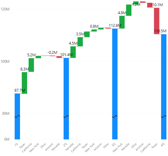
Running Sum – The breakdown field displays as a running aggregate to give a grand total. In the below example, each state adds up to the quarterly sales and each quarter adds up to the grand total. Thus, displaying the total revenue at each point of time.
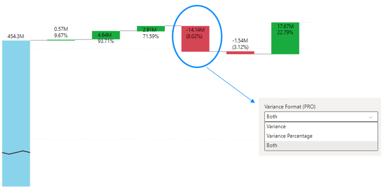
4. Runtime Deviation Bar
This helps you analyze the deviation between any two columns at runtime. You can choose to display both the difference and difference % or either one of them.
Please note: In cases, where you would like to drill down as well as analyze the deviation between the columns, the deviation property will take precedence. The deviation property can be disabled at runtime using the context menu to enable the drill-down features.
6. Axis Break
In the case of a variance scenario, the variances tend to be very small and hard to view. The axis break property dynamically scales the Y-axis to get a better view of the variances.
7. Data label Customization
You can customize the variance display to either show actual / percentage value or even both together with the ability to position it inside or outside the chart.
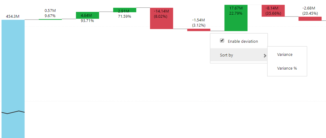
- Custom Sorting: Sort waterfall chart based on Variance and Variance %
- Runtime Deviation: You can either drill down or activate runtime deviation. With this option, you can enable runtime deviation when needed and disable it when you want to drill down.
Note: The context menu option is only available for variance analysis scenarios.
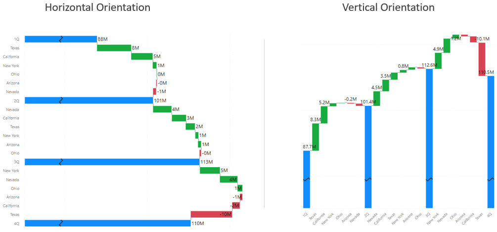
9. Chart Orientation
The xViz Waterfall Chart Custom Visual provides the flexibility to display both as vertical and horizontal.
***
To get the latest version of the custom visual, reach out to us here.
You can take a look at the other advanced custom visuals by xViz here