Marimekko Chart, also known as Mekko chart, is used to analyze two KPIs across two categories. A typical Mekko chart utilizes the width of a column chart to add the information of one more metric.
In the image above, we are visualizing a sample dataset of the Scores of a few US Cities for various Categories in the form of the column heights, while the width of the column for every City indicates the Population of that city.
The xViz Marimekko chart provides a combination of the concept of Mekko charts with the basic charts that we use in our reports, and thereby offers the following variations of the Mekko chart:
- Column Chart
- Stacked Column Chart
- 100% Stacked Column Chart
- Bar Chart
- Stacked Bar Chart
- 100% Stacked Bar Chart
1. Column Chart
Column charts are generally preferred over Bar charts for plotting KPIs across a time scale, to compare the performance of a metric over time.
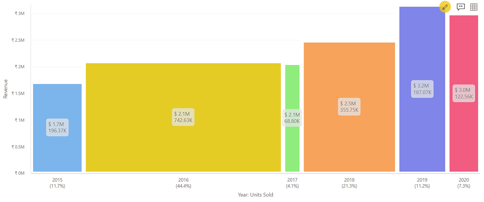
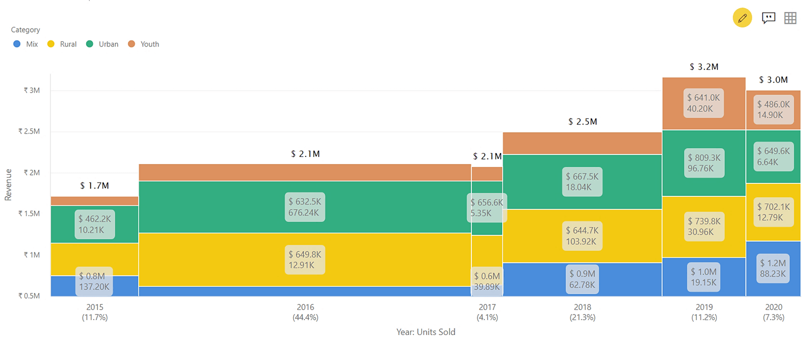
In the image below, we can depict the Revenue for every Year from the height of the respective column. xViz Marimekko adds the data of Units Sold, shown as the width of the same column. We can easily derive quick insights like the maximum Units sold in the year 2016, but the maximum Revenue was made in the year 2019. Despite selling only 7.3% of units since the year 2015, the year 2020 has earned a revenue of $3M, which is the second-highest in recent years.
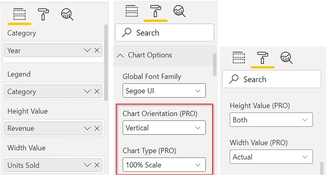
To use this form of the visual, we have:
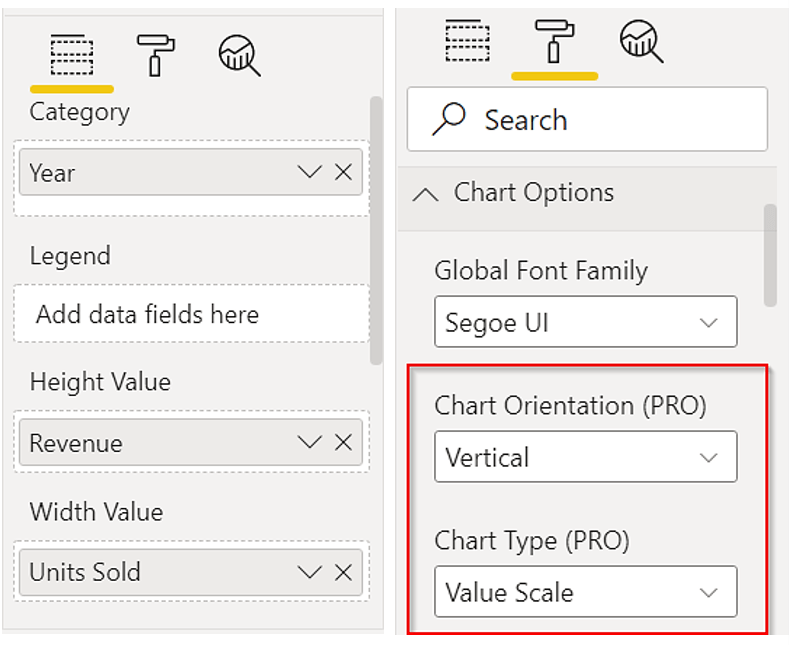
1. Populated the Category, Width Value, and Height Value data fields
2. Chart orientation is set to ‘Vertical’ and Chart Type as ‘Value Scale’
2. Stacked Column Chart
Stacking is helpful to understand the contribution by a category and compare the total at the same time.
In the example below, we can see how the Revenue for every Year is broken by the Category and also compare the total Revenue by Year. At the same time, we can see the Units Sold for every Year in the column width.
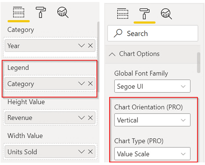
In addition to the configuration of the previous form, we have populated the Legend field to get the stacking in the columns.
3. 100% Stacked Column Chart
100% Stacked Column charts are useful for comparing the proportional contribution of a category across the X-axis category. As it’s a column chart, it’s best to use this style to analyze data over a time-period scale.
In the visual below, we can see the proportion of contribution in Revenue by every Category.
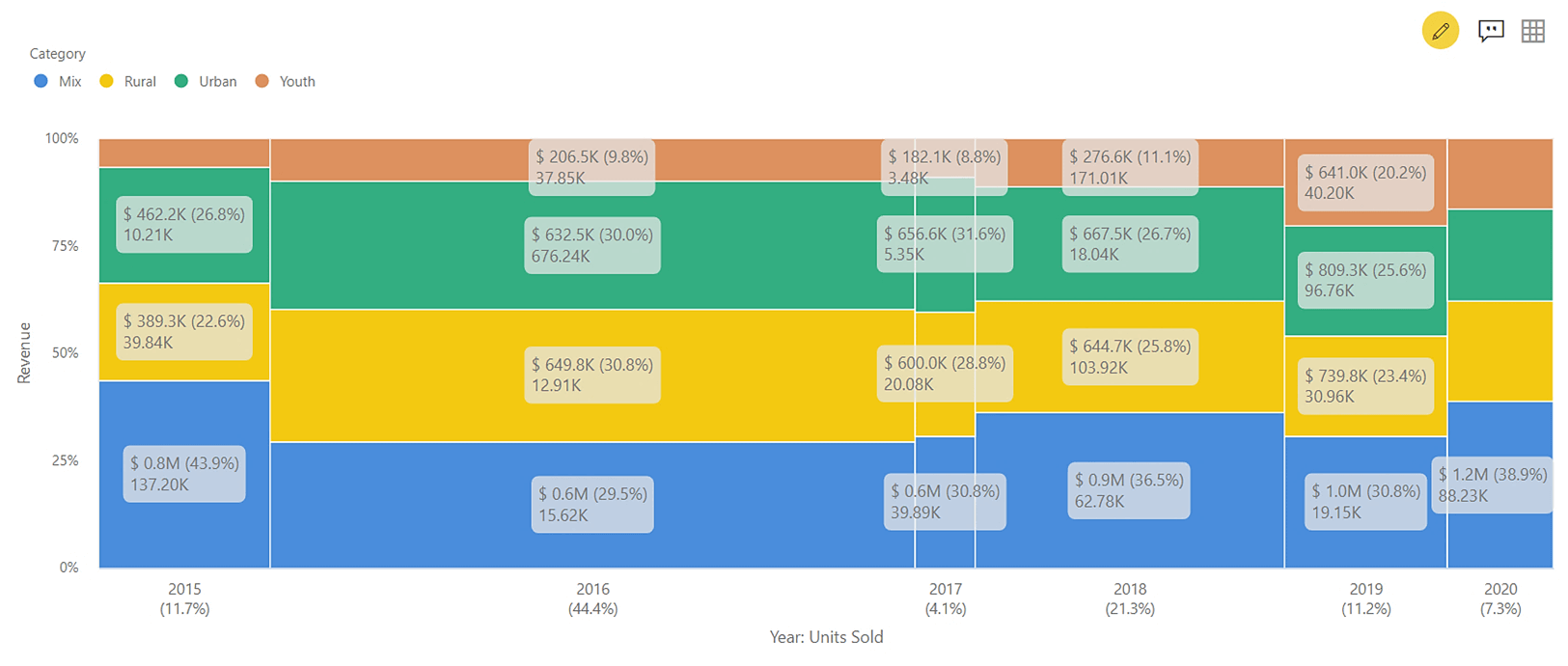
Change the Stack Type to ‘100% Scale’ for switching from value-based axis to 100% stacking. Data labels can show Actual, Percentage, Both or None values for Height and Width individually. To enhance the proportional understanding in this view, both the values (Actual and Percentage) have been enabled for height in the data labels, through the formatting options.
4. Bar Chart
For the comparison of the metric across a Category, Bar charts come across as the simplest form of visual. With the bar chart in the Marimekko chart configuration, the width of the bars gives an easily receptive style of conveying information of one more metric.
In the scenario below, we have the Revenue shown for various Regions in the form of bar lengths. The width of the bars indicates the Units Sold. With the below view, we get direct insights that although the Revenue in Central region is the maximum, the maximum Units have been sold in West region. On the contrary, the North region has earned the third-best revenue despite selling the least Units.
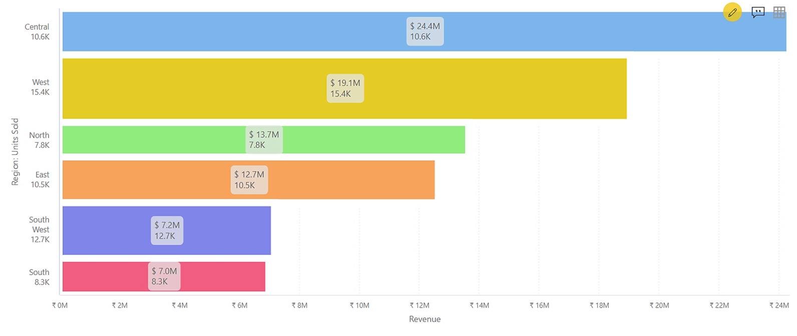
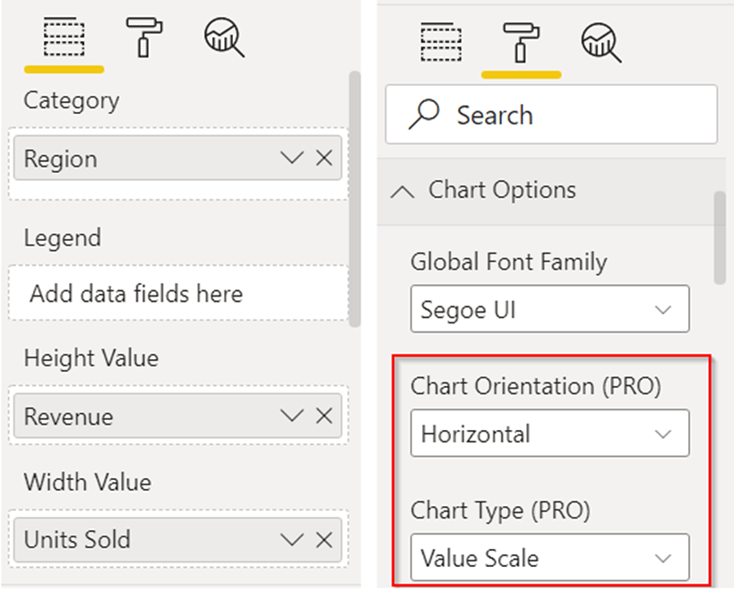
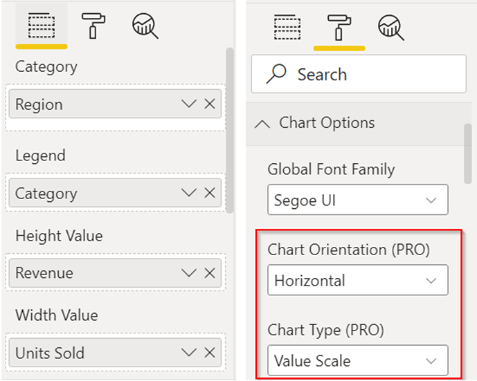
For switching Column charts to Bar charts, change the Chart Orientation in the Format pane to ‘Horizontal’.
5. Stacked Bar Chart
The bars can further be broken down by a Category to visualize the contribution by every Category and at the same time, compare the total of every bar.
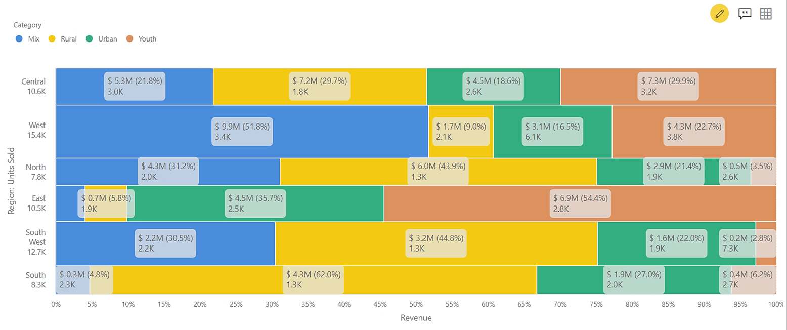
In the snapshot below, we can see how the Region wise Revenue is further split by Categories. We can see the data labels showing information for both the KPIs – Revenue and Units sold, for every Region and Category.
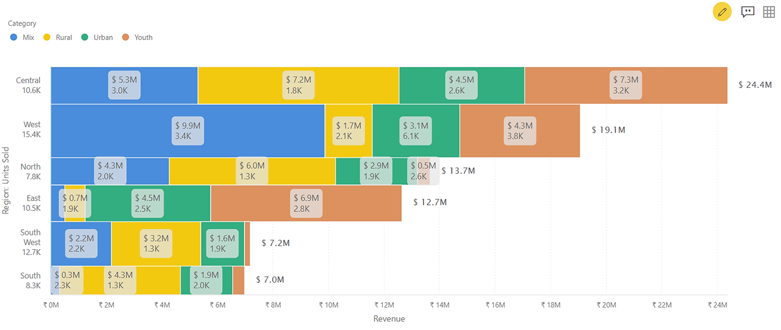
We add a categorical column in the Legend field to get the stacking in the Bars.
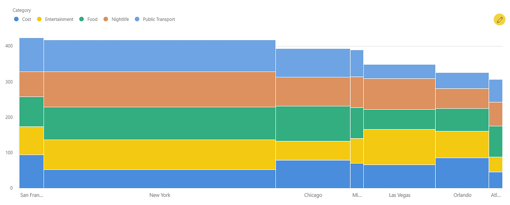
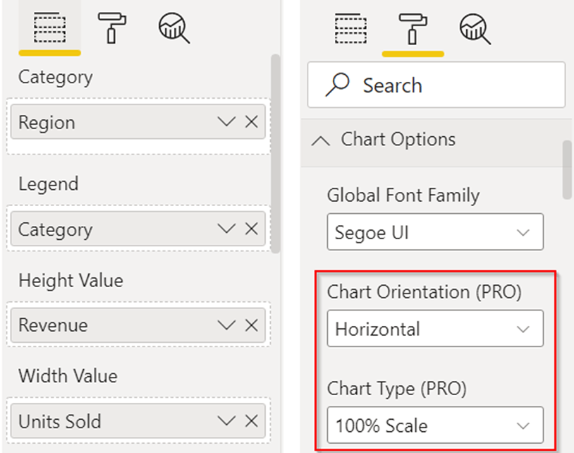
6. 100% Stacked Bar Chart
Once again, 100% stacking is useful for comparing the percentage-to-whole ratio. This view is useful to visualize the contribution of every Category across various Regions.
In the example below, we can see that the Youth category has contributed nominally in the North and Southwest Revenue. But it is the biggest contributor in the East region, followed by Urban category for the same region.
Use the Chart Type option in the Format pane to change the scale from Value Axis to 100% scale.
The xViz Marimekko chart configurations also include conditional formatting, annotation, and summary table features bundled with rich formatting options. Check out all the capabilities of the visual here.
**********
Check out all the Power BI Visuals in the xViz Pro Suite here.