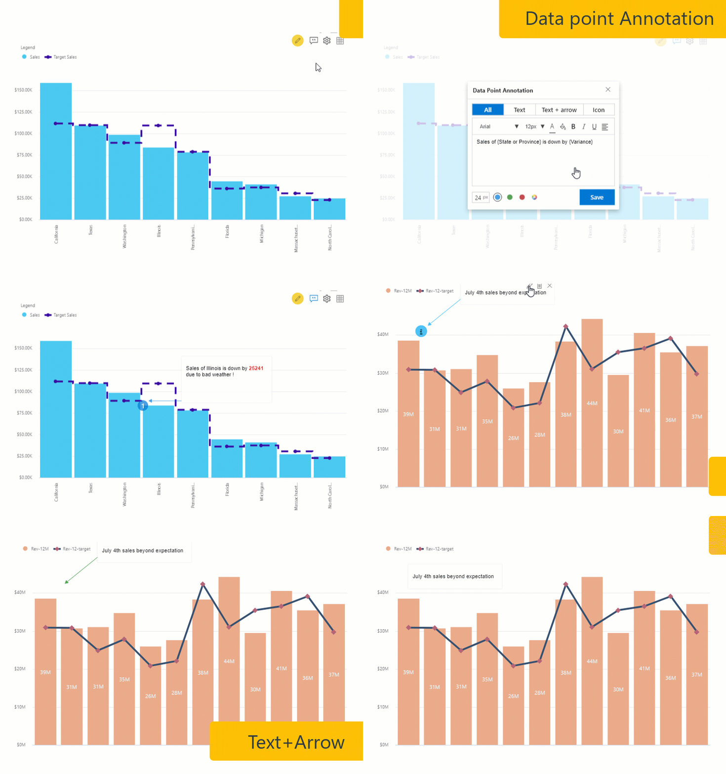
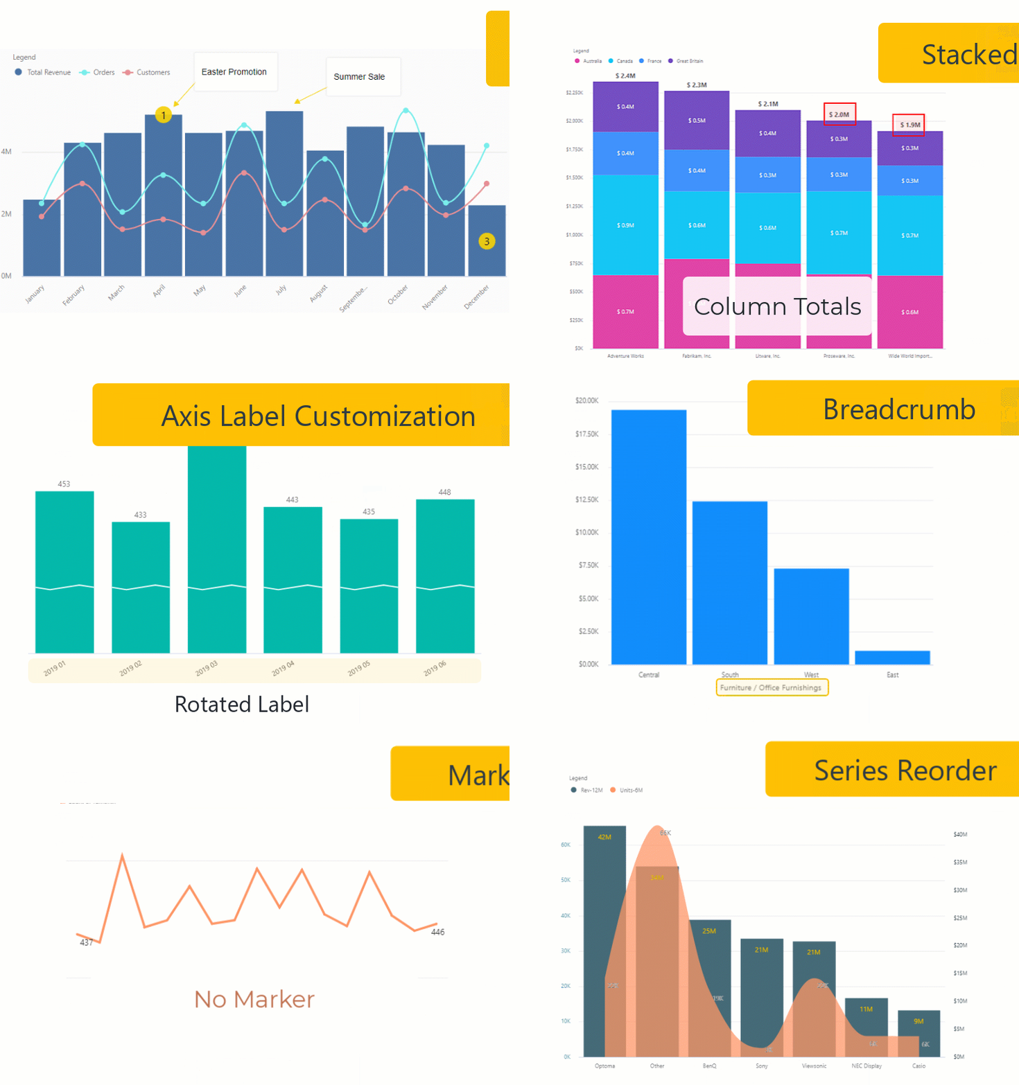
The Latest xViz Multi Axes Chart v1.1.5 which is packed with features requested by customers has been highlighted in July 2020’s Power BI Desktop Summary Blog. The features highlighted include Annotations for Storytelling, External URL, Advance Data Label, and Axis Customization.
The Visual additionally supports 20+ Chart Configurations that include Single Series, Multiple Series, Combo Chart, Dual Axis Chart, Multi-Axis Chart, and many more.
Annotation in Power BI
Add data-point annotations with context to enhance your storytelling experience with textual call outs and drive attention to important areas. Annotations help communicate one’s ideas effectively by drawing attention to the marked areas with different colored icons and arrows.

Other Key Features
The following are the list of new features added to the Multi-Axis Chart:
- Annotation
- Runtime deviation Bar
- External URL
- Interaction – Lasso, reverse Lasso, Zoom
- Column Totals for stacked charts
- Styling – Pattern for stacked chart
- New chart option – Lollipop, Stepped Area and Line Charts
- Data Label Customization for Individual Series
- Specific data label positioning and format options for line, column, and Stacked charts
- Number formatting specific to each series
- Axis Break for Y-axis
- Log Axis
- X-Axis label display options
- Time Series capabilities
- Series ordering
- Series visibility
- Breadcrumb
- Marker customization for Line, area, and Lollipop
- Tooltip enhancements – Shared tooltip and Stacked chart tooltip
- Responsiveness – axis labels auto-hide

The Desktop Summary July Edition can be found here.
The xViz Multi Axes Chart is a part of the xViz Pro Suite, check out all the resources for Multi Axes Chart including other blogs, and FREE Power BI Desktop Version!
Check out all the Power BI Visuals in the xViz Pro Suite here.


