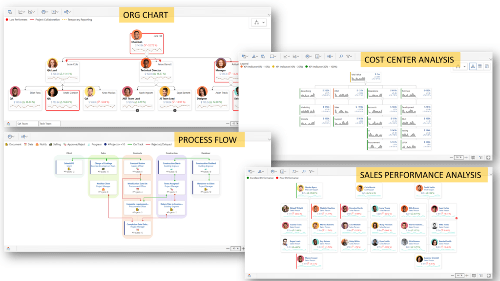
Are you looking for a dynamic organizational chart in Power BI? xViz Performance Flow provides an interactive and insightful visualization for hierarchical views of many different use-cases like Process Flows and Organization Trees, Cost Center Analysts and Sales Analysts, among many others.
In this blog, we focus only on organizational charts (org charts) and will take a deep dive into the 10 best features of xViz Performance Flow to visualize an Organization Chart in Power BI.
Consider this example – Lucy is the Data Analyst of Contoso Inc. She has been given the requirements below to develop a report for the management. The management of Contoso Inc. needs the following information available in a Power BI report for employee performance tracking:
- Easy navigation in the chart as the organization contains multiple departments. Users may want to look closer at the trends of the performance.
- Ability to search for any particular employee in the hierarchy
- Know the team size of a team leader
- Visualize any temporary reporting structure changes and cross-team project collaborations
- The total salary of employees in Contoso is dependent on the performance bonus. Management wants to see the current salary of the employee and the variance from the previous year
- The trend of the performance scores over the last few assessments
- Identify low performers
- Quick view of the QA and Tech team hierarchies
- Access to additional notes about any employee to easily identify the underlying reasons for the performance trends or salary structures
Let us see how xViz Performance Flow can help Lucy accomplish these goals in Power BI:
1. Navigation
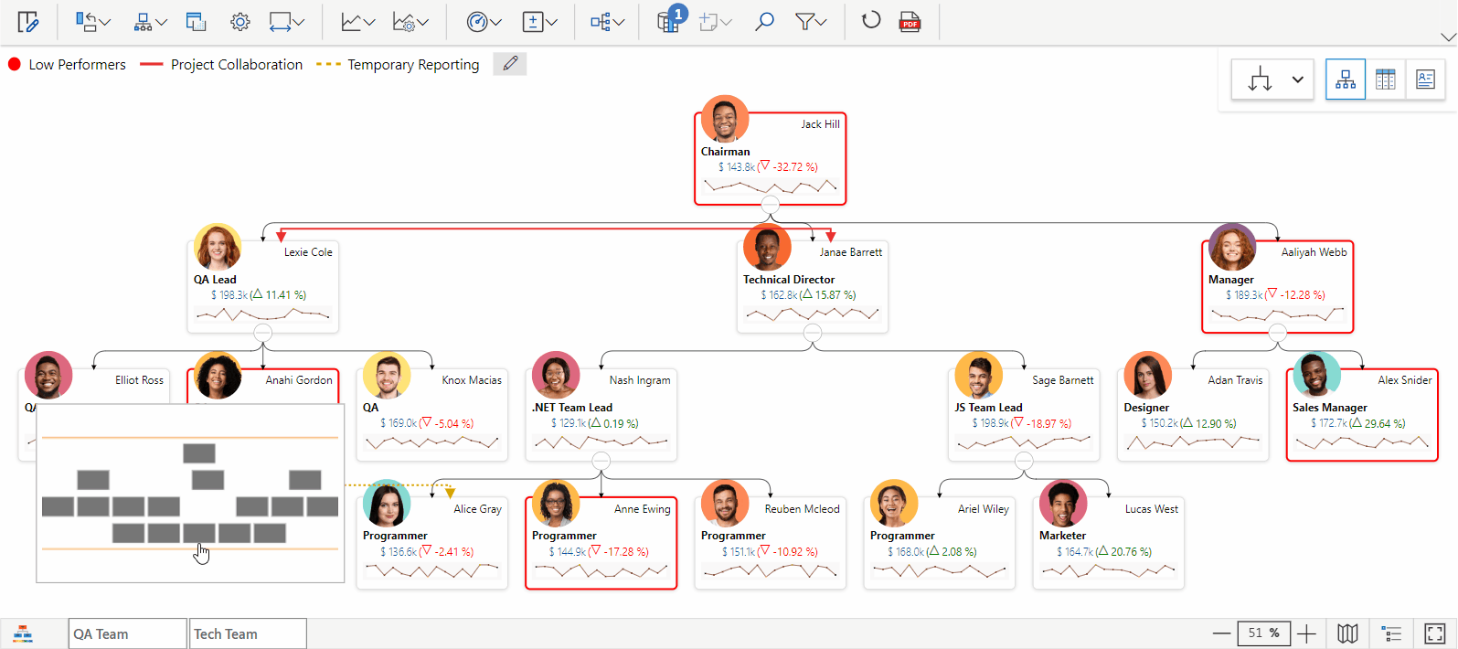
The visual provides an easy navigation experience with Zooming controls (or mouse wheel) and dragging navigation. The Minimap view provides a reference with respect to the full hierarchy. This will enable the management of Contoso to take a closer look at the employee cards.
2. Search
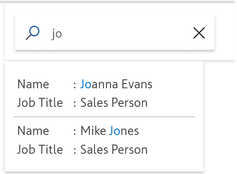
The Search feature in the Performance Flow visual provides an effective mechanism to locate the required employee. This will save the management’s time in browsing the complete hierarchy to find a particular employee.
3. Child node count
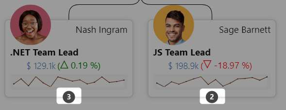
With a simple toggle button, Lucy can enable the team count on employee cards so she can immediately see how many employees report to that person. The count will be visible when the subtree of the team lead is collapsed, thereby giving the count of employee cards collapsed in the view.
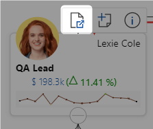
4. Links
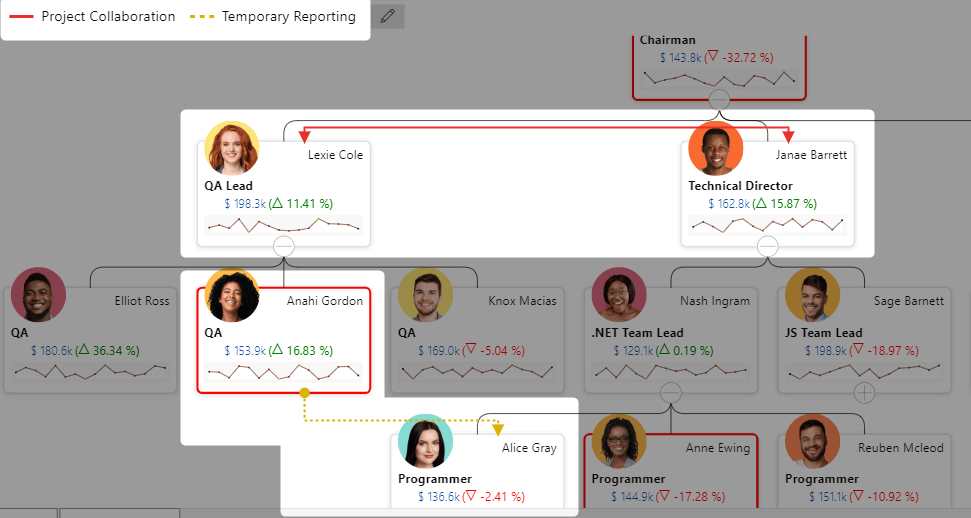
In addition to the reporting structure, the Performance Flow visual provides a provision to plot additional dependencies in the form of Links. Lucy can plot different kinds of dependencies. Different kinds of links can be represented using different line styles and colors. This way management has access to all kinds of dependencies like project collaboration, temporary reporting, etc. integrated into the organization tree.
5. KPI & Variance
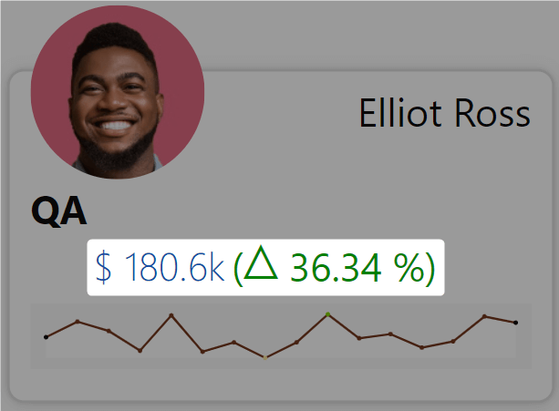
Lucy can display the Current Salary on every employee card. And by also providing the previous year’s salary, the visual will calculate the variance and display it on the employee card.
6. Trend analysis using Sparklines
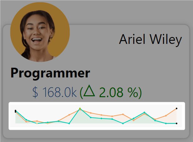
Lucy can provide the Monthly Performance Scores trends for the year. The trend line will clearly indicate the performance trend of the employees. Lucy can also add any other KPIs to highlight that KPI’s trend.
7. Alerting
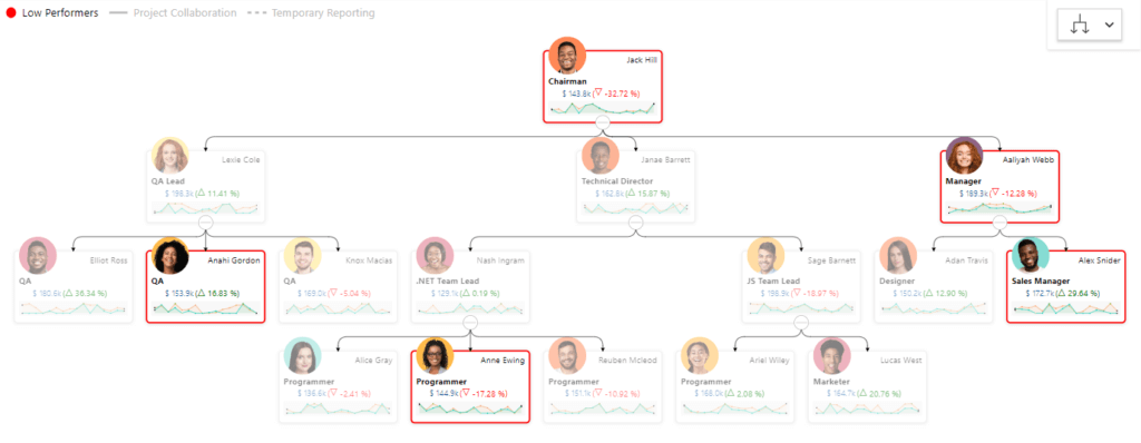
Lucy can set data-driven rules to identify the low performers. Using conditional formatting of Performance Flow, the cards for the low-performing employees can be highlighted. In the snapshot above, the low performers are highlighted using a red border.
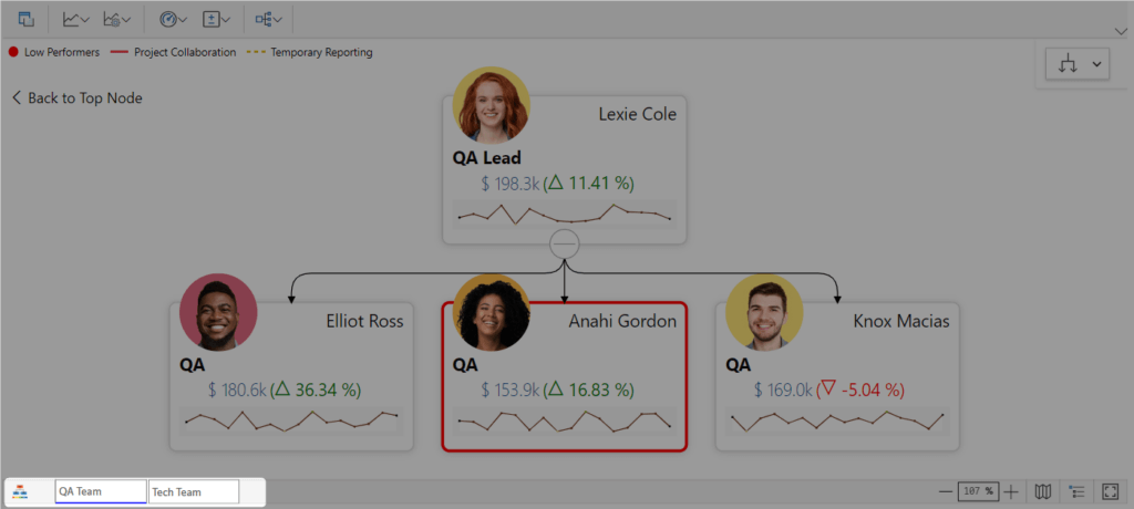
8. Subtree as Tabs
Using the “Set As Root Node” option Lucy can create predefined tabs for the QA and Tech team. She will need to set the team leads as the root nodes to focus on their subtrees.
For instance, as Lexie is the QA lead and the entire QA team is represented as her subtree, Lexie can be set as the root node to focus on the QA subtree.
9. Notes
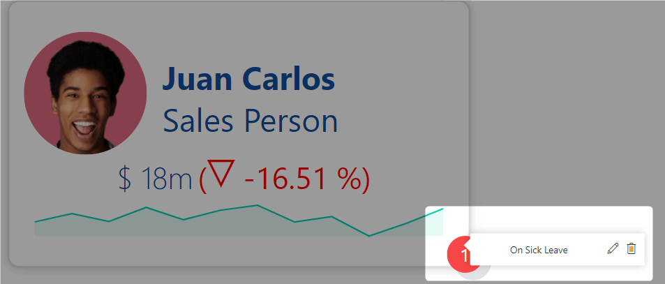
Juan has shown a considerable dip in his performance lately, which would normally require a formal performance review However, with the Notes feature, the management has additional information on employees and they can immediately see that the underlying reason for his performance is health issues.
10. 10+ Predefined Templates
Lucy can choose from 10+ predefined templates for different node designs to suit her report.
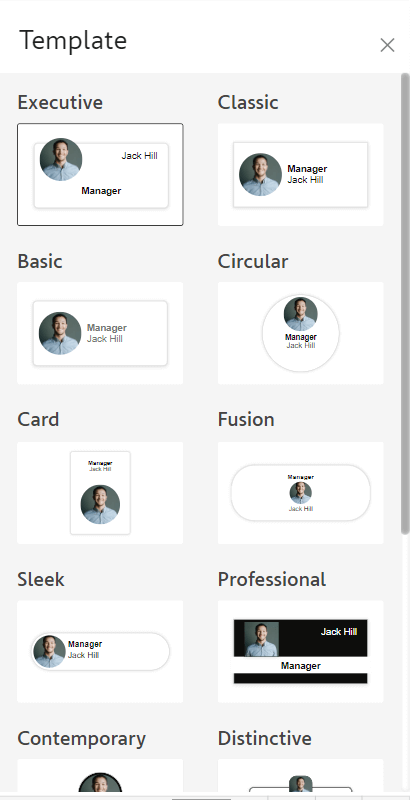
The visual also provides a bunch of formatting options for Lucy to further customize the look and feel of the cards.
In this way, Lucy has been able to accomplish all of the requirements of her management team to visualize the organization hierarchy in an interactive tree structure with additional dependencies. For every employee, they have an integrated view of performance trends, KPIs, and notes to complete the storytelling experience.
In this blog we focused on org charts, but remember that the xViz Performance Flow visual is useful for many different scenarios like Org Chart, Process Flow, Cost Center Analysis, Sales Performance Analysis, etc.
Try out the xViz Performance Flow visual from Microsoft AppSource. For more details on the features and configurations, please refer to our docs here.