Microsoft released the Power BI Desktop Summary blog for December 2019 that features the new visuals from xViz Suite extensively.
The custom visuals discussed in detail are:
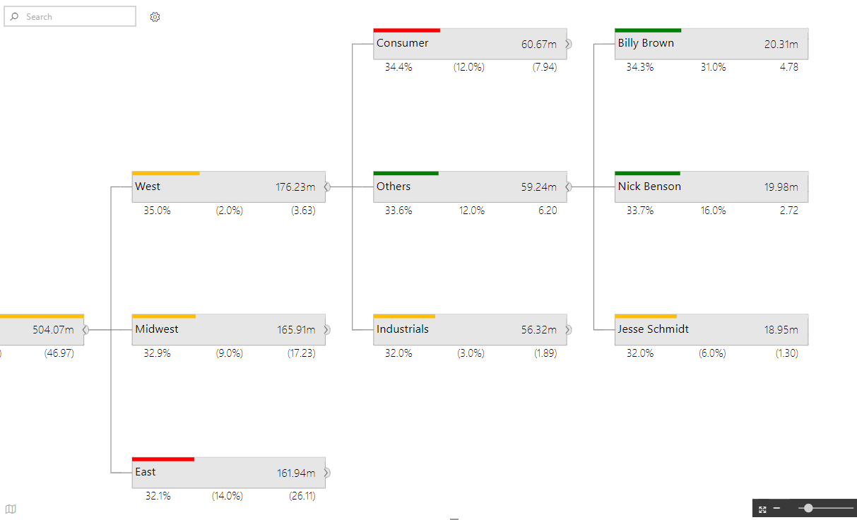
- Hierarchical Tree – can be used to visualize hierarchies of different sizes in an appealing way
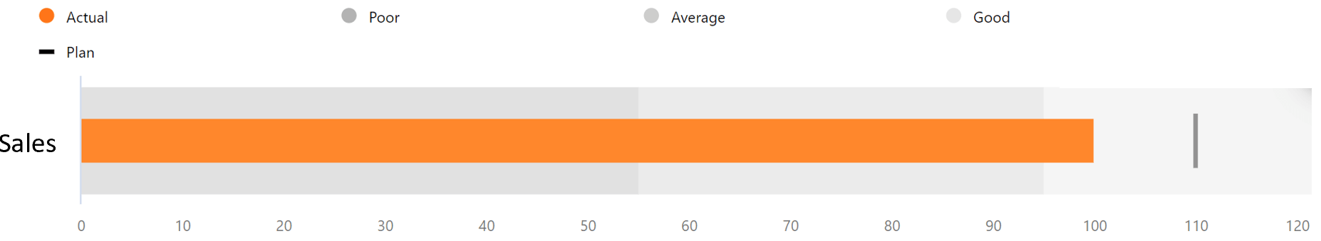
2. Bullet Chart – variation of bar chart that requires less real estate and displays multiple measures
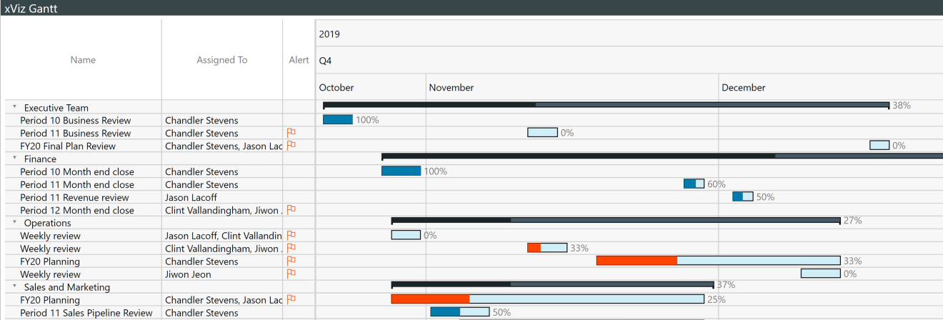
Gantt Chart – helps visualize project plan to articulate, communicate and monitor progress
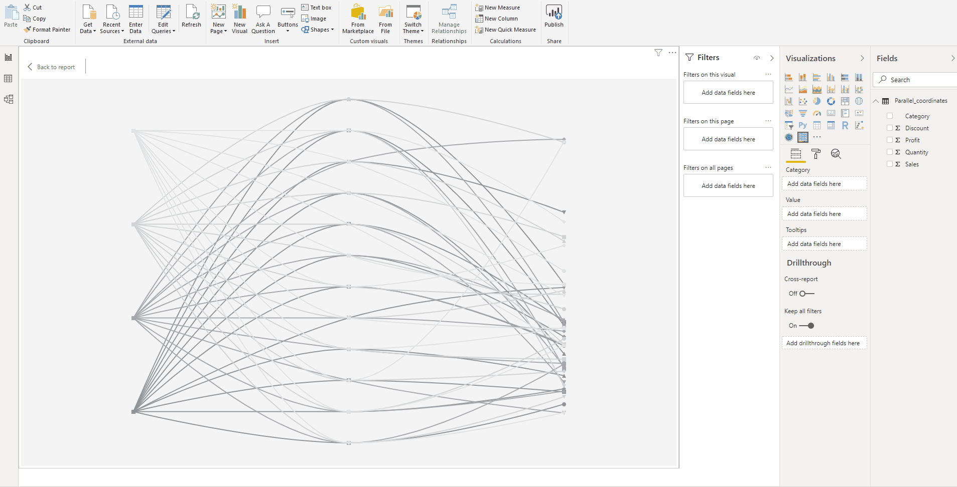
4. Parallel Coordinates – plot multivariate numerical data, compare many variables together
The blog from Sujata Narayana, Program Manager, Microsoft provides comprehensive insights on the highly advanced conditional formatting, configuration capabilities and various other features present in xViz Custom Visuals.
Click here to import the latest visuals to your Power BI.
You can look at the other advanced custom visuals by xViz here