Note: For the Latest Feature Updates to xViz Gantt Chart Power BI Visual, check this blog out!
This blog is part of the Gantt Chart Blog Series
Gantt Chart is one of the most widely used project planning tools. It helps you visualize your project plan to articulate, communicate, and monitor the progress.
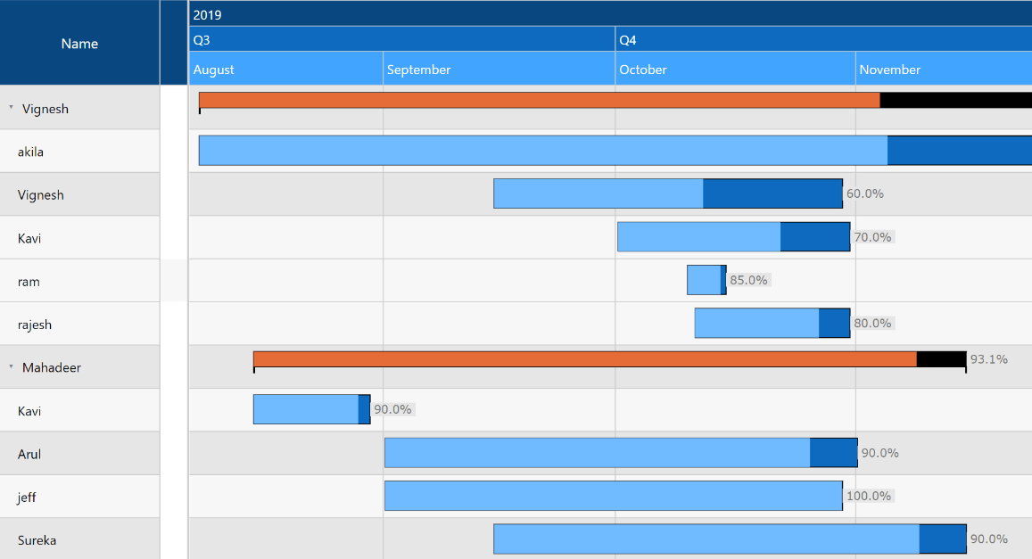
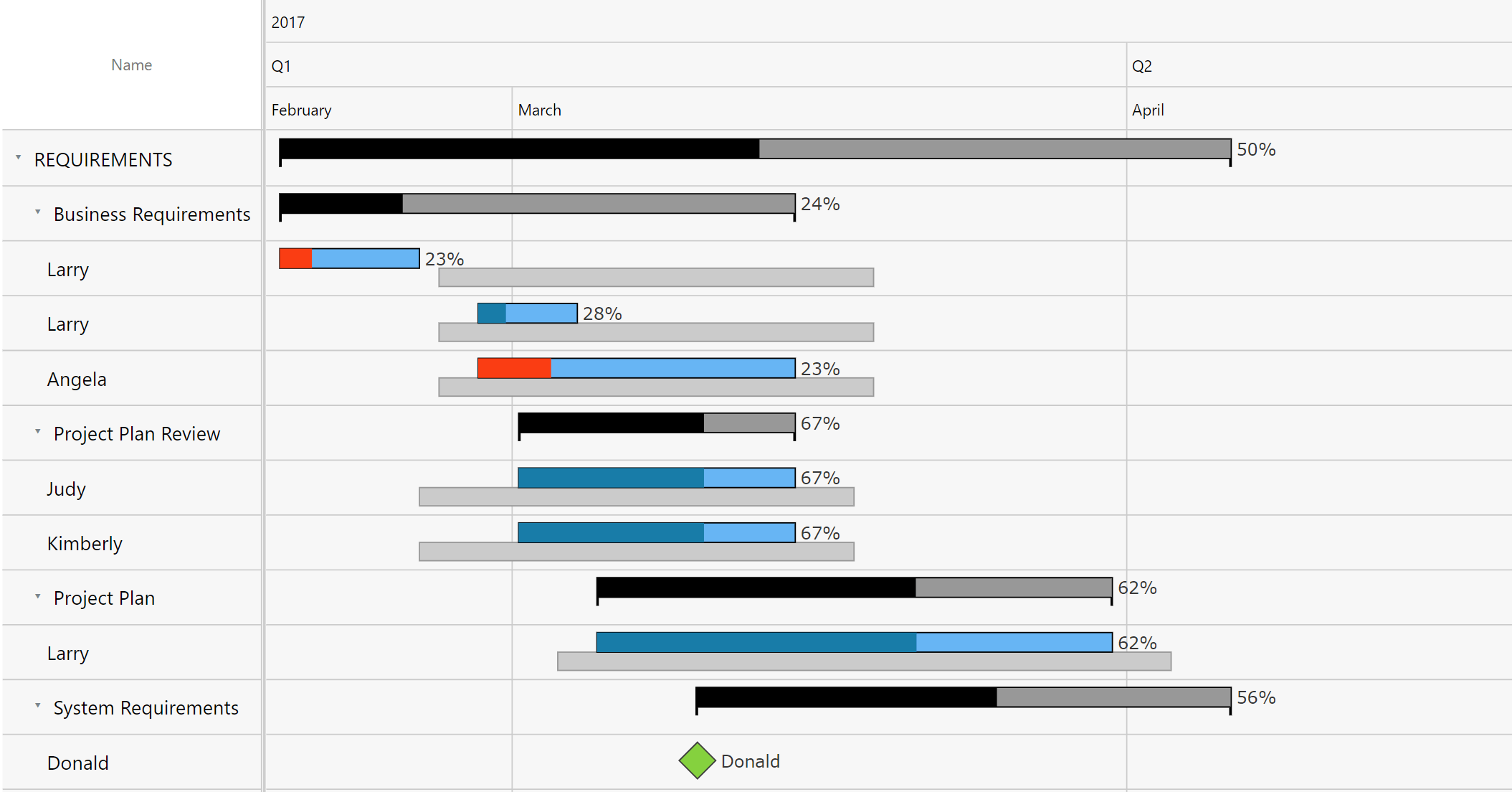
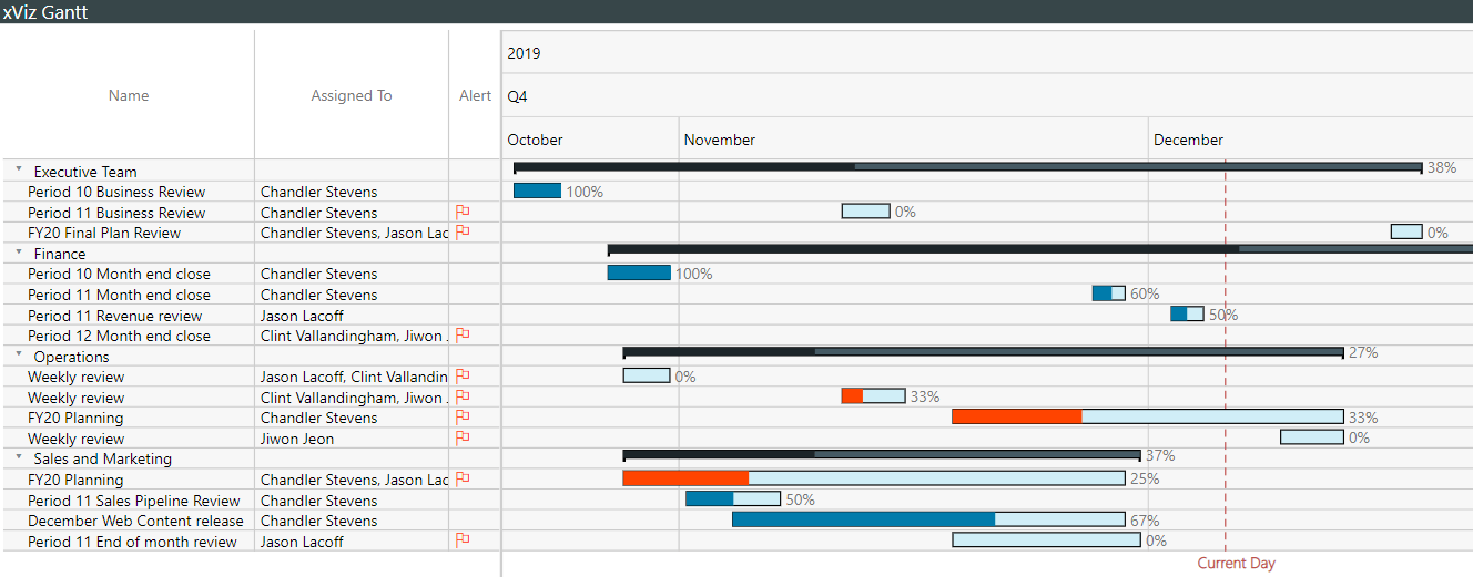
A Gantt Chart shows activities (tasks or events) displayed along a given timeline. On the left side of the chart is the Data Grid, which displays lists all the tasks as part of the project or work breakdown the structure to be completed. On the right-hand side, the Gantt chart provides a visual representation of these tasks in a typical bar display where the length of the bar represents the duration of the task. The positioning of the bar represents the scheduling of the bar where if one bar is followed by another then it means that the task begins at the end of the previous task.
Now let’s look at some of the key features of the xViz Gantt chart for Power BI.
Key Features – Summary
- Gantt chart types – simple Gantt and Gantt resource
- Milestone
- Conditional formatting
- Status Flag
- Zoom
- Data grid styling
- Timeline styling
- Today’s date
For the latest Feature Updates to the xViz Gantt Chart, check this blog out!
Key Features – Description
- Gantt Chart Types
The xViz Gantt chart provides 2 types of Gantt chart configurations – Simple Gantt and Gantt resource.
Simple Gantt – The simple Gantt follows the original definition of the Gantt chart, developed to monitor project performance and viewing the actual and planned timelines for each task in the project.
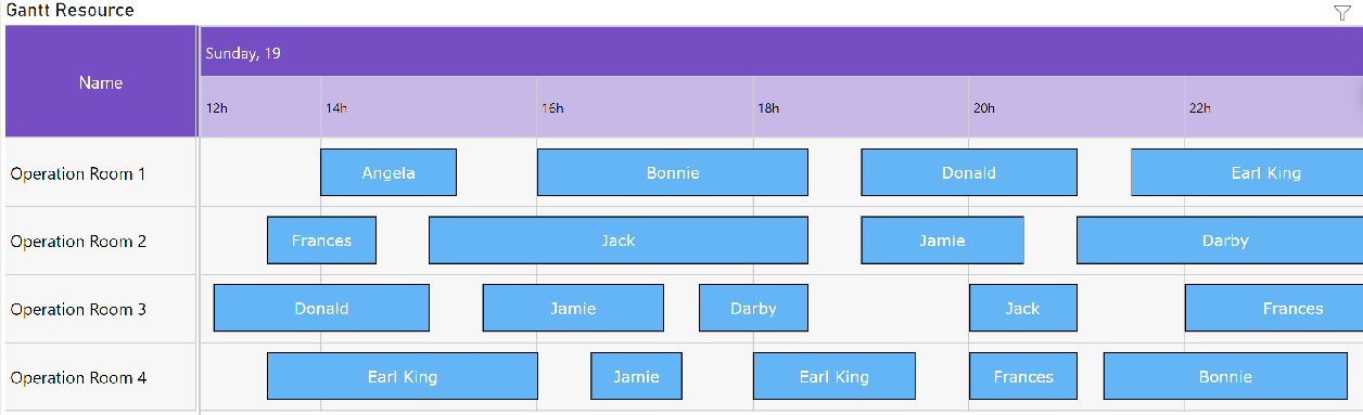
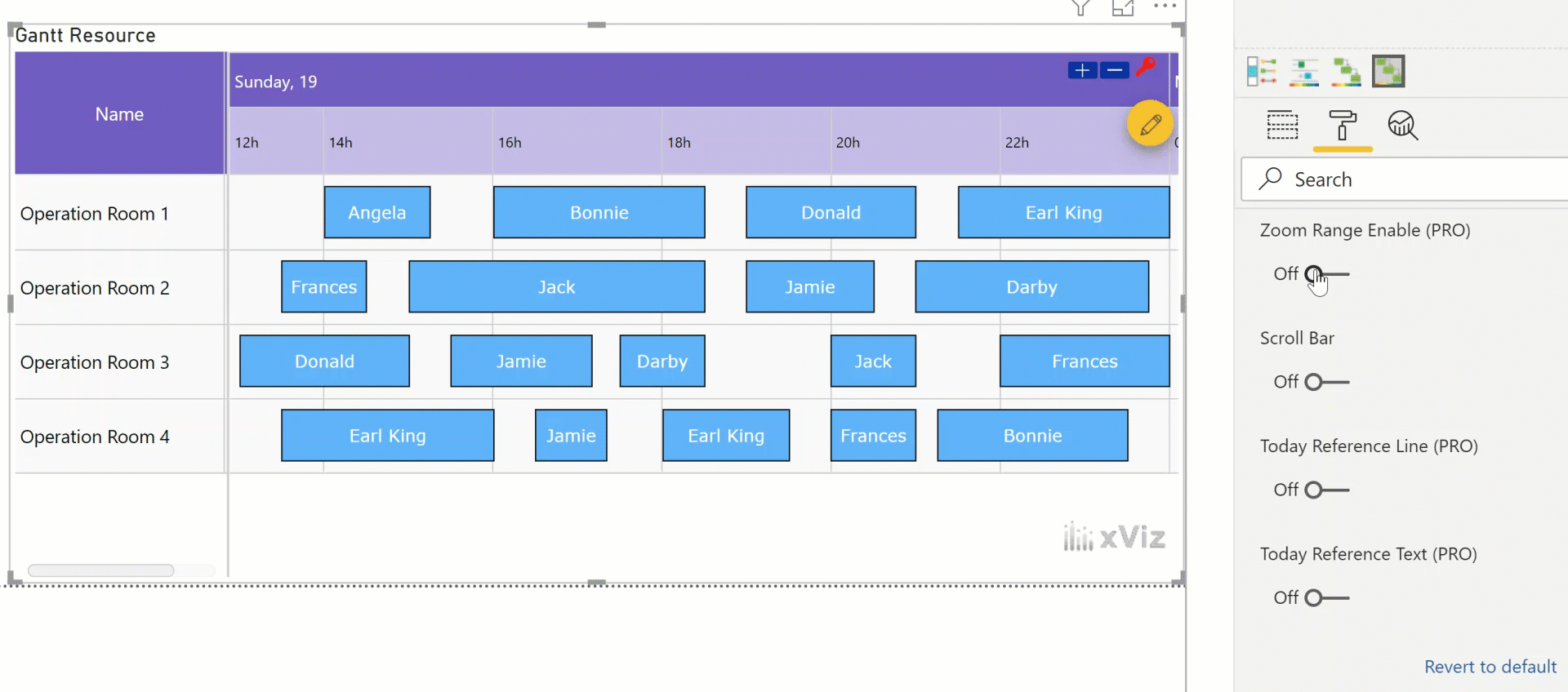
Gantt Resource – Variation of Gantt chart, catering to resource planning and allocation use cases.
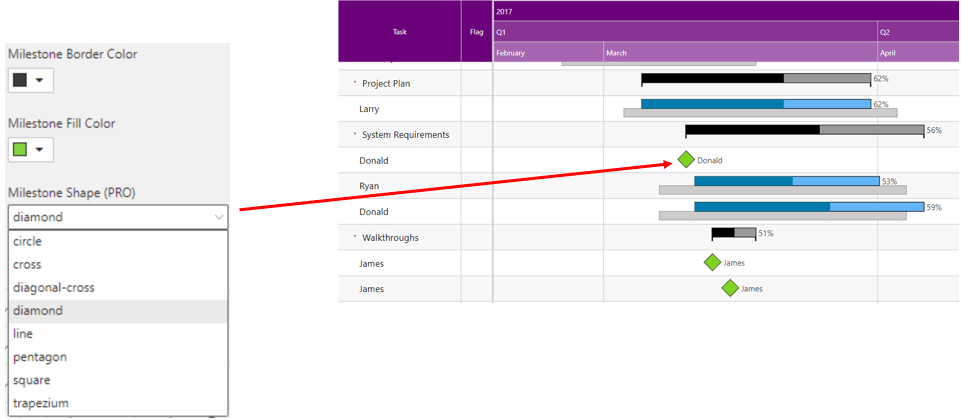
2. Milestone
These are usually represented by a diamond symbol on the Gantt and have no duration. A milestone marks the end of a piece of work or phase of the project. The xViz Gantt chart not only provides the ability to customize the color and shape of the milestone but also the flexibility to place it both in the child and parent task. Thus, making it visible even when all the child tasks are collapsed.
3. Conditional Formatting
Just like other xViz charts, the xViz Gantt chart also provides conditional formatting capabilities based on the set rules. You can even set different rules based on fields that are not displayed on the chart. Fields that are part of the tooltip, measure, and Column fields can also be accessed to set rules and highlight the taskbar which met the criteria of the set rule.
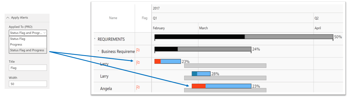
4. Status Flag
Apart from using conditional formatting property, you can also use the status flag to highlight a given task based on user preference. Just like the conditional formatting, the rules for the status flag are set using the advanced editor. Once the rules are set, the apply alerts field will have to be set to either status flag (if you only wanted the status flag) or both the Status and Progress (as shown below).
5. Zoom
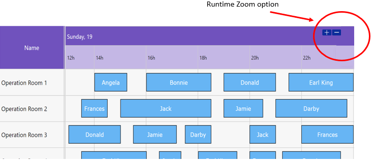
The zoom feature can be configured both at design time and runtime. The report designers can fix the default zoom range for comfortable viewing by selecting the appropriate units and range. In case, the end consumers of the report need to set their own zoom levels they could do so by using the runtime zoom buttons.
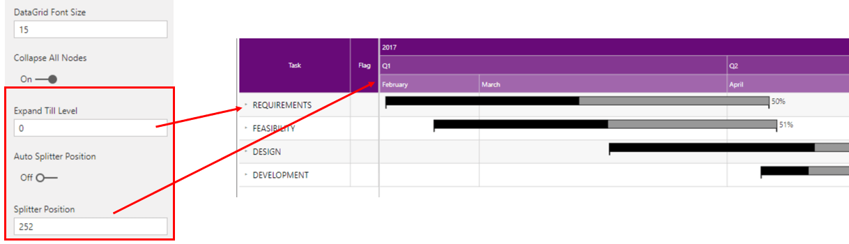
6. Data grid customization
The data grid provides a list of all the tasks or resources in a project. In case you have a hierarchy displaying the parent-child tasks in a project then you may use the collapse node functionality to decide the default appearance of these nodes. Along with the various formatting options to customize the look and feel you can also set the splitter position to be either auto or fixed based on the design of your Gantt chart.
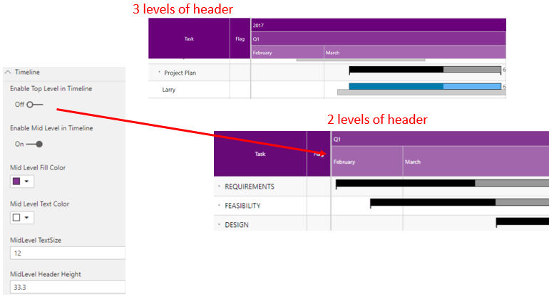
7. Timeline customization
The timeline of the Gantt chart provides a visual representation of the time allotted for each task. The xViz Gantt chart provides extensive formatting capabilities righting form formatting the headers at each level to zoom and reference line for today’s date. You can choose between the different levels for the headers needed.
8. Today’s date reference line
The xViz Gantt chart provides you with the option to display today’s date on the chart thereby giving an indication of where you are in the project and to assess the level of completeness.
***
To get the latest version of the custom visual, reach out to us here.
You can take a look at the other advanced custom visuals by xViz here.