How often have you felt the need to focus on a specific range of information in the report, that is of more relevance to you? Or felt the need to exclude a range of information that is skewing the data, to see the impact of other information? A few ways to do this are to filter the data through slicers or select multiple datapoints using ctrl+click. But wouldn’t it be easier to be able to make the selections through the drag of a mouse from the visual itself? Lasso and Inverse Lasso features help you achieve this.
For instance, in a chart plotted on the Month axis, we can focus on the months of a specific quarter using the Lasso effect. Lasso helps to narrow down the graph to a specific range of months while viewing the report.
On the same chart, to exclude a highly impacting quarter and see how other quarters are performing combined, we can use the Inverse Lasso effect. Inverse Lasso helps you exclude the selected range of months.
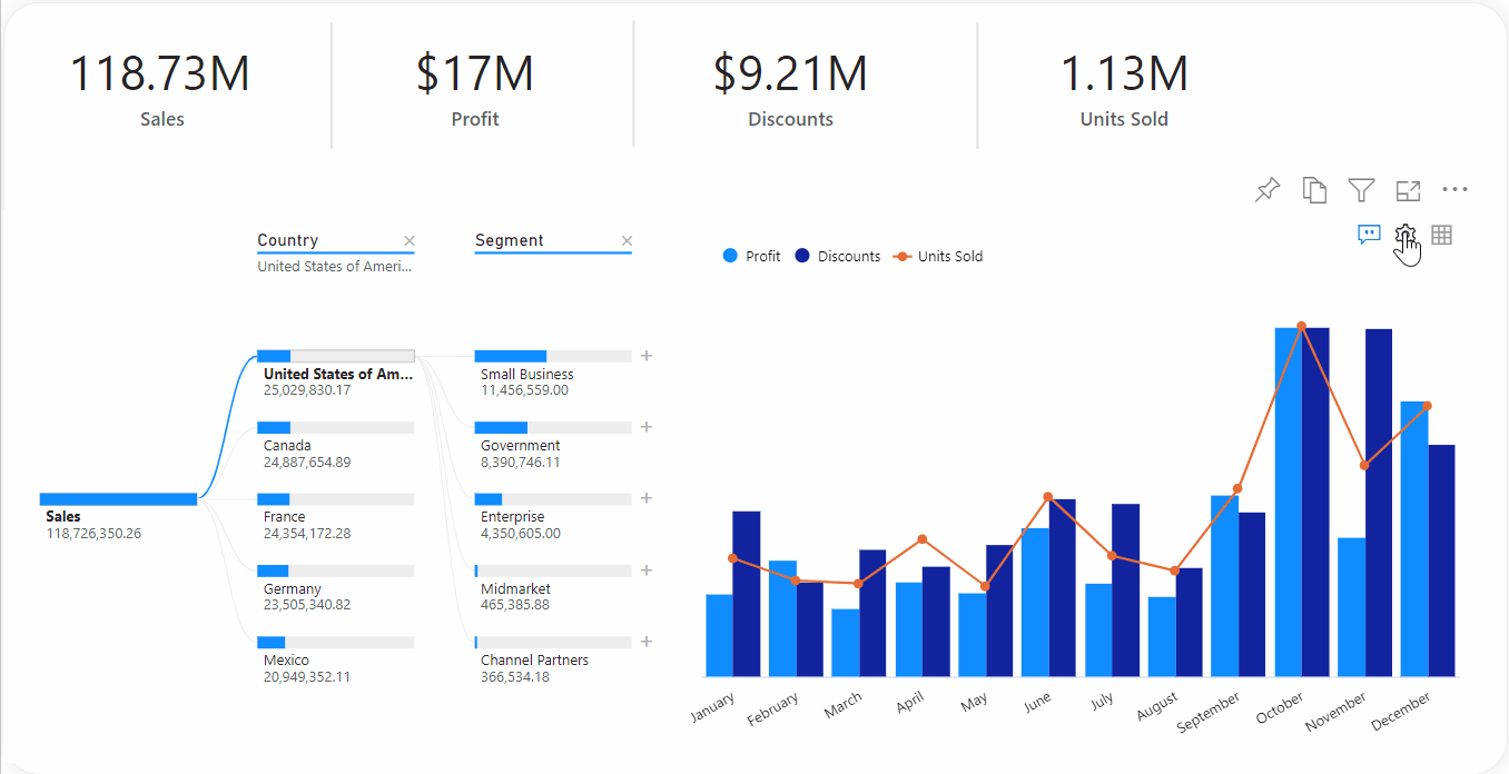
In the xViz Multi Axes Chart, we can define the action on drag selection using the utility menu (represented as a gear icon), available in the visual canvas.
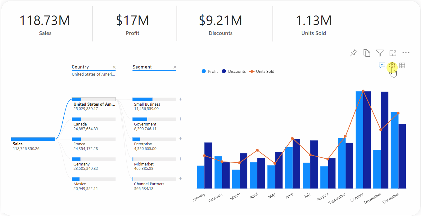
Lasso
To enable Lasso selection, we must select the Lasso option from the drag selection actions list shown in the previous section. We can now drag the mouse over the range of data points to be selected, in a rectangular fashion.
The selection, in turn, interacts with the other visuals on the report page showing the impact of cross-filtering/cross-highlighting, based on the report configuration.

Read more about visual interactions in Power BI here.
Inverse Lasso
To enable Inverse Lasso in Power BI, we must select the Inverse Lasso option as the drag selection action from the utility menu. We can now drag the mouse over the range of data points to be excluded from the current context, in a rectangular fashion.
Once again, the impact of excluding the selected data points can be seen in the rest of the visuals of the report because of the visuals’ interactions in Power BI.
Zoom
Other than Lasso and Inverse Lasso, xViz multi-axes visual also provides a zoom feature. It is the default drag selection action of the visual. It helps to visualize only the specified range of information in the visual.

**********