Tracking the performance of any entity, like Stores, involves evaluating several KPIs. This brings a need to concisely represent multiple KPIs for comparison in one visual. Most of the time, these measures might not have the same scale or even be the same kind of measure, for example, you might want to see sales in dollar amounts scaled by thousands and number of customers, which is an integer number. The xViz Multiple Axis Chart fits this purpose. The chart can represent multiple KPIs in up to 5 different axis scales with various data series styles and patterns. Additionally, the chart is packed with features to add more insights to the same chart.
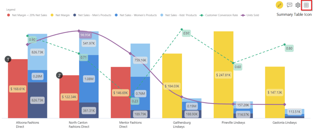
Consider an example in which we analyze the performance of various stores for a retail company based on multiple KPIs. Below are the few functionalities of the xViz Multiple Axes chart that can be helpful to plot the data for this scenario:
Multiple Axis Scales
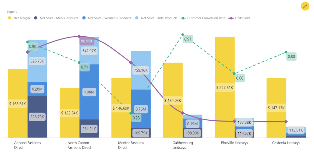
In the graph above, we have the following KPIs plotted with different axis scales that make it easier to read values ranging in smaller scales:
- Net Sales – A stacked style that shows the breakup of the Net Sales across the categories of products (Men’s, Women’s, and Kids’).
- Net Margin – Clustered with the Net Sales, the bar shows the earned revenue for those Sales
- Customer Conversion Rate – Represented as a dotted line, it represents the ratio of store visitors that get converted to customers by making purchases
- Units Sold – The spline depicts the total number of units sold
Being able to see all these metrics in the same graph makes is much easier to see these insights, which will help you make better and more-informed decisions:
- The North Canton Fashions Direct store provides a lower Net Margin despite its highest units being sold. The underlying costs involved with this store must be revisited to increase the margin.
- The Mentor Direct fashions store has a pretty low customer conversion rate, still, has decent units sold. This shows that the customers here buy items in high numbers. However, the customer service needs to improve.
- The Pineville Lindseys store has the highest margin even with fewer Units Sold. This store can be classified as a low-cost, high-margin grosser. However, owing to its low number of Units Sold, action must be taken to increase its Sales.
Steps: To achieve the above view, insert the various measures in different Value axis fields in the data fields of the visual. For stacking, insert the three Categories’ Net Sales measures in the same data field.
Set the Series Type for every value from the given set of 12 options. Further customizations for every style, like marker customizations and line thickness, are done using the Data Series Pattern options in the Format pane.
Use the Data Labels options for enabling the labels and setting their font styles.
Conditional Formatting
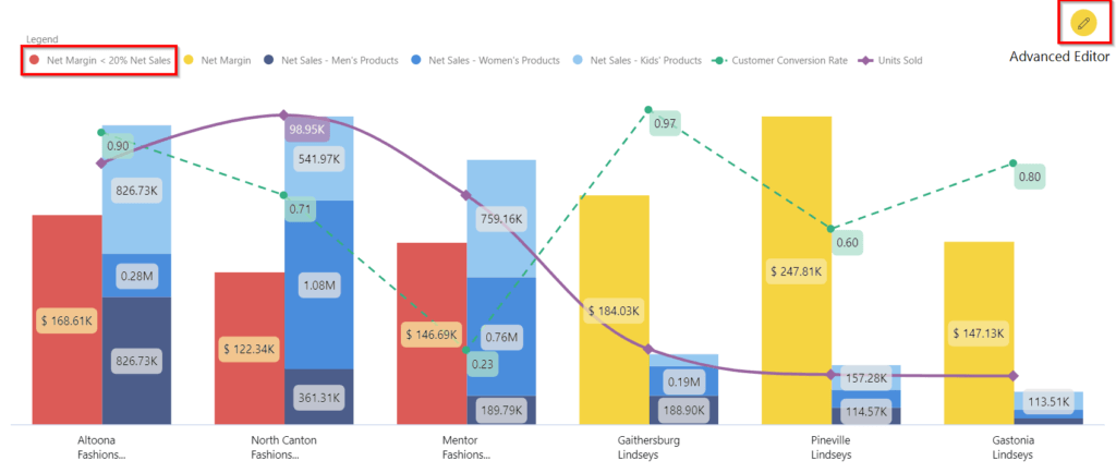
One part of the performance analysis is highlighting the low-performing stores. Based on different cases, the criteria may differ. Here we have highlighted the Stores where the Net Margin is less than 20% of the Total Net Sales. These are shown in red bars of Net Margin.
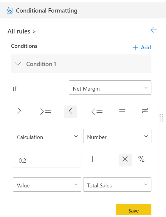
Steps: Add conditional formatting rules using the Advanced Editor. In the snapshot above, we have set the conditional formatting for Net margin bar color.
The conditional formatting rules are also shown in the Legend. Interactivity with the conditional formatting feature - Clicking on the rule in the Legend disables/enables the rule in real-time.
Annotation
Based on the insights we derived in the chart, we can complete our storytelling by adding custom information on specific data points. In the case of stores analysis, it’s easier to analyze data when some metadata like a new store or local regional challenges are mentioned. It helps to track down the supporting reasons for the KPI values, thereby reducing the churn in reaching out to multiple teams to get the reasons associated with the value of the KPIs. The Annotation feature helps to add textual details to add more context for specific data points.
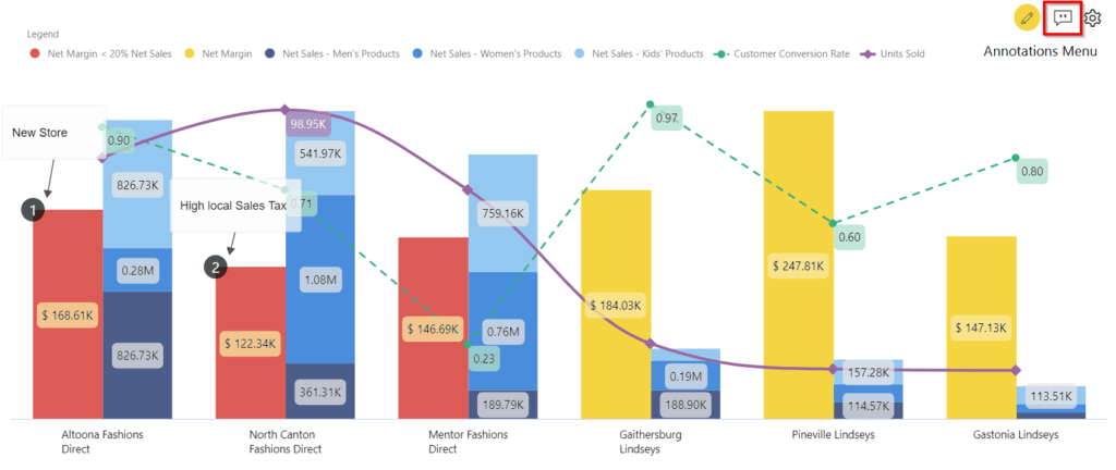
Insights: For the North Canton Fashions Direct, we have the data now, which explains why the Net Margin has been pretty low for this store. We can directly take actions based on the insights, instead of reaching out to the respective accounting team to understand the underlying causes.
Steps: Enable Annotations from the Format pane under the Utility menu to enable the Annotations menu in the visual canvas. Select the Create/Edit mode from the Annotations menu on the canvas and start creating/editing the existing Annotations. You can also refer to the data values using curly braces {} for annotation texts.
Summary Table
To view the data in tabular format, use the Summary Table feature of the visual. The summary table provides the space for individual users to play around with the data and make their analyses. It provides the ability to interact with the data like sorting, filtering, etc. Advanced Summary Table also enables a pivot view of the data for further analysis.
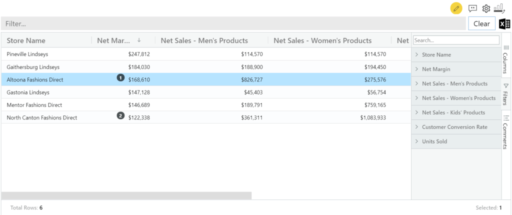
Steps: Enable Summary Table option in the Format pane. To switch to the Summary Table view in runtime, simply click on the table icon in the visual canvas.
**********
The xViz Multi Axes Chart is a part of the xViz Pro Suite, check out all the resources for Multi Axes Chart including other blogs, and FREE Power BI Desktop Version!
Check out all the Power BI Visuals in the xViz Pro Suite here.
![Latest Features of xViz Multi Axes Chart in Power BI [v1.1.5]](https://xviz.com/wp-content/uploads/latest-features-of-multi-axis-chart-in-power-bi-150x150.png)
