Note: This blog addresses some features that will be available in the App Source in Sep 2019. To get this latest build, reach out to us here.
The xViz Variance Chart for Power BI provides users with the capability to compare a performance and benchmark with variance visualized in both absolute & % terms.
In this blog, let us look at how it can be used and review some of its key features as shown below:
Key Features – Summary
- Choose horizontal or vertical Variance Chart
- Sort by Variance
- Conditional Formatting
- Ability to enable/disable Absolute Variance or % Variance series
- Customize width of the three series (Base series, Absolute Variance, % Variance)
- Display average variance
- Leverage RTL (Right-to-Left) support for languages such as Arabic
- Capture “Negative Variance is Good” scenarios by changing colors
- Customize # of Data Series to be displayed by default (with the rest available upon scroll)
- Use Custom Theme
- Consolidated Tooltip
Using the Variance Chart
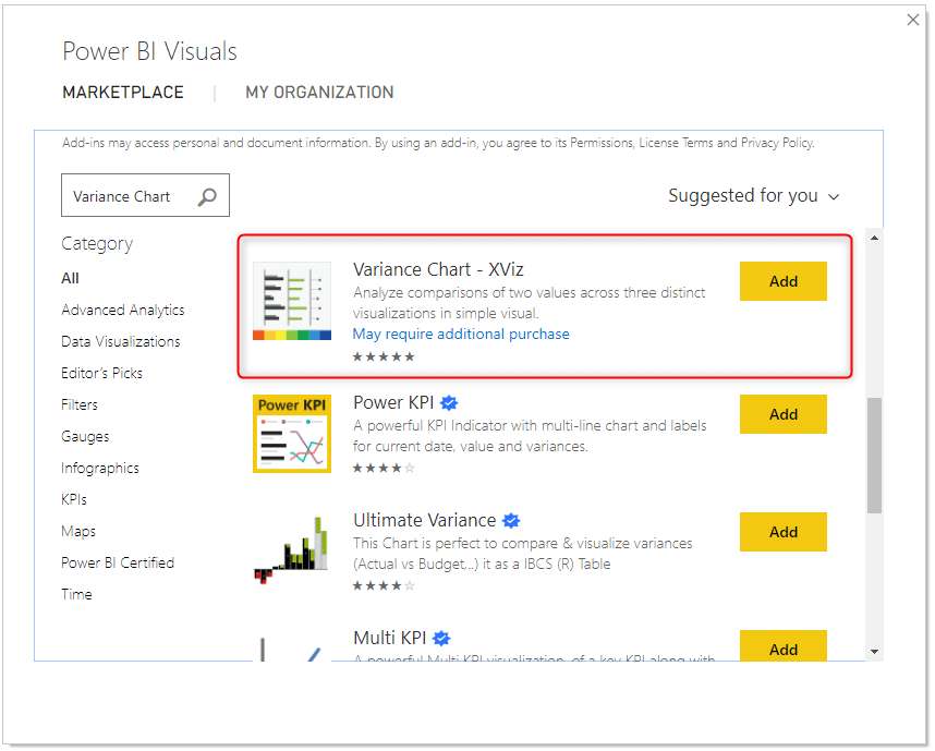
- Import the xViz custom visual from the Marketplace.
2. Assign the fields as shown
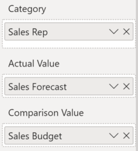
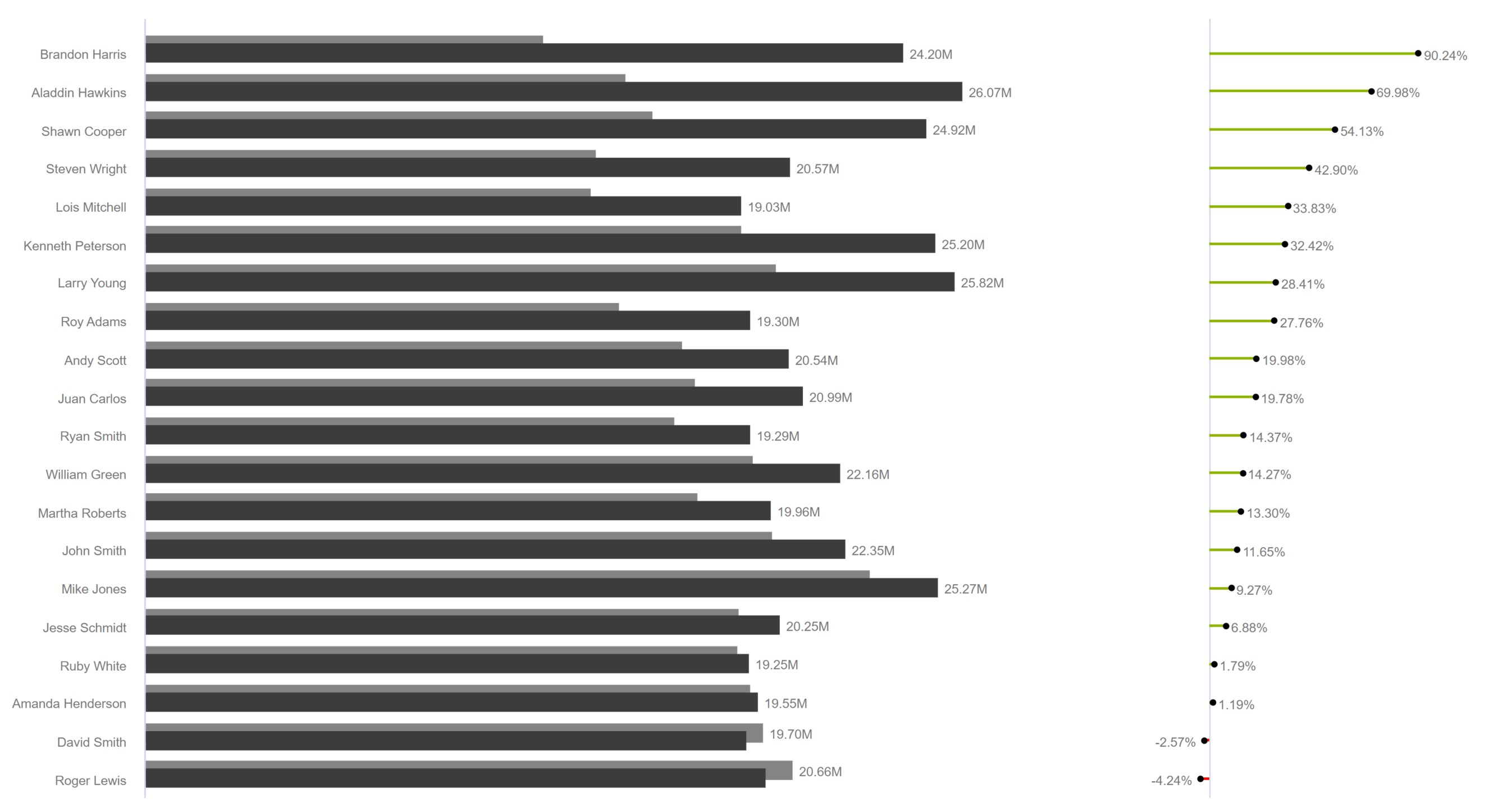
3. The Variance Chart will render the results as follows. By default, values are sorted by descending order of the primary performance value (Sales Forecast)
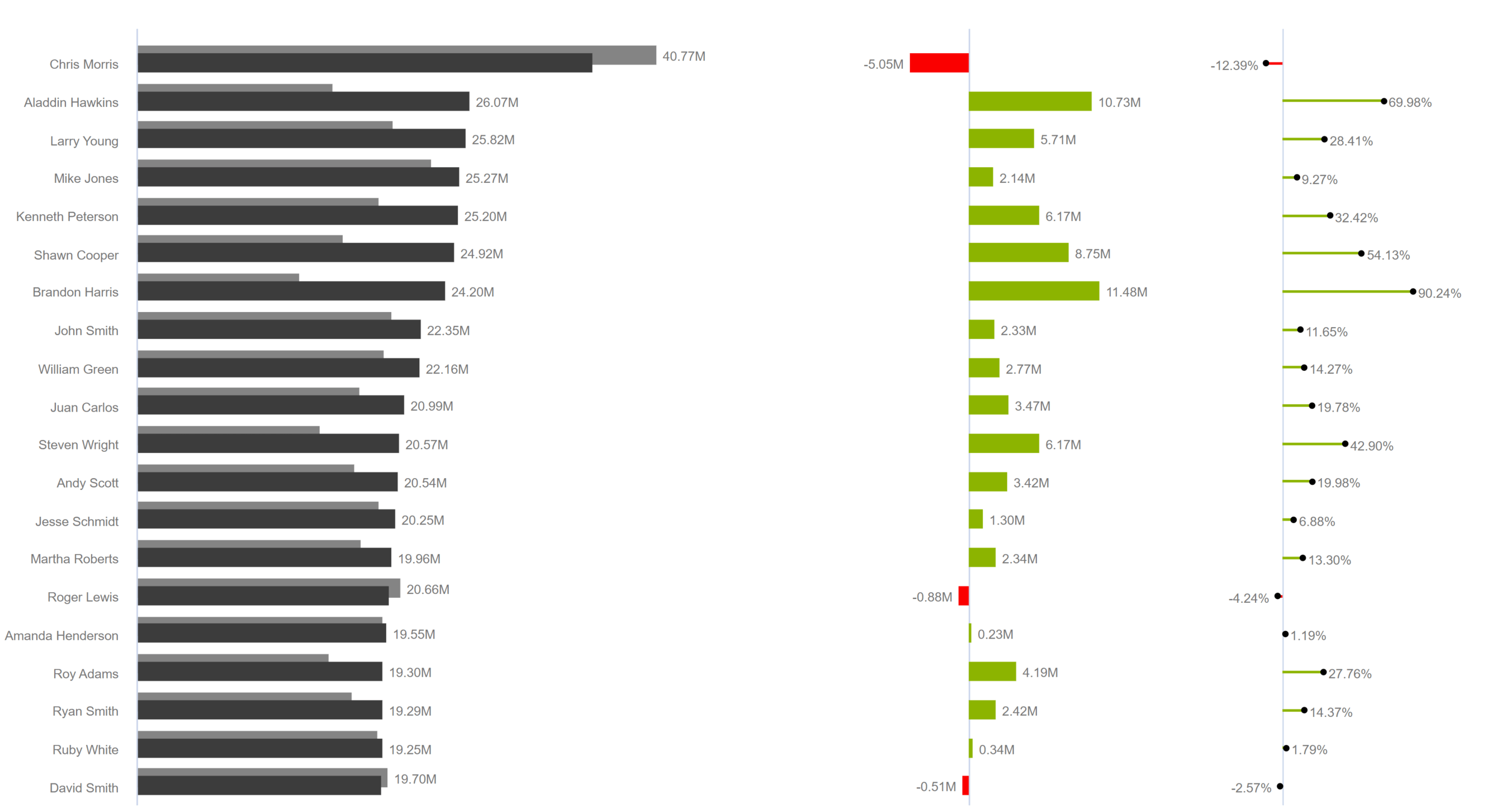
Key Features – Description
Now let’s take a quick look at some of the key features:
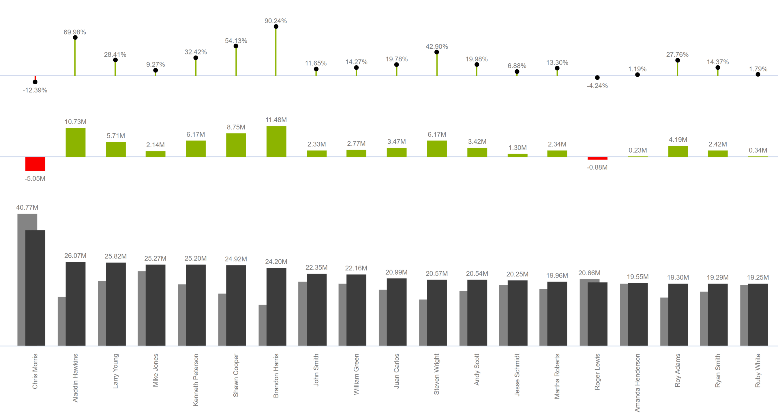
1. Orientation
Choose between horizontal and vertical alignments. The horizontal orientation is shown below.
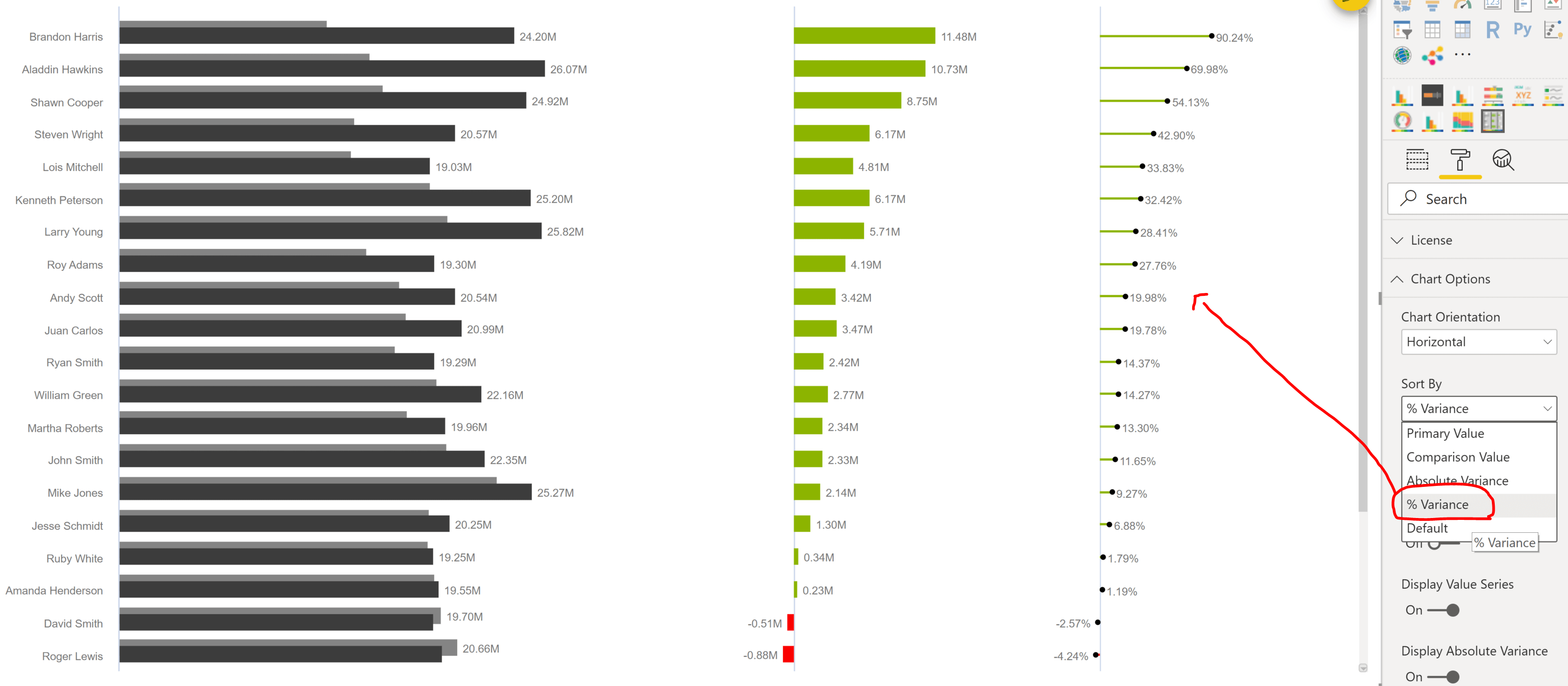
2. Sorting
Sorting by Performance, Comparison, Absolute variance or % Variance. In the image below, the values are sorted in descending order of % Variance.
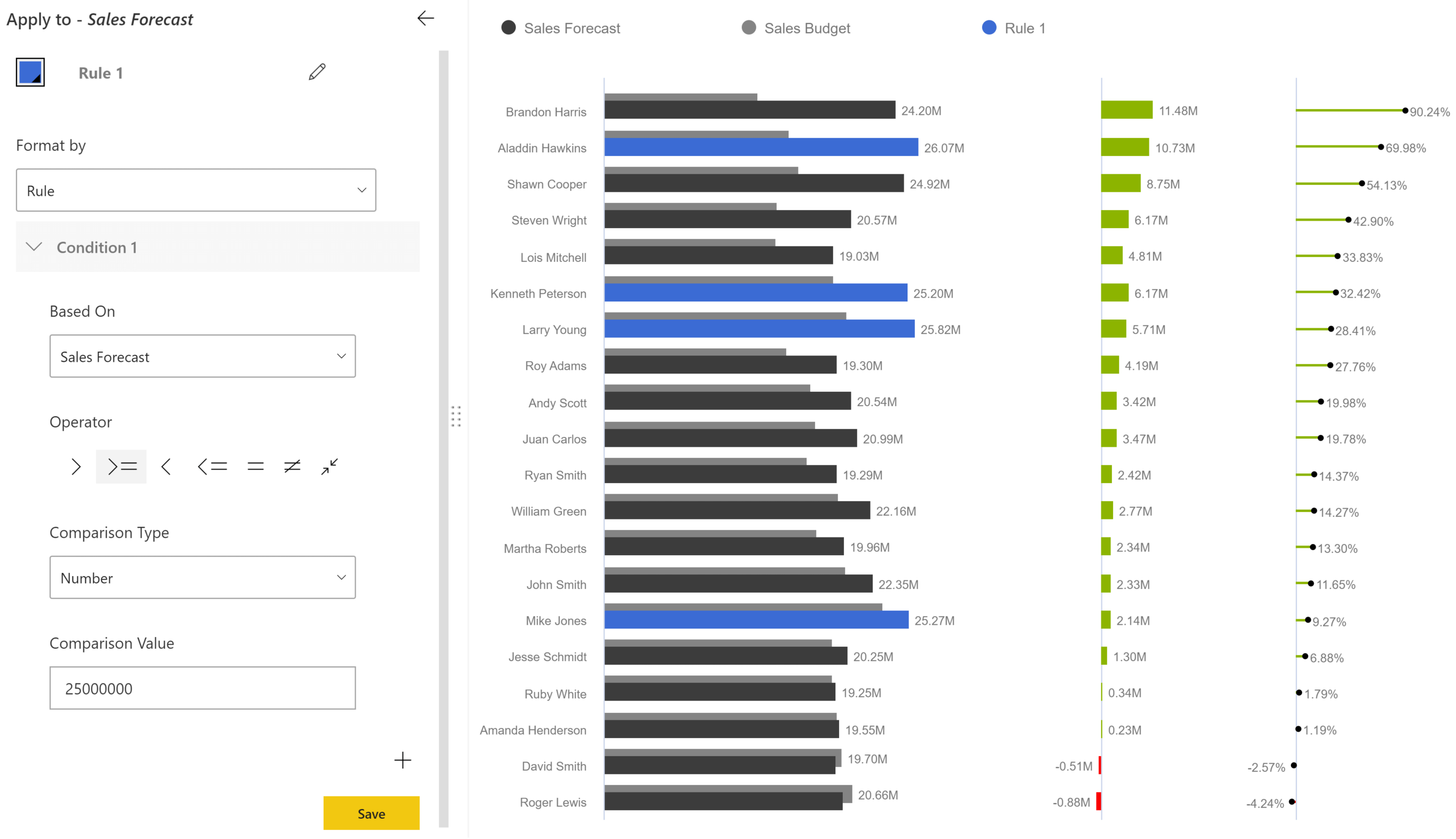
3. Conditional Formatting
Invoke the advanced editor using the icon and set up excel-like conditional formatting. In the visual attached, we are calling attention to Sales Forecast that are higher than a certain value.
4. Enable/Disable Absolute Variance or % Variance series
Sometimes we prefer to view only one type of variance – absolute or %, but not both. In such cases, the Variance chart visual gives you the option to hide either (or both) of these.
In the below example, the Absolute Variance Series has been turned off. This property is available under ‘Chart Options’.
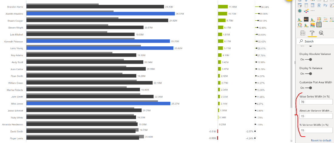
5.Customize the relative width of the three series
Depending on the real estate, you can also decide which of the three series needs to have higher prominence.
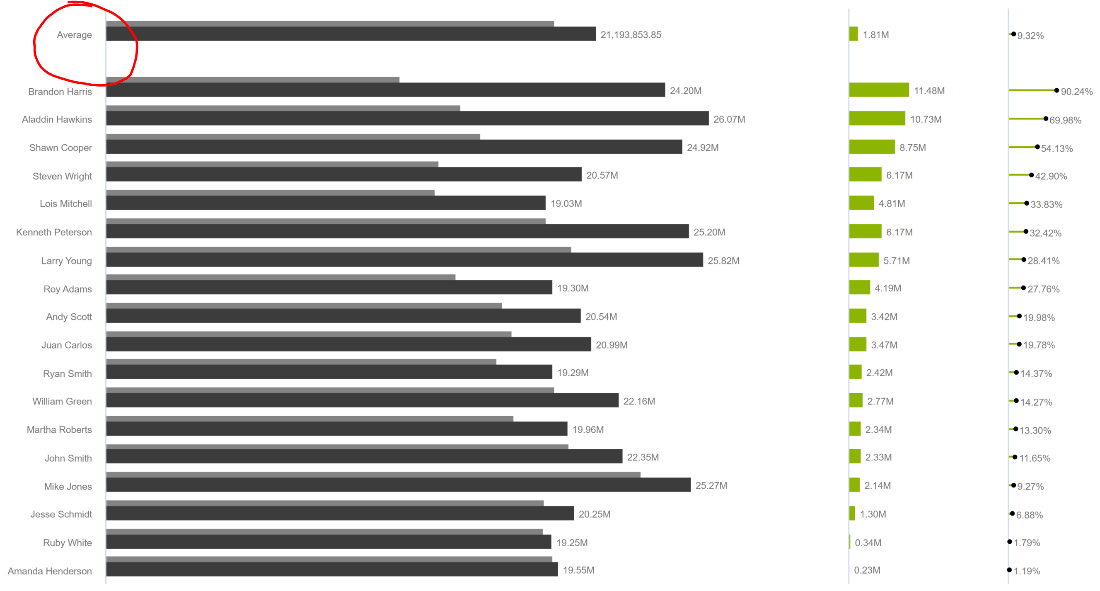
6. Display Averages
Display averages for all the entries – including performance, benchmark, absolute variance, and overall average % variance. This property is available under ‘Chart Options’.
7. RTL Support
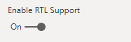
RTL support is used to enhance readability of right-to-left languages like Arabic & Hebrew. This can be enabled by using the “Enable RTL Support” option under the Legend properties.
Enabling this option enhances readability as shown.

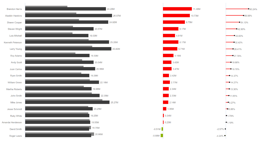
8. Capture “Negative Variance is Good” scenarios
The scenarios can be captured by changing the order of the colours. Note that the positive variances are highlighted in red. This can be used to track whether your expenses are within or beyond budget.
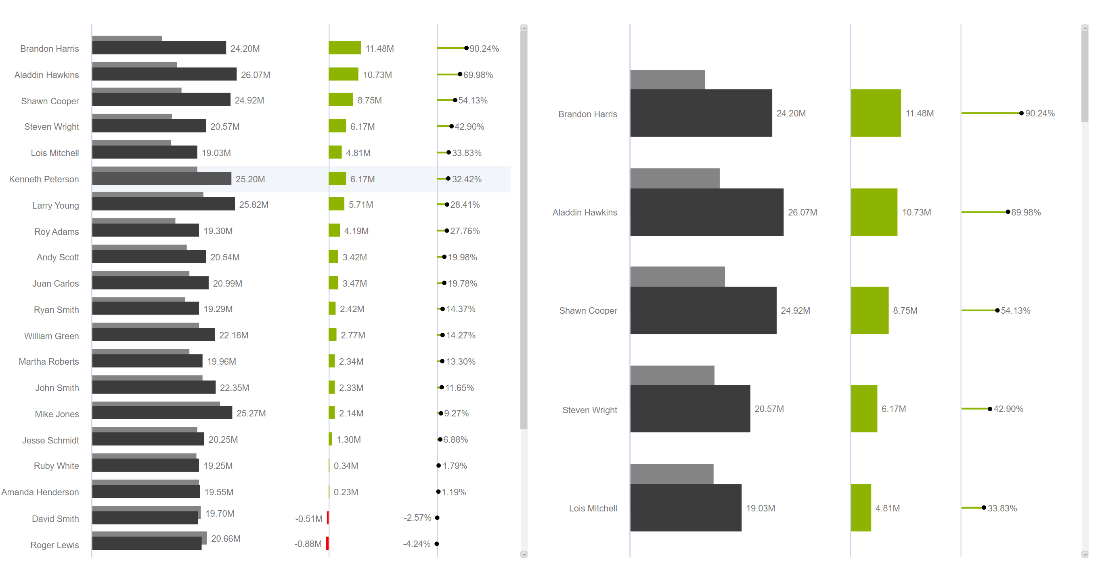
9. Customize number of data series to be displayed
The number of data series can be customized to display by default. This gives you the flexibility to adjust the display based on the real estate available for your visual. Notice the larger scroll required for the chart on the right.
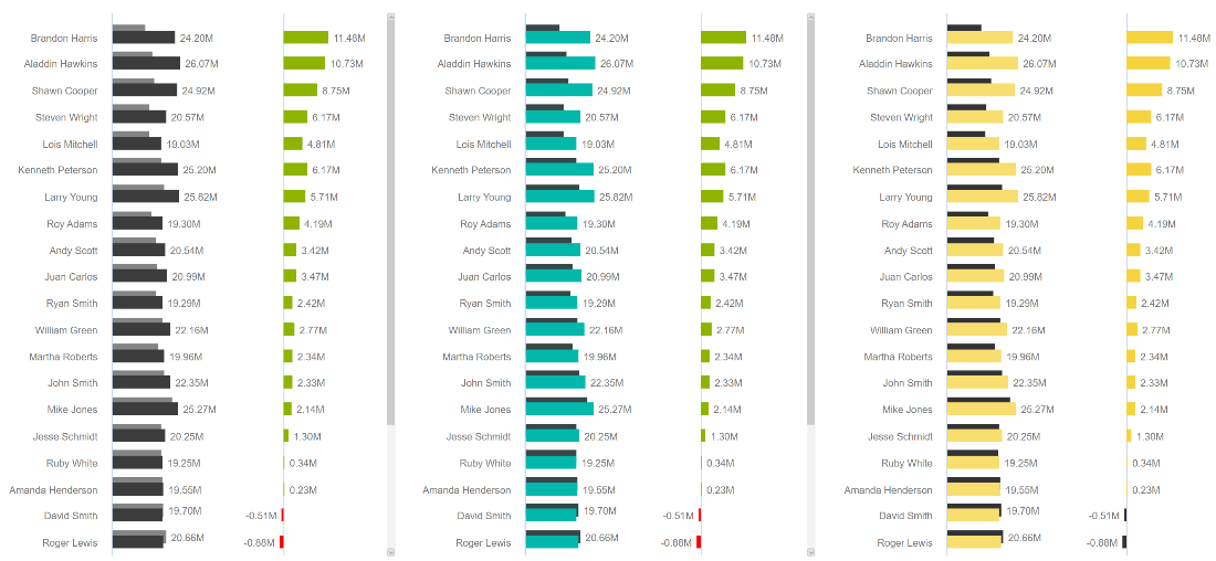
10. Use Custom Theme
The Variance chart custom visual allows you to switch between the themes in which you want to look at the visual. You can switch between the Standard, Microsoft & Custom themes, the examples of which are shown in the order below.
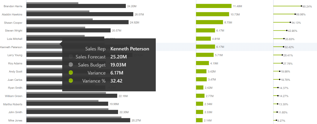
11. Consolidated tooltip
The tooltip of the custom visual is also consolidated, allowing you to view all the data at once.
We have covered some of the key features above, but there’s more to explore.
* * *
To get the latest version of the custom visual, reach out to us today here.
You can take a look at the other advanced custom visuals by xViz here.