Note: This blog addresses some features of the custom visual that will be available in the App Source in Sep 2019. To get this latest build, reach out to us here.
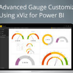
Advanced Gauge charts always reminds me of a speedometer that measures and displays the instantaneous speed of the vehicle which always indicates if we are crossing the speed limit and keep us in control. Likewise, the Advanced gauge helps visualize a single value within a given scale as pointed by the needle on the colored data range or chart axis. This chart type is often used in executive dashboards to show key business indicators.
Now let us look at how to configure this visual in 7 simple steps
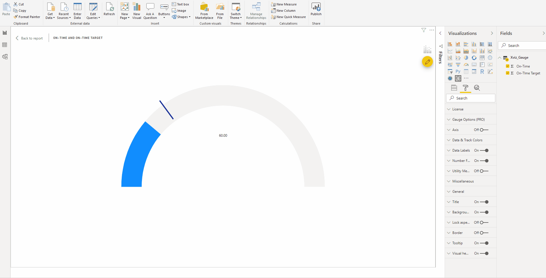
Step 1: Assign the Actual and Target value
Assume that we are looking at a supply chain dashboard and need to visualize the On-time Delivery % – comparing with our target value.
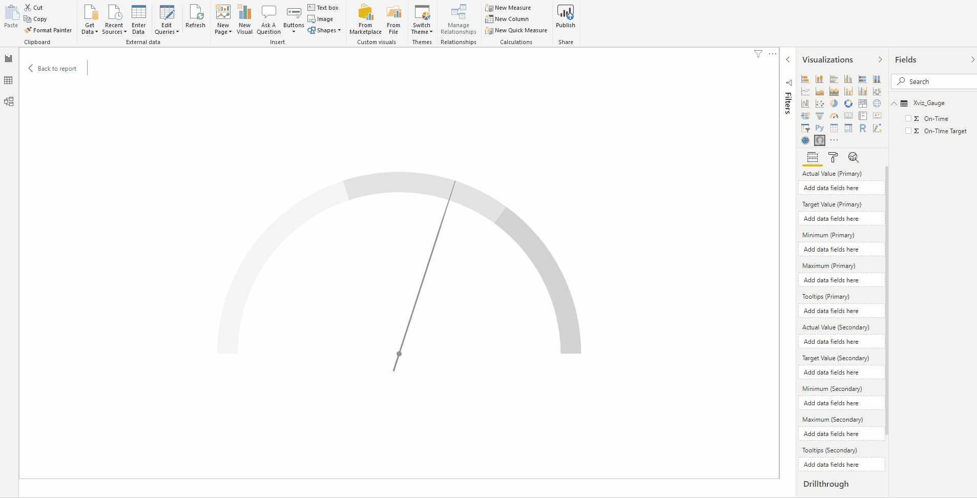
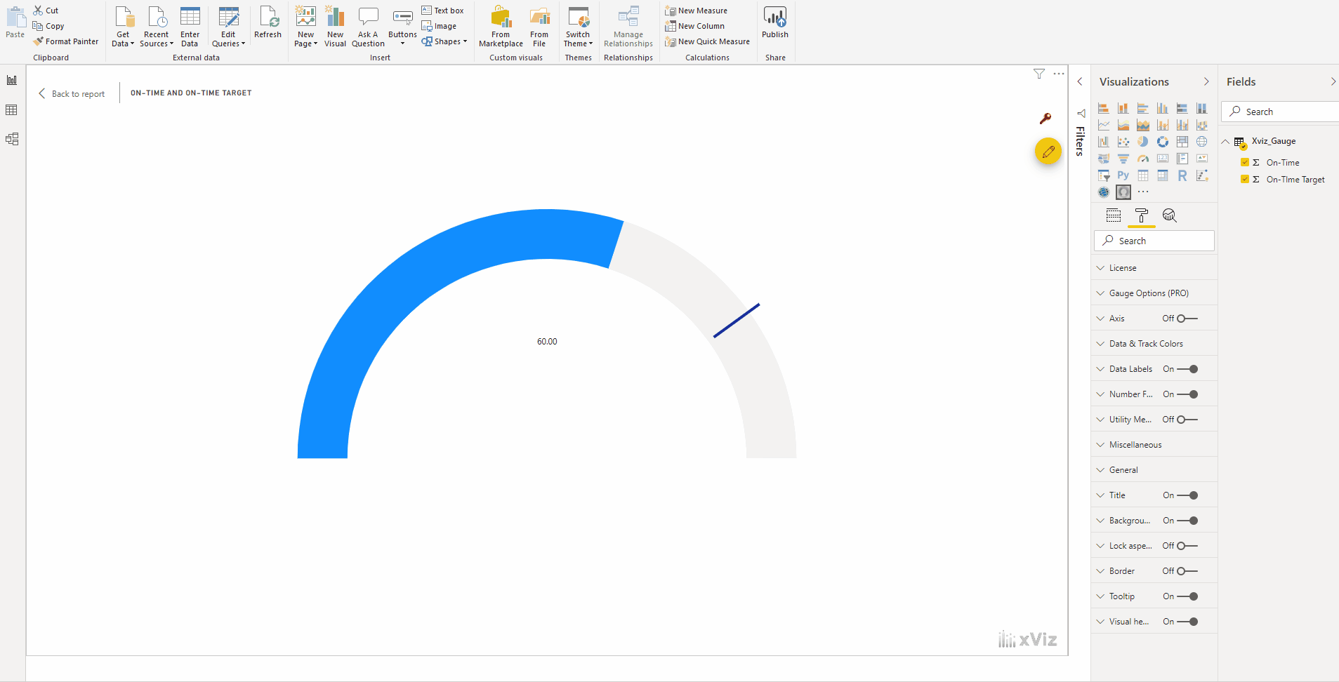
Step 2: Set the max/min value from property sheet directly
Once we have the actual and target values of the On-time % is mapped, we could input the minimum and maxmimum directly from the format tab – Gauge Options
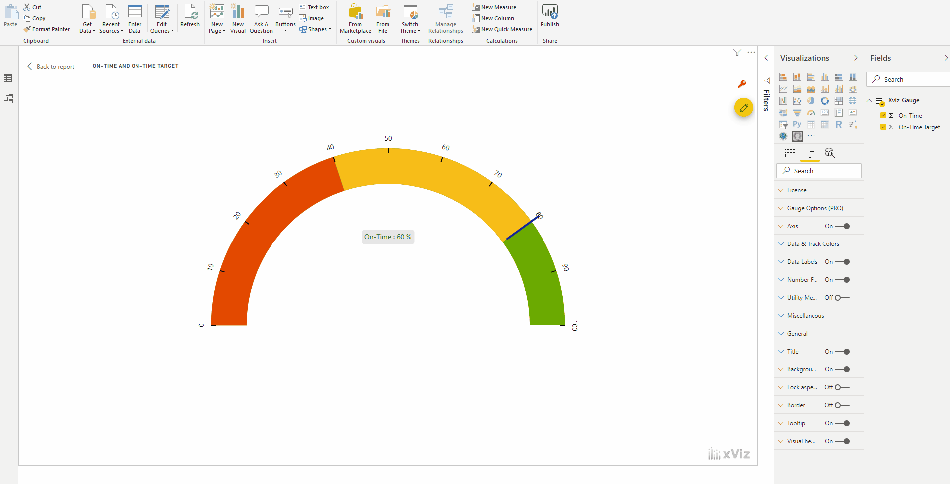
Step 3: Conditional formatting (Apply to Track background)
This custom visual allows the user to apply conditional formatting providing more insight to the visualization quickly using the advanced editor
Step 4: Data labels
Allows the user to customize the data labels of both primary and secondary values

Step 5 : Number formatting
This visual allows the user to Set the scaling display and customize it, add separators, prefix and suffix values could be added, even semantic formatting is available

Step 6 : Axis Formatting
This visual provides more customization option for axis such as reverse axis, Show/hide labels & the ticks within the axis

Step 7 : Data & Track Colors
We could set color theme for both target and actual values if no conditional formatting is added to the visualization, including a needle pointer for the actual values
We have covered the key features of xViz Advanced Gauge so far but there is more.
***
To get the latest version of the custom visual, reach out to us here.
You can take a look at the other advanced custom visuals by xViz here.