The xViz Advanced Trellis chart(aka small multiples) is of a group of similar charts having a common axis and value fields split across a category. For example, you can compare the same Product Sales across different countries, where each country is a separate chart. They are a great choice when it comes to analyzing trends across a category in a single view.
It is a common chart type found in BI tools like Power BI, Tableau, Qlik, Spotfire, etc with a variety of different names like Small Multiples, Trellis, or grid charts. It is best used for scenarios where you want to analyze multiple categories (3 or more) across a given set of values (1-4) in a single view.
Key Features – Summary
- Trellis Type – Split Panels, Stacked charts, and Animated Charts
- Series Styling and Customization
- Ranking (Top N)
- Pagination
- Layout
- Average Panel
- Data Label customization
- Axis label customization
- Advanced conditional formatting
- Interaction options
- Drill down support with Breadcrumb
Key Features – Description
- Trellis Type
The Trellis Type property gets activated when you have a category field assigned to a ‘Group by’ well. There are 3 different modes for Trellis:
- Split Panels
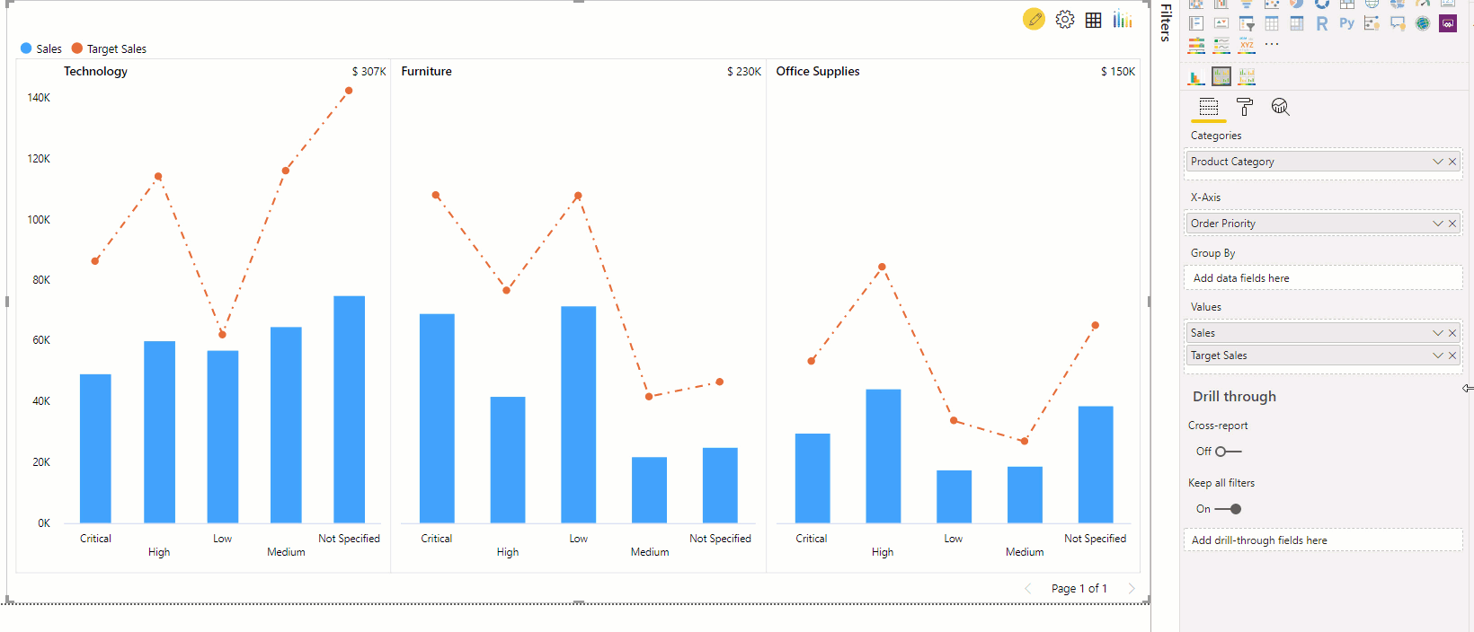
As the name suggests during this mode, the Trellis category field is split further into additional panels by the Group by category field. In the below example, Split panels mode is enabled to view Sales across the Product Category/ sub-category combination.
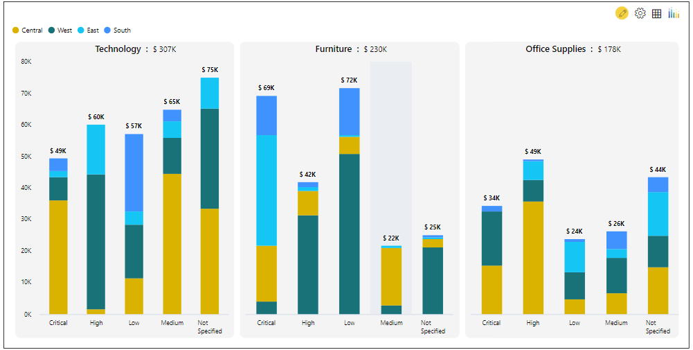
- Stacked Charts
The xViz Advanced Trellis apart from supporting single and multi-series chart options also supports stacked charts. You can display stacked column, bar and area charts using this mode where the ‘Group By’ field acts as a legend for the stacked charts
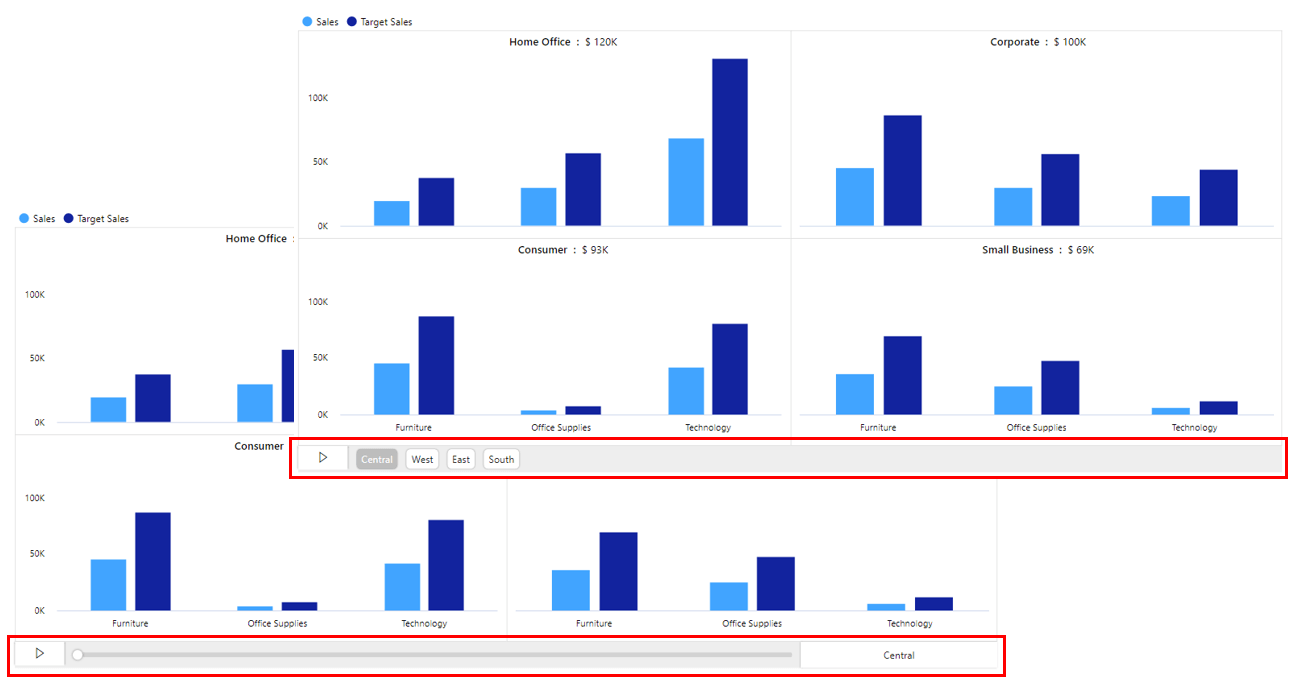
- Animated Charts
The Animated Chart mode helps you visualize the change in trends across the assigned category field. You can define the layout and speed at which you want to loop through different visuals. The xViz Advanced Trellis chart has 2 different animated chart control options –
-Button
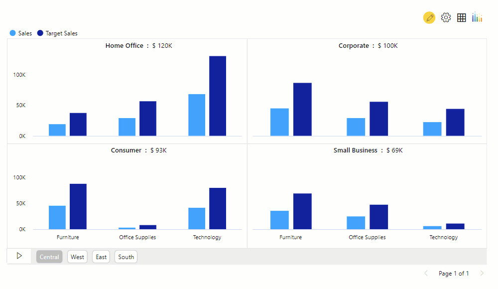
Slider
2. Series Styling and Customization
The xViz Advanced Trellis Chart provides extensive series styling and customization options. It offers 4 basic charts types that can be customized to create 10+ charts types which are as follows-
- Column and Bar
- Line, Spline and Stepped Line Chart
- Area, Spline Area and Stepped Area Chart
- Lollipop Chart
- Combo Charts
- Stacked charts – Column, bar, and area
3. Utility Menu
Represented by a gear icon (image), the Utility Menu provides a set of key runtime features for end-users. Following are the list of features offered by Utility Menu:
- Ranking [Top N]
The ranking is one of the most commonly requested features in the data visualization world. It helps users sort information based on importance and quickly understand the overall trend and business health. Users can use the Advanced Trellis ranking feature and focus on the Top/ Bottom N panels while bucketing the remaining panels in the ‘Others’ bucket.
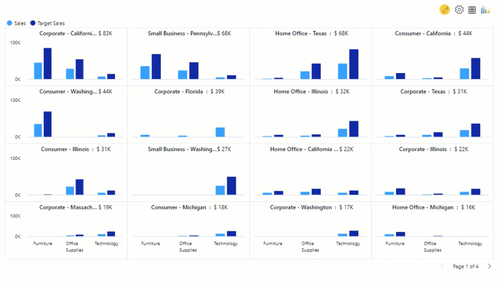
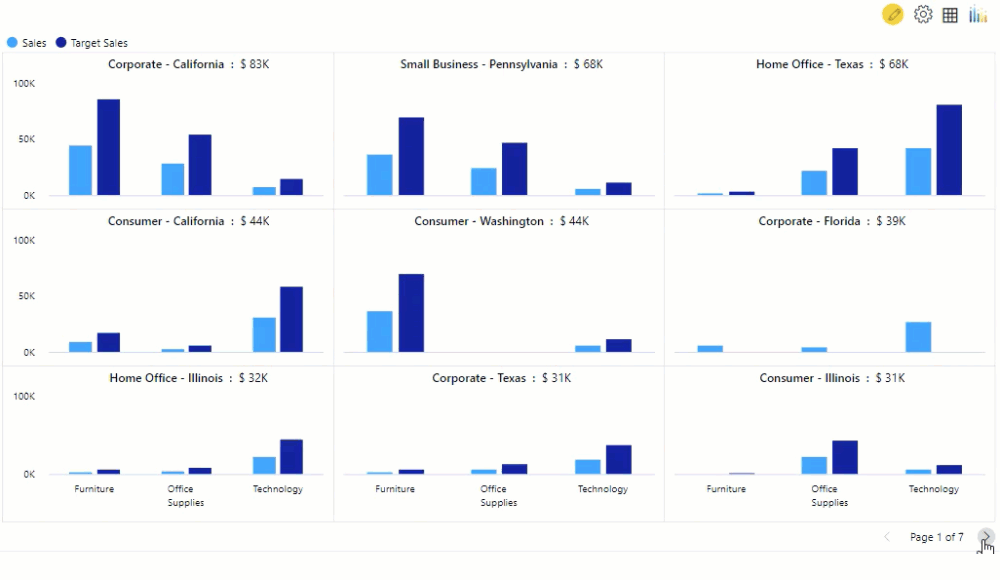
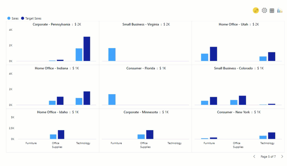
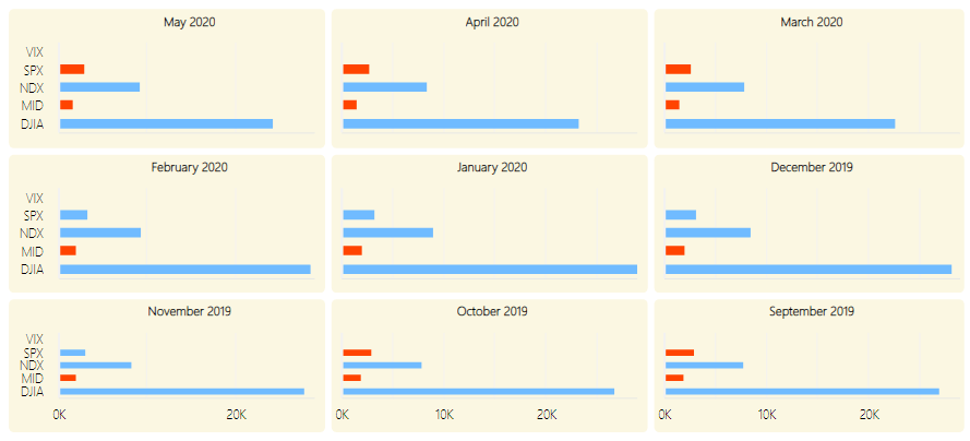
Pagination
The Pagination feature helps you easily navigate the Trellis and lets you split a large number of panels into smaller chunks for easier consumption of data. You can choose from different page controls, which let you span across different pages or even jump directly to the last or first page of the Trellis.
Layout
The Advanced Trellis is intelligent enough(Auto mode) to suggest you the best panel layout based on the assigned data. The runtime feature makes it easily accessible to fix or change the panel layout on the fly.
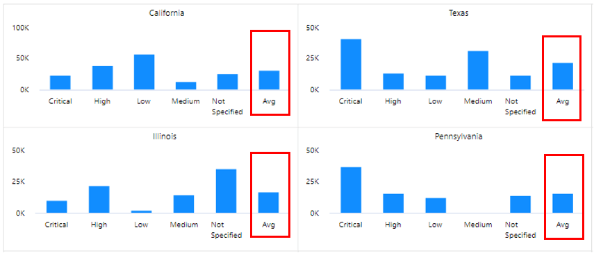
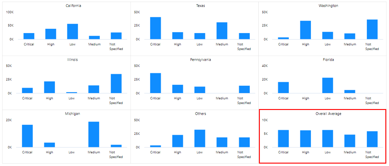
4. Averages
By displaying averages in the chart one can easily compare how the performance of each item, whether it at par or below average. The Average Type property helps display average values across the Trellis or within a Panel (Average Datapoint).
5. Data Label Customization
The xViz Advanced Trellis chart provides unique data label customizations options, which make it more suitable for displaying small multiples. The different data label formats are as follows:
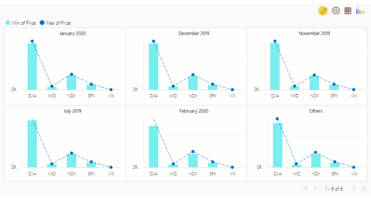
- Max & Min
- Start & End
- Limited datapoints – Max & Min + Start & End
- All Datapoints

6. Axis Label Customization
Quite often, we come across scenarios where the axis labels tend to overlap each other and get cut off due to limited real estate or long labels, thereby making it hard to read the chart. To overcome these issues, the xViz Advanced Trellis similar to xViz Multiple Axis charts provides various Axis label customization options which are as follows:
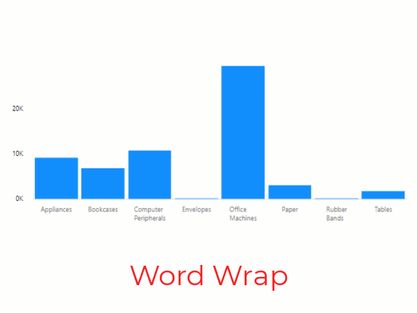
- Word wrap
- Nth label – Skip labels to declutter
- Stepped labels – Display Labels in Steps format to accommodate long labels
- Rotate Label- Rotate labels to the desired angle or better viewing
7. Advanced Conditional Formatting
Visually highlight outliers based on different business rules.
8. Interaction Options
Enlarge Panels
You can click on the enlarge panel option to zoom into panels for better visibility
Interactive legends
Just like other xViz charts, the trellis legends are interactive which on click enabled/ disable the selected series to provide a better viewing experience

9. Drilldown Support with Breadcrumb
The Breadcrumb helps in understanding the levels traversed to reach the current state while drilling down. In the below example, we can see that the Breadcrumb provides a clear overview that the user has drilled down on Telephones and Communications followed by Technology and is now viewing the Product Category level.

***
You can check out the other custom visuals in the xViz Pro Suite here. Check out videos and all the other resources for xViz Advanced Trellis here
![Key Enhancements to the Advanced Trellis/Small Multiples [v1.1.4] Power BI Visual](https://xviz.com/wp-content/uploads/Key-Enhancements-to-the-Advanced-Trellis-Small-Multiples-Power-BI-Visual-v1-1-4-150x150.png)