Linear gauges are a great choice when you want to display a single value within a given scale in a linear format and are more space-efficient as compared to the Radial gauges (Advanced Gauge). The simplest example of a linear gauge would be a thermometer.
The xViz Linear Gauge supports a wide variety of uses cases with some new addition provided by features like Bands (Custom Data labels), Band Limits, and Tier Limits which were added in the latest release of xViz Linear Gauge V 1.1.4.
Now let’s look at some of the unique customizations offered by xViz Linear Gauge.
- Simple Linear Gauge
It is the simplest Linear gauge configuration displaying actual value along with the min and max value in a linear format.
2. Simple Linear with Target
Adding a Target Value to the Linear Gauge makes it more meaningful. It adds context to your Actual value and signifies whether the Target or goal was achieved or missed. With xViz Linear gauge for Power BI, you assign a Target value as part of the fields tab or enter the desired target value as part of the chart properties field.

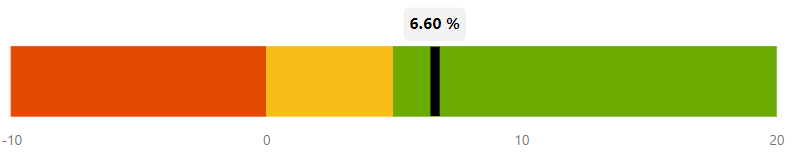
3. Conditional Formatting
One of the most important properties in the world of visualization is Conditional formatting, mostly used for outlier detection or measure the health of the KPI being measured. In the below example, you can easily visualize that the KPI lies under the green zone, signifying that it is doing good. In xViz Linear gauge you can either set conditional formatting on track background (shown below) or actual value which dynamically changes color on reaching a certain set threshold.
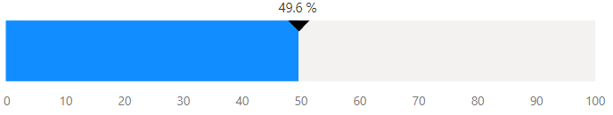
4. Progress Bar
With the new release of Linear Gauge (v 1.1.4), you can also use Linear Gauge for tracking progress. For example, you could use it to track the status or progress of a given task.

5. Data Label (Actual + Percentage Value)
Displaying percentage values along with actual value or vice versa makes the visual more impactful as the percentage values now have a context to it. For example, 42% of task completion becomes more meaningful when you know that 59 hrs have been completed or utilized by a certain task.

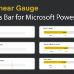
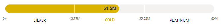
6. Band Labels(Custom data labels)
In certain use cases, the Bands (custom data labels) demand equal attention as the actual value. It is important to know under what band or Tier does the value lies. A classic example would be of airline miles or hotel tier system where it’s important to know the actual point earned and the tier status at the same time.

7. Progress bar bands and Limits
Limits signify the range for each of the bands by stating the start and end for each value. With xViz Linear gauge you can assign up to 5 limits and bands.
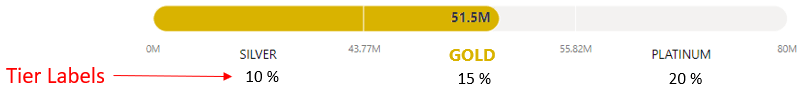
8. Progress Bar with Band limits and Tier Labels
Tier labels come in handy to add extra information needed for Band labels. For example, consider a partner seller dashboard where each partner is incentivized based on the band it lies. For instance, if a customer falls under the Gold Tier, they are entitled to a 15% discount and so on.
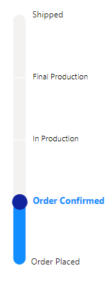
9. Orientation – Vertical/ Horizontal
There are certain use cases where you may want to display Linear gauge in vertical orientation than horizontal. For example, you could use vertical orientation for measuring temperature or order tracking as shown below.
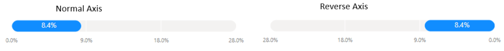
10. Reverse Axis (Flip Y-axis)
Reverse axis comes in handy, especially in cases where customers would like to read from left to right like in the middle eastern countries or some KPIs which are more effective if read in the reverse direction.
***
The xViz Linear Gauge is a part of the xViz Pro Suite, check out all the resources for Linear Gauge including other blogs, and FREE Power BI Desktop Version!
Check out all the Power BI Visuals in the xViz Pro Suite here